Humanities Networks in Gephi, pt. III

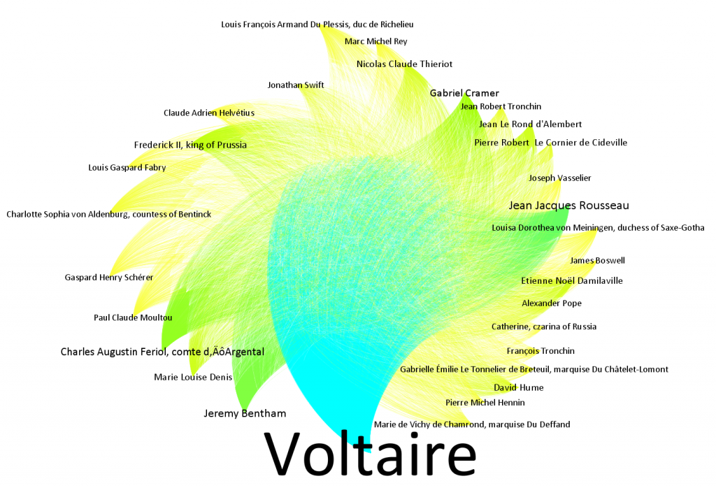
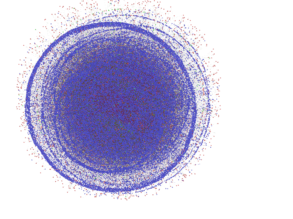
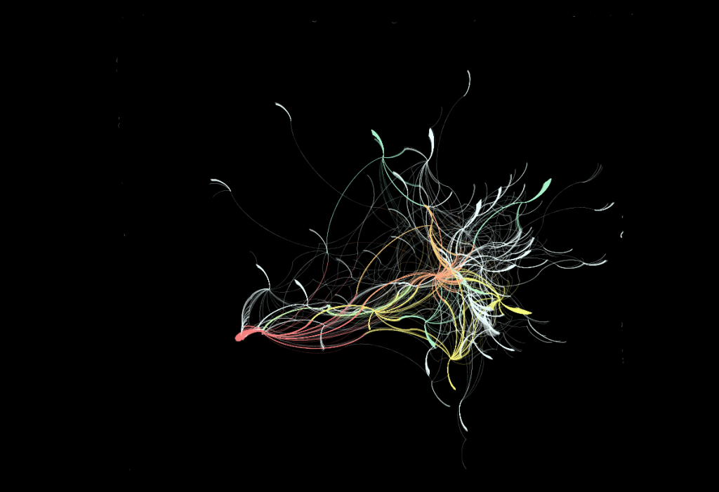
A few last easy visualizations, before I move on to different datasets and methodologies. First, as close to an informative visualization of Voltaire and his correspondents as I can produce:

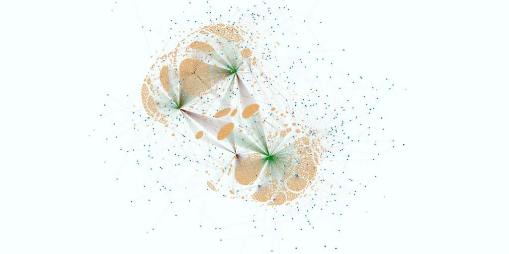
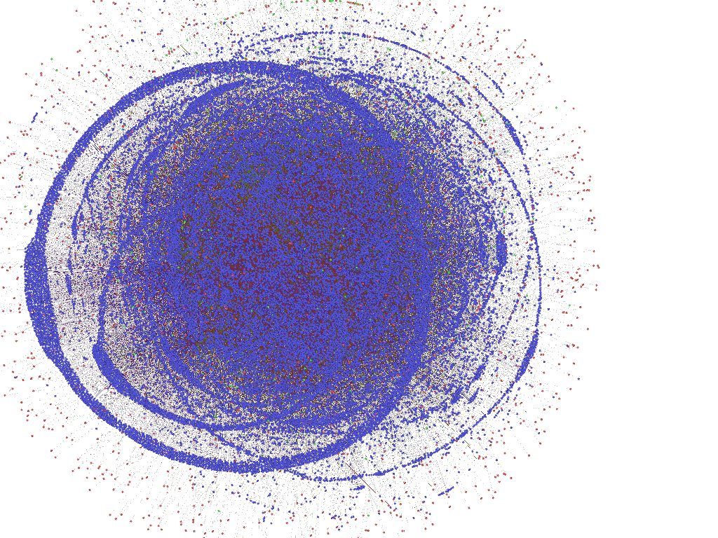
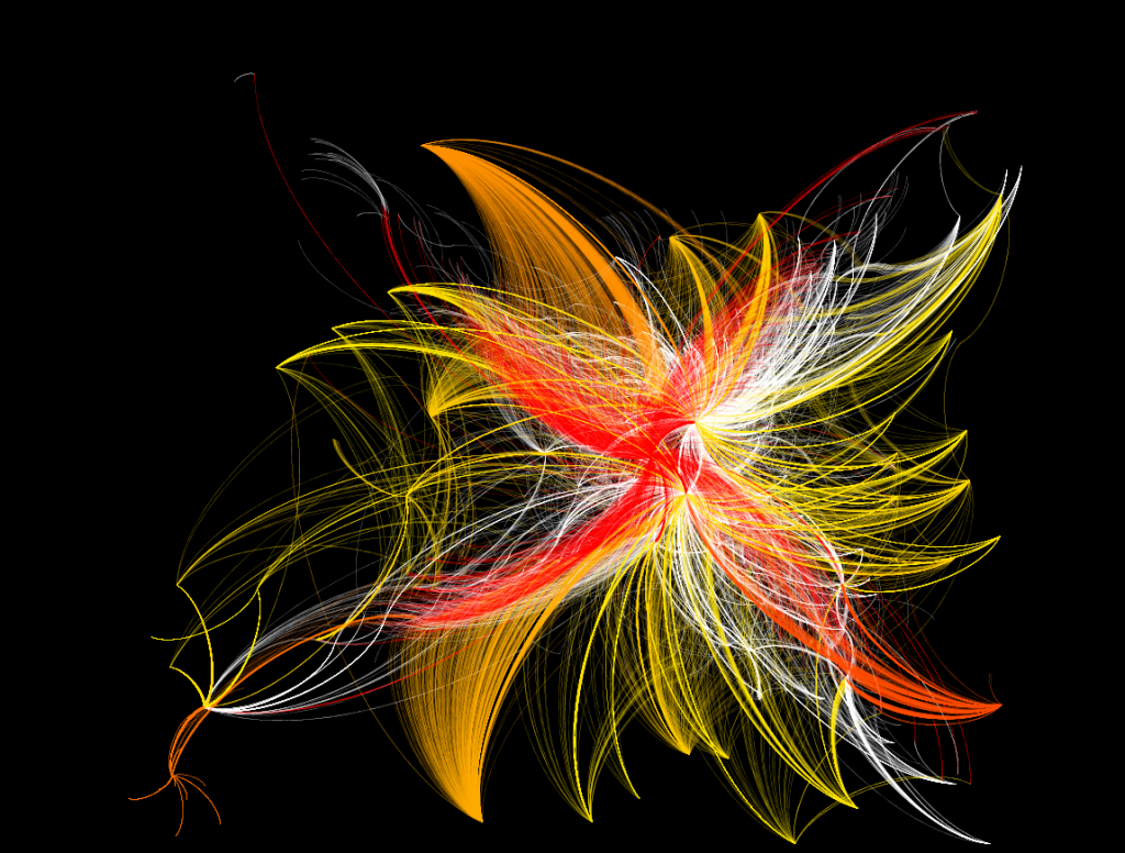
And a few of the more interesting drafts of Benjamin Franklin’s network:

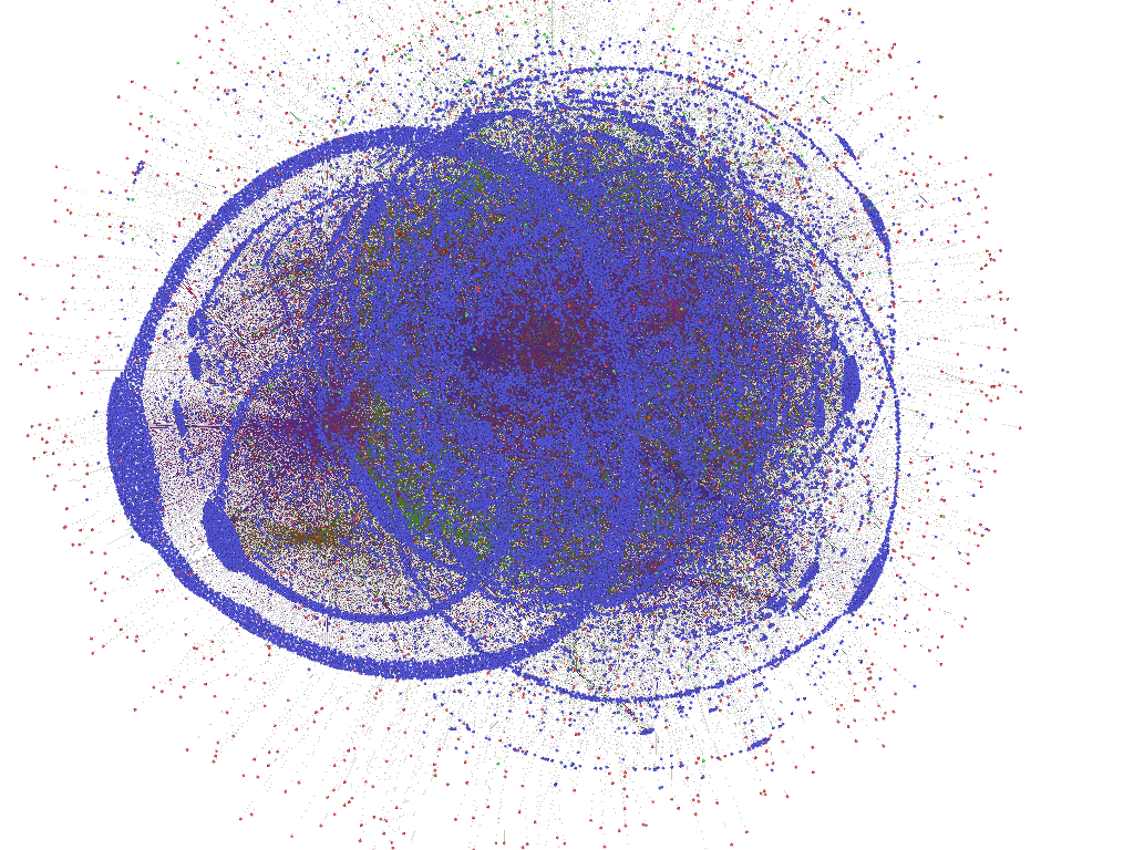
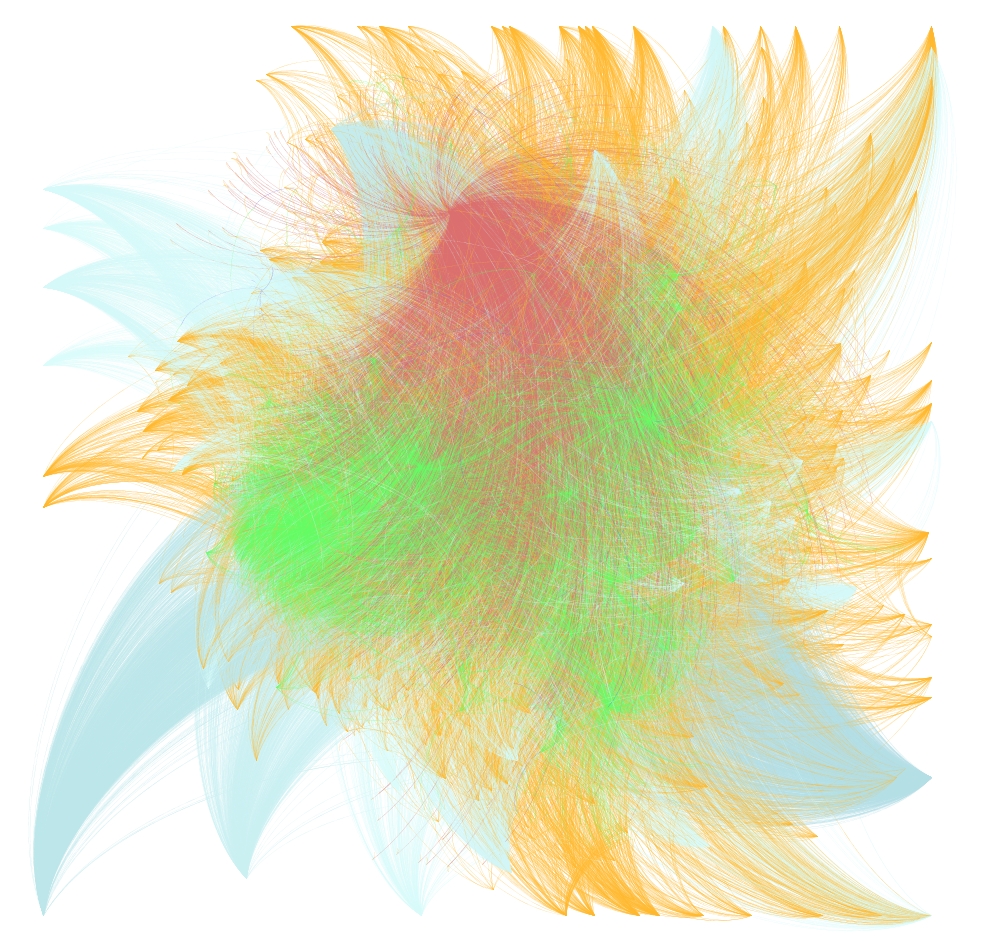
And, finally, the early phases of Voltaire’s network in the process of self-organization:

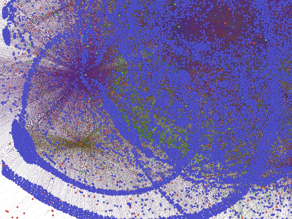
The network focused on the neighborhood of Voltaire, Ferney, London and Jeremy Bentham. The bulges on the sides of the circles are the beginning of the accumulation of letters that have only one associated location, which will later become the tails seen in the earlier Voltaire visualization.

Posted in Graph Data Model, Spatial Humanities, Tools, Visualization | 1 Comment

Mapping the Republic of Letters

I’ve been remiss in leaving out an updated link to the excellent Mapping the Republic of Letters project that I’ve had the good fortune to take part in over this last year.  Led by Dan Edelstein and Paula Findlen and managed by Nicole Coleman, they’ve gathered an impressive list of collaborators both at Stanford and abroad, and have put together an enormous amount of information related to European intellectual history, ranging from the correspondence of Voltaire, Franklin, Vallisneri and Kircher to the travel patterns of Francesco Algarotti or 18th century Grand Tour participants.  Interestingly, the project has also resulted in a growing historical gazetteer of Europe, necessitated by the reference both in text and map to various places and placenames that are remarkably difficult to reconcile using traditional means.  Various permutations of this database, as well as the ability to interact with and analyze it, have been at the core of my work here in 2010.  It is an exemplary project in the digital humanities.

Posted in Digital Humanities at Stanford, Graph Data Model, HGIS, Spatial Humanities | Comments Off

More Voltaire Graph Visualization

The interesting problem when dealing with such a large dataset with little depth (the data as it is collated in these examples is focused on number of connections rather than quality, as individual letters are held as connecting two people or two locations–I may reformat the data to treat these as simple connections to see if the analytics produce more interesting results) is moving beyond the seemingly cosmological representations of places and individuals and toward something more intellectually dense.  Still, I think there is a place for large, almost artistic representations of individuals and places that may help scholars to better understand and explain humanities phenomena.  The visualization in the last post was a combination of location and person, mediated by letters as connecting elements.  Below is a visualization of the locations involved in Voltaire’s correspondence (and, I now realize, a little bleed over from the correspondences of Voltaire’s correspondents, it seems I wasn’t as focused with my query to produce this dataset, but since it’s just a visualized humanist fishing expedition, I’m not terribly concerned).

London, in red in the bottom left, and Paris, in orange, show interesting patterns for exploration, implying that despite London’s quantity of correspondence, Paris still has a centrality of correspondence.  More telling, though, is the visualization of a failing of the data:  Oftentimes only the sent or received location is known, and as such each location has a “tail” of non-linking correspondence that in many cases overwhelms the linked correspondence.  Contrast this with the network visualization for the people involved in the correspondence:

Individual names of people and letters are shown in the larger version available by clicking on the image.

Voltaire and his most popular correspondents are displayed from red to yellow, with less popular correspondents in white.  Tails are only evident in correspondence that travels beyond the network parameters set during the query (a mistake, these tails shouldn’t exist at all).  This was produced using a combination of the Yifan Hu algorithm and the ForceAtlas algorithm, with further effort to pull out the clustered correspondents for aesthetic purposes.  The latter activity damages the ability to recognize clustering patterns but, given the purpose of this visualization (to examine the possibilities of the tool from the perspective of a digital humanities specialist rather than examining a particular humanist point of inquiry) I deemed it worthwhile.

On reflection, the availability of the dataset and the particular format of the data prior to ingest seem at least as important as the methods used to visualize and analyze said data.  Further exploration of the capabilities of Gephi are going to require my restructuring the Mapping the Republic of Letters data to emphasize connectivity as well as working with the geographic network analytical functionality.

Posted in Algorithmic Literacy, Graph Data Model, Spatial Humanities, Tools, Visualization | 1 Comment

Graph Visualization of Voltaire’s Network

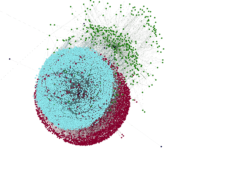
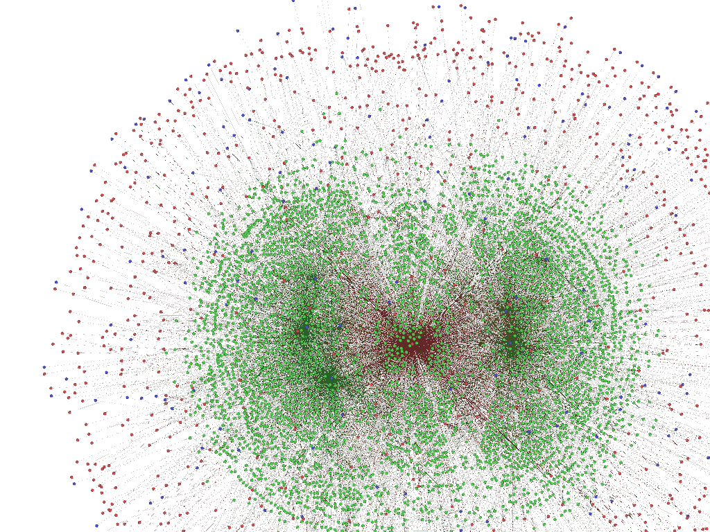
Gephi continues to impress me with its ability to arrange and represent large amounts of graph data.  Voltaire, with his nearly 20,000 letters sent and received, is in red.  His most numerous correspondents are in blue and the various locations associated with his correspondence are in green.  Less popular correspondents are represented in orange.

This dataset consists of 37,000 nodes, most of which are letters, and 87,000 edges.  Despite the beauty and complexity of the visualization, I’m still just playing around with the tool, and will try to post a much more comprehensive treatment of Gephi and the various digital humanities networks (including geographic networks) that I have access to once I grow more familiar with the tool and the math behind it.

Posted in Graph Data Model, Spatial Humanities, Tools, Visualization | Comments Off

Humanities Graphs Using Gephi

The network visualization tool Gephi, which recently received recognition from Oracle as an exemplary Java project, provides an enormously powerful toolbox for visualizing and analyzing network data such as the kind found in the new Mapping the Republic of Letters database.  Like any powerful tool, Gephi provides such arresting visuals that it makes me feel like I need to spend the rest of the year figuring out just what, exactly those visuals are.  Force-based algorithms arrange graph data by assigning attractive and repulsive forces to a node based on the number and quality of its connections.  The result can be rather stunning.

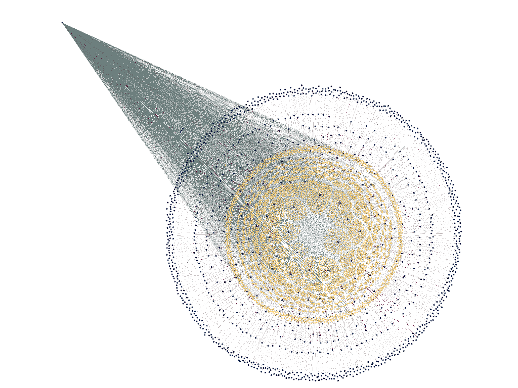
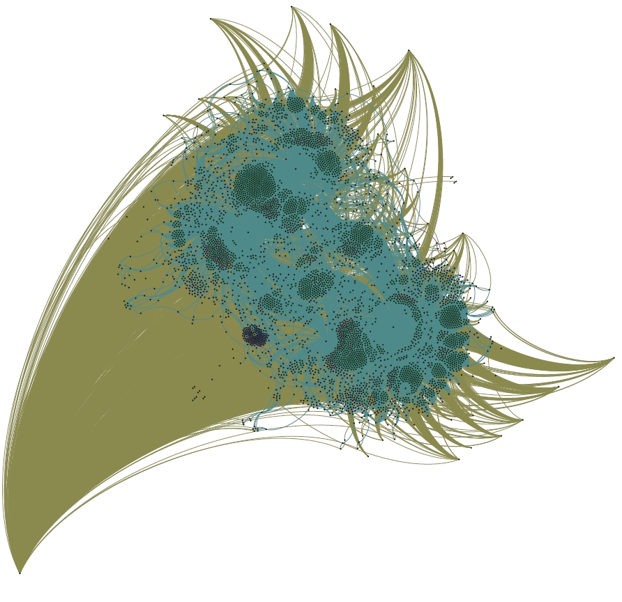
A portrait of Benjamin Franklin, as a network of letters, locations and recipients. He resembles Cthulhu more than usual in this method.

The image above is a large (but not complete) sample of Benjamin Franklin’s correspondence from the Mapping the Republic of Letters database.  Franklin himself exists at the bottom left, and the more popular recipients of his letters occupy a more distant orbit around the teal cluster that differentiates the various locations where letters were sent to and from.  The three major locational clusters, surrounded by small islands of letters oriented to exist between the locations and actors involved in the letter, are Philadelphia, London and Passy.  Smaller locational clusters nest around these and various less common recipients of Franklin’s letters are buffeted to and fro on mathematical eddies, sometimes nested between larger authorities and sometimes flung far from the locational centers.  I’m only just getting started with Gephi and serious graph visualization, and cannot do more than a rough interpretation of the results of this particular algorithm.  I will note that the process to get this 5000 node and 30000 edge Franklin network to the shape above required 3GB of RAM and a dedicated processor and 12 hours.  I’m currently running the much larger Voltaire network and in 18 hours it has only just begun to take shape.

Posted in Graph Data Model, Social Media Literacy, Spatial Humanities, Tools, Visualization | 2 Comments

Historical Georectification: The Seductive Power of Ducks

Edward Tufte referred to one form of visual junk as “ducks”, in reference to a house built like a giant duck, criticizing the superfluity of it with a quote from Robert Venturi that ends with the admonition:

It is all right to decorate construction but never construct decoration.

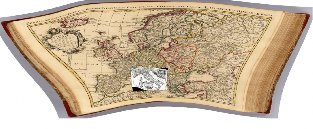
On that note, I’ve begun to struggle with the concept of historical map rectification1, and the noble ideals that push one to georectify and then make available–either within local applications or via WMS (Web Mapping Services)–beautiful historical maps that seem to have been run through funhouse mirrors, such as the two below:

A map of Italy c. 1695 from the Bibliotheque Nationale de France, overlaid on a map of Europe from the Rumsey Collection, c. 1743. Notice the irregularity of the latitudinal and longitudinal lines, indicating what modern geographers would refer to as a non-standard projection coupled with a lack of familiarity with the terrain.

The product of such work is so delightful to a variety of audiences that the pursuit of digitizing and georectifying historical maps is as concrete a “good” as the digitization and OCR of every book available.  Just look at the Map of Yu (well, if you could find it) projected onto the modern, 3D globe of Google Earth and tell me that there isn’t a more true definition of the Digital Humanities!

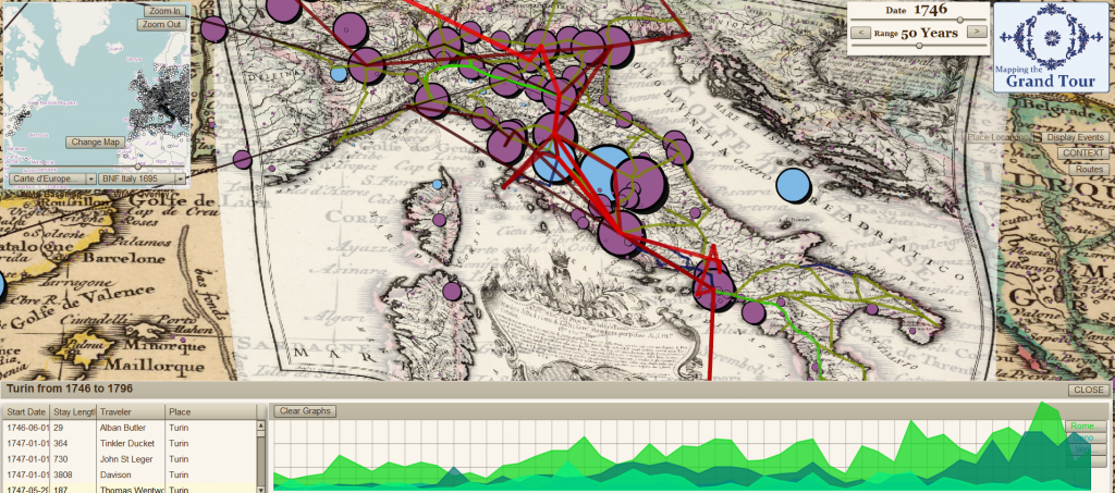
There’s an unpleasant truth in the accuracy of such a claim if the effort expended on rectifying these maps is only for the purpose of decorating our historical research.  The image below, is fundamentally useless from the perspective of historical research–it’s too cluttered and discombobulated, but it shows an enormous amount of information and effort all at once on one screen.  The historical maps that sit below the network and point data are nothing but wallpaper.  It’s a duck, purpose-built to demonstrate to people my carpentry skills, in which case it may not be a duck, because it is serving a purpose, but not all such products are so self-conscious:

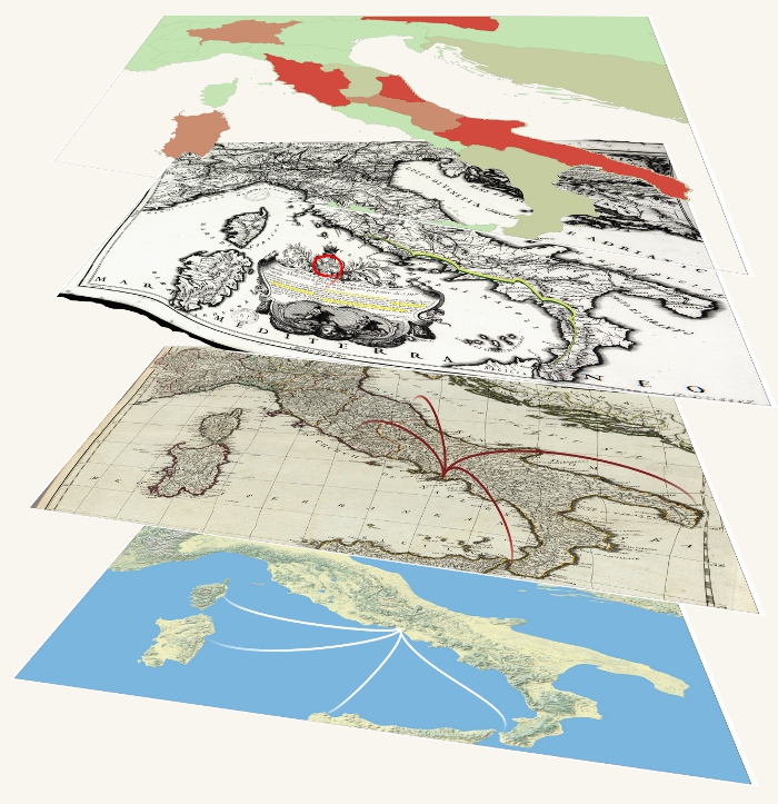
The same maps from above, with the BNF map made semi-transparent, overlaid with postal routes of Italy c. 1790, the travels of Richard Colt Hoare and destination popularity in the latter half of the 18th century.

Rectification of historical maps, especially older historical maps that have problematic geography, is not necessarily construction of decoration, but the heuristic value of such maps needs to be examined.  Tracing the borders of environmental or political bodies will have questionable returns given the distortions of many of these maps, and point locations, which can be triangulated to some degree of accuracy through many passes, may prove to be better discovered through textual search that associates the historical place with a modern place.

Identifying networks and topologies, such as the postal routes used in the analysis of the Grand Tour above, can be accomplished without any georectification, except (and here is the reason why the above maps are rectified) insofar as georectification allows for using Cartesian geography as an index, and therefore is practically useful from a sense of workflow.  In other words, if I am identifying networks between cities, it is easier for me to catalog them on the map in which they exist rather than cataloging them in a spreadsheet and then associating those places with the georeferenced locations later (especially in the case of historical places, which have interesting placename issues with batch geocoding).  As such,it is easier to overlay a set of locations onto the map and allow myself or other users to click on those locations in the order of the network rather than to write each of them down and then find x-y coordinates in a later step.

So, while there are good reasons to georectify historical maps, it should not, like OCR of historical texts, be considered an automatic step in any good archival process.  In fact, it may be that, like OCR of historical texts, we should develop a way to OCR maps, and not for the purpose of automatic georectification but rather to catalog their features and the internal geography of the map itself.  Such catalogs could be used to provide rough, on-the-fly rectification when needed (and likely this level of rectification the most useful for 200+ year old maps) for the purpose of lifting knowledge for use in historical GIS or otherwise.  Presenting modern GIS data overlaid on a 300-year-old map does indeed impress audiences, and at times that may be a legitimate goal, but lifting data from old maps may be better served by rarely, if ever, rectifying them.

1 There’s a very different set of rules when it comes to more modern maps. Land use and demography can be more readily drawn from maps from the last century or so, and especially in the case of urban maps.

Posted in HGIS, Spatial Humanities, Visualization | Comments Off

The Digital Humanities as Imagined Community

On September 28th, from noon to 5PM, I’ll be taking part in the SULAIR Open House, where I’ll show off a few tools and analyses I put together for the “Mapping the Republic of Letters” project in an attempt to explain what I do as a digital humanities specialist, and, in the process, explain what the digital humanities is and could be.  I’m not the only one wrestling with this, and some notable examples are HASTAC Scholar Chris Forster’s explanation of the four circles of the digital humanities circus and Patrik Svensson’s “The Landscape of the Digital Humanities” up at DHQ.

Like any such presentation, my own will be an exaggerated and oversimplified vision of my work and, through it, the digital humanities as a whole, but in a sense that’s the best one could do to explain such an admittedly nebulous concept.  “Digital Humanities” isn’t a field, rather it’s a transition through definition of two pernicious Others: the “traditional humanities” (which no one has ever claimed to exist before the digital arrived) and “Humanities Computing” which has been long-established and as such could not afford the inclusion of games studies and database analysis and geographic information systems into its hard-wired text-focused analytical realm, much less digital pedagogy, social media studies or the many other digital humanities topics that will be found at DH2011′s Big Tent.

The Digital Humanities quickly became tied to a populist concept of new media, where anything and everything involving books and computers could be considered the Digital Humanities, which has itself led to redefinition through a new pernicious Other, which leads to the Spatial Humanities, Digital Geographers, Spatial Historians, Interdisciplinary Humanists, and Multimodal Humanists who define themselves as not being (nor seeing the usefulness) in the “Digital Humanities”.  I’m just as guilty of planting flowers of revolution, claiming the existence of a Procedural Humanities in examination of humanities knowledge represented in games, as well as distinguishing algorithmic media from new media in the former’s focus on the logical constructs that produce the effects typically associated with the latter.

While a fertile ground for self-definition, this shifting and swaying of the very bedrock of an academic pursuit is still a barrier to participation.  In my own experience discussing the development of digital scholarly media with interested faculty, I’ve come upon an all too common complaint about the superficiality of digital humanities research and scholarship.  Partly, I believe, this is a result of so many different disciplines represented under the auspices of the digital humanities.  Sometimes, the result of a classicist being exposed to a new media theorist or a historian confronted with the study of literature is a retreat into stereotypical derision for different field, with different methods.  More often, unfortunately, is the legitimate criticism of digital humanities projects that is still so lacking within the digital humanities community itself.

But the integration of digital media into the humanities has traction and a growing appeal.  Digital humanities labs are producing more and more undergraduates and graduate students who feel it natural to use once arcane software packages.  Libraries and departments are providing more outreach to identify and support interested faculty who may not think of themselves as being part of the digital humanities.  So, while the digital humanities remains nebulous and seems destined to shatter into a thousand new, possibly equally nebulous, concepts, it seems to be serving its purpose.

Posted in The Digital Humanities as... | Comments Off

When the mouse was in my hand, the cigarette flew away

The Digital Humanities is a big tent, and includes analysis of how digital communication has affected traditional society.  I couldn’t help thinking about this as I was watching one of my favorite actors, Shammi Kapoor, in the process of putting his entire life online:

The Urdu bits translated:

:17 In my life, the computer has played a very big part.  I used to spend about ten or twelve hours a day at the computer, because it’s magic to me…

:53 Because I was on the computer…

1:00  …it’s 12 o’clock, are you going to eat something, are you going to drink something?

1:17  Whenever I was on the computer, my hand had the mouse in it, I didn’t have the time to smoke.  A man forgets to do that…

I don’t deal with this aspect of DH, and I’m allergic to social media (you won’t find me on Facebook or Twitter) but that doesn’t mean that I’m not in awe of the phenomenon nor unaware of the excellent work that people are doing with new media, especially in pedagogy. Joseph Kautz, the head of the digital language lab here at Stanford, welcomed the 2010 Fulbright Foreign Language Teaching Assistants by giving them the opportunity to share their experiences and their songs using WordPress and Kaltura, and while there may not be any future Muhammad Rafis among them, the results were still amazing:

떴다 떴다 비행기 ( flying airplane)

Joseph and I spoke about this before and after, and there were two incredible things that I took away from it:  The first was a strike against my jaded view of the total penetration of digital media into global society, made clear by the remarks of students for whom this was their first exposure to the concept of “YouTube”.1 The second was a firm belief that for someone like myself, who was there when all these temples and black boxes were built and who knows that they’re simply the creation of people, there is a core responsibility of the university is to demystify social media, and demonstrate that a video-embedded and tag-clouded blog produced by a few neophytes was only different in scale from the seemingly monolithic Web 2.0 structures, not in kind.

1Or, as William Kamkwamba said in his interview on The Daily Show, “Where was this Google all this time?!”

Posted in Pedagogy, Social Media Literacy | Comments Off

What the Digital Humanities needs to learn from Google Wave

The Office of Digital Humanities at the NEH just released a new study analyzing the efficacy of their Digital Humanities grant program.  The response of SUG recipients was uniformly positive and they described the program as “hugely successful”.  But a cursory glance of the appendix of projects reveals that for every excellent inPho there are a handful of half-baked digital humanities projects that sadly litter the landscape.  The Start-Up Grants were designed as High Risk / High Reward, and so failure is a definite possibility, but it’s been six years since A Companion to Digital Humanities was published and participants in the field are still uncomfortable criticizing the work of their peers and of themselves.  As I said on HASTAC last year, if the Digital Humanities is to be taken seriously, then we need to be able to distinguish between success and failure.  Everything isn’t successful, even if it’s innovative, just look at Google Wave.

Like many people, I always meant to use Google Wave.  The initial beta was only open to select digerati and the press release described a transcendent, synthetic form of communication that would do to email what email did to the telephone.  Wave was multimodal, real-time and still grounded in text–which sounds like most Digital Humanities project proposals–and, unlike so many of those proposals, Wave actually got up and running.  But last month, Google pulled the plug, and the more I think about this ambitious project, the more I think humanities scholars could do well to learn from Google’s experience.

It’s possible Wave was axed because of the use of a non-compliant Java framework, which would open it up to legal action by Java’s new owners at Oracle, and while this may have contributed to Google’s decision to drop Wave, I tend to think it had more to do with the tension between Wave’s grand potential and its rather middling adoption.

Ambition and feature creep go hand-in-hand

Google Wave was an email and a document and an instant message and more.  It integrated video with text and put the whole thing together in a wiki-like editable space.  The framework was new and innovative, but it was fundamentally a synthetic project, which is very common in the Digital Humanities.  These synthetic projects are easy to envision, but if not carefully considered, they can also resemble a certain meme known as Yo Dawg:

The “Yo dawg” or “Sup dawg” image macro first appeared on the ’chans in early 2007 and experienced a resurgence in late 2008 on Reddit, Tumblr, and other mainstream forums & blogs. It follows a simple format:

Standard: {yo,sup} dawg, I herd you like X, so I put an X in your Y so you can VERB while you VERB
Repetitive: {yo,sup} dawg, I herd you like X, so I put an X in your X so you can X while you X
Abstract: {yo,sup} dawg, I herd you like X, so I put an Y in your Z so you can VERB while you VERB

Now, I’m not saying that Google heard we like videos and wikis and texting so they put all that in an email so we can do all that while we do all that, but I can think of several Digital Humanities projects that consist of simply bolting one concept onto another without any theoretical or technical effort expended to present a unified structure.  When Ruth Mostern and I built the Digital Gazetteer of the Song Dynasty, we’d considered also building a web interface allowing search and visualization but decided only to release the raw database, because the web app, while highly visible (and therefore professionally valuable), wandered too far afield from the project’s initial purpose: to build a rigorous and sophisticated representation of medieval Chinese political geography.

Acknowledge when you don’t have an audience.

Even the most tedious academic scholarship has metrics for success based on audience adoption.  Sure, your latest monograph on 17th century French medallions may not show up on the New York Times Best Seller List, but if it didn’t even get bought by the UC library system, then maybe that’s a sign that you, too, should move on.  In like manner, if you’ve built something that no one is utilizing, then maybe it’s time to phase it out.  Which brings me to the most important lesson that Google Wave taught us:

Don’t just wander away from a project, definitively end it.

A colleague of mine pointed out that the Valley of the Shadow Project had a definitive end and that now the library has the (not easy) task of maintaining it as a finished work.  This is decidedly not the norm with Digital Humanities projects.  Even the most superficial survey of “current” Digital Humanities projects will reveal that many are vaporware or abandoned.  The lack of a definitive end product short-circuits the capacity for outside scholars to review the work of their peers and determine its quality.  The field cannot be taken seriously as long as this remains the standard practice of its participants.

Reuse, Reduce, Recycle

I started this post by writing that everything isn’t a success, and I know that one argument against that is even in failure there are lessons to be learned, methods and technologies developed.  Google is opening up more of the source code and, we can be assured, folding into other projects lessons and code that they may not be making public.  But these steps, whether it’s turning over created data to library curation or making public the code underpinning your Digital Humanities projects, will be hindered or completely unavailable if you cannot acknowledge that your project is over.  There are three probable results for any valuable technical or methodological assets of failed Digital Humanities projects that fail to acknowledge their failure:  Either they’re distributed arbitrarily in a piecemeal, shadow economy, or they’re only publicly released when they’re outdated and the value has significantly declined, or they vanish and all the work and effort and thought that went into them might as well have never occurred.

One of the most common responses about the Digital Humanities SUGs was that just winning the grant established credibility for the scholar in question.  Credibility cannot rest solely on the ability to get grants.  The academy has a long tradition of peer review in the establishment of scholarly credibility, and though peer review is problematic, it is focused on results and on the ability for the scholar to properly describe their results, even when the original goal was not achieved.  We cannot achieve that ability to review works unless the creators of the work can define its completion.  And we also cannot place value on works unless we can acknowledge failure when it occurs.  Google Wave was a failure, but Google isn’t.  Likewise, digital humanities projects can be failures without the Digital Humanities being a failure.  It’s time to acknowledge that.

Update:  I bit the bullet and did my part for memedom.
Posted in Peer Review | 9 Comments

Visual Programming

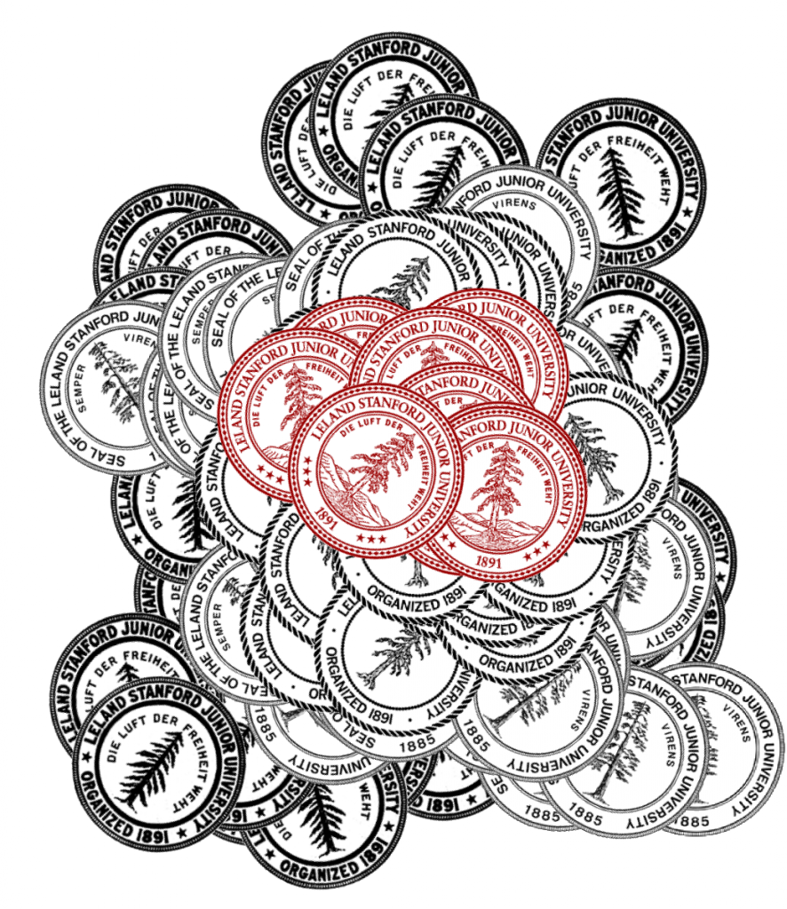
Stanford pogs, made with Inkscape's new spray tool.

Inkscape released a new version of it’s excellent SVG editor on August 23rd and it continues, in my mind, to be the most intuitive and useful visualization tool available.  It’s invariably the fist thing I use when approaching a new topic or to quickly describe some data model or process.  The no-nonsense editor is a credit to the open source community and anyone with an interest in visualization who feels intimidated by the more involved vector editing packages should download it immediately and start writing algorithms with a visual language.

Vector graphics are drawn based on mathematical descriptions of shapes, and as such creating vector graphics using a package like Inkscape is, in fact, writing code.  It’s a true visual programming language, as opposed to Visual Basic or Visual C++ or Model Builder in ArcGIS, which allow you to graphically describe relationships but still requires diving into the text to establish relationships and actions.    I still use Inkscape to build any vector graphics used in Flash Pro, even though the import process is annoying, which brings me to a more contentious point.

Fun with spiros in Inkscape .48

While animation and interactive elements can be integrated into SVG, if you’re building an interactive web app that needs to allow non-trivial access to large amounts of data represented in graphical form, the best platform still seems to be Flash.  Flash, and especially the more multimedia-focused Flash Professional, is also heavily vector-graphics oriented.  There’s been a lot of criticism directed toward Flash recently, especially with Apple’s decision not to support it in their mobile operating system, but the arguments are primarily geared toward delivery of video and breaking the monopoly Adobe has on web video.  As far as developing web-based applications to analyze and visualize data, the in-browser options still can’t compete with the performance and ease-of-use of Flash.  Fortunately for those of us who want to continue to develop in Flash and take advantage of the amazing multitouch platforms, the continued penetration of Android into the smartphone and tablet market mean Apple’s decision isn’t the final word on the subject.

SVG is still the future, and not in the sense that vector graphics are tremendously revolutionary (The attack on the first Death Star was planned in vector graphics, after all) but rather, the creation of code and the manipulation of logical and mathematical constructs as born visual elements will assuredly open up complex programming to a much wider audience.  Much of our world runs on code, and the fact that that code is, well, in code, prevents much of our world from interacting with it.  A visual language of coding, something like SVG on steroids presented in an intuitive environment like that found in Inkscape, would allow the creation of complex software to become a less onerous task.  Software is too pervasive to allow its creation and understanding to be under the control of an elite class, and tools like Inkscape, still not even to version .5, will allow this to change.

Posted in Algorithmic Literacy, Tools | Comments Off