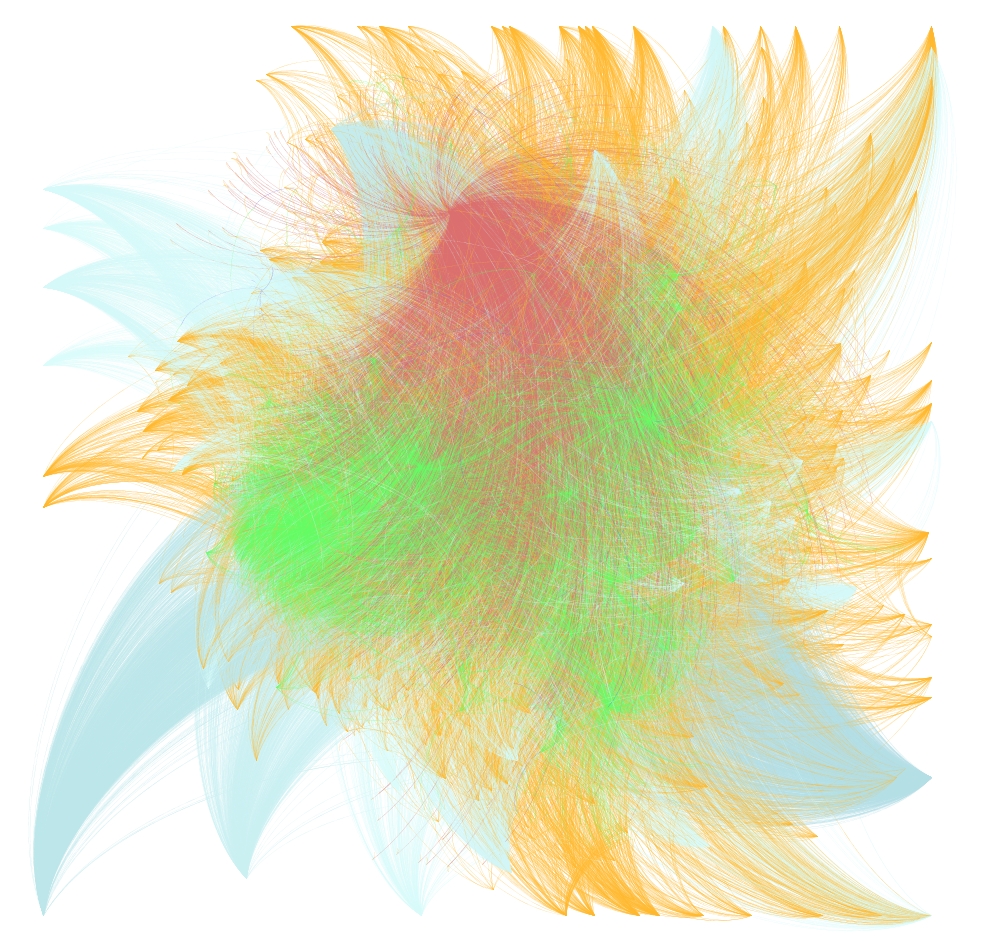
Gephi continues to impress me with its ability to arrange and represent large amounts of graph data. Voltaire, with his nearly 20,000 letters sent and received, is in red. His most numerous correspondents are in blue and the various locations associated with his correspondence are in green. Less popular correspondents are represented in orange.
This dataset consists of 37,000 nodes, most of which are letters, and 87,000 edges. Despite the beauty and complexity of the visualization, I’m still just playing around with the tool, and will try to post a much more comprehensive treatment of Gephi and the various digital humanities networks (including geographic networks) that I have access to once I grow more familiar with the tool and the math behind it.

