I’ll be updating the DH@Stanford graph for the upcoming DH11 Conference. Below is the previous iteration and explanation.
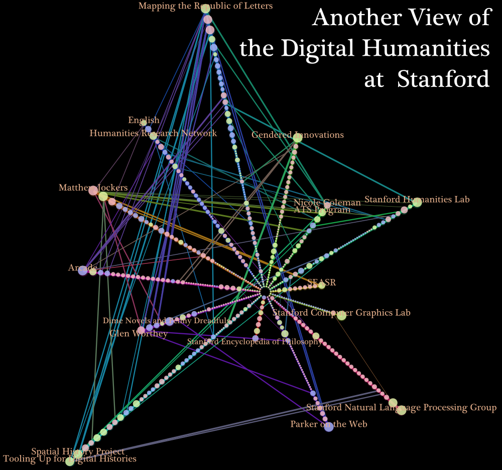
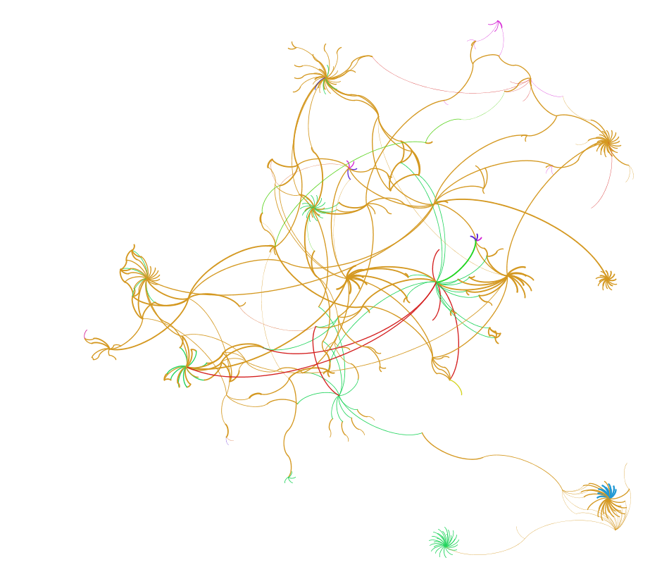
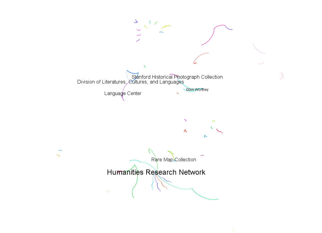
Below is an attempt to map out the various individuals, projects and institutes involved in the digital humanities at Stanford. Connections are based primarily on descriptions of project participants on affiliated websites. The network maps below are static exports created from Gephi graphs and, along with presenting an interesting overview of the ongoing digital humanities work here at Stanford, problematize the concept of the Digital Humanities and highlight the need for metrics that go beyond discrete self-identification. Each image below links to a browsable network diagram:
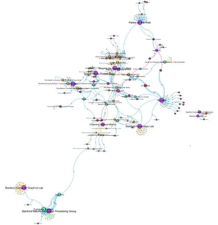
Communities are determined using the Louvain method to measure modularity. For instance, the latest DH@Stanford graph has grown quite complex:
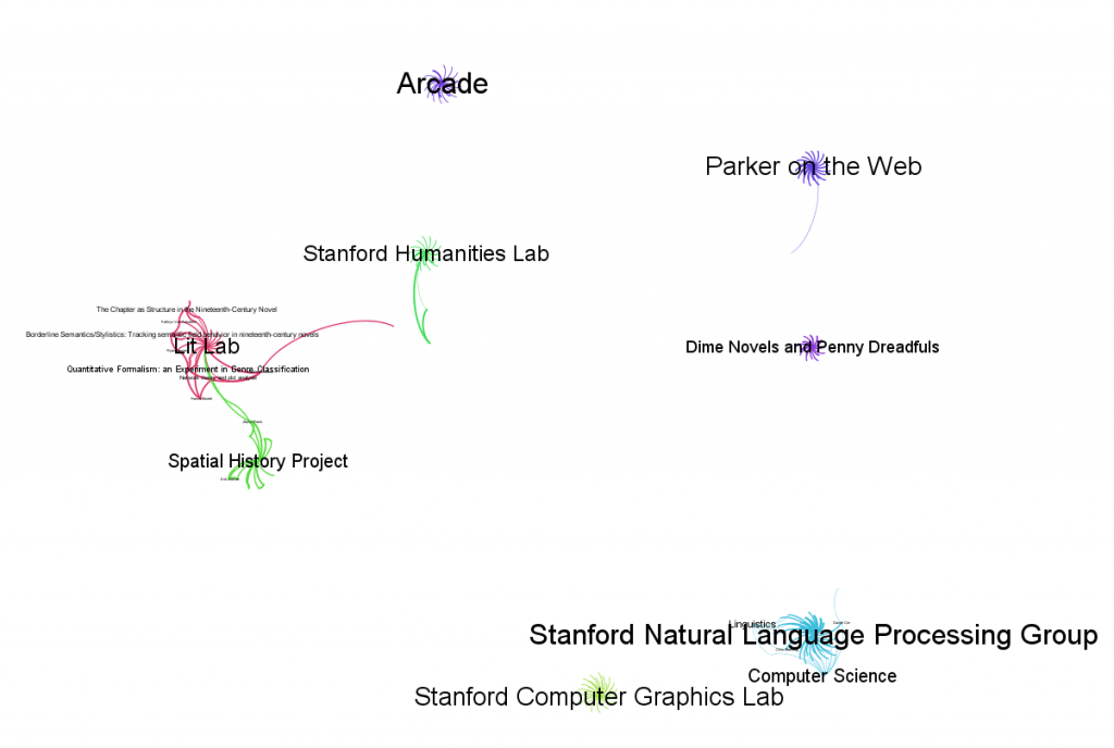
There are now 429 nodes with 556 edges detailing the projects, people, organizations and materials taking part in (broadly defined) Digital Humanities activities at Stanford. Analysis of the community of these nodes demonstrates three categories of module. The first is of the large, self-identified and self-contained projects that are, primarily, the sole “digital humanities” activity that a linked scholar is known to take part in. These include the Spatial History Project, the Lit Lab and Parker on the Web. These large, homogeneous entities could easily be evidenciary artifacts, based on incomplete knowledge of the full activities of their participants and the existence of greater connectivity between projects and scholars that is unreflected in the data.
 The medium-sized modules include particularly active individuals (such as Paula Findlen or Dan Edelstein) as well as small archives or major, identifiable subcomponents of larger projects that did not appear earlier (supporting the truism that better data collection will reveal a more clear picture of the objects being represented).
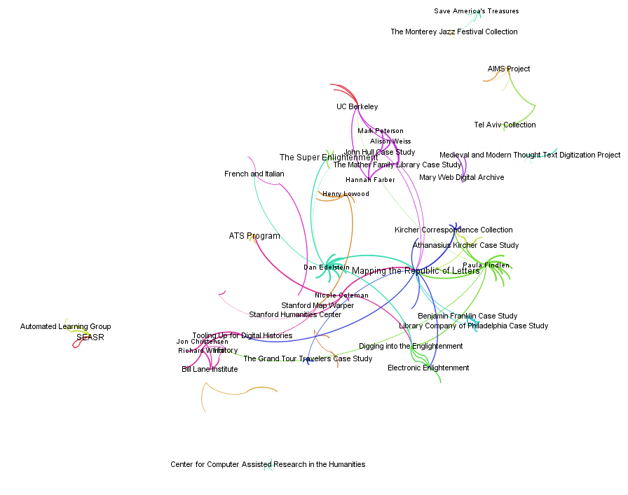 Finally, the smallest modules include a hodge-podge of individuals, small projects and, especially, outside contributor-host university pairs. Many of these will fall out with better detail, but some of these smaller modules are accurate representations of small projects in need of integration into other projects or interested scholars who with whom collaboration may be a real possibility.
Visualization using network diagrams, while aesthetically pleasing and offering new analytical functions, reveals several problems:
Lack of Coverage – After building a draft of this map based on the project and institution pages across Stanford, I’ve already been confronted by projects and people that should be represented on the map but are not. By all means, if you know of a person or project, institute or other object that should be represented on this network, just leave a comment below.
Lack of Definition – The projects and people above have self-identified as being part of the Digital Humanities, but the definition of the Digital Humanities is contested and the result of such contention is that various people and groups may not consider themselves to be part of the same network, or the reverse.
Lack of Metrics -As it exists currently, this network map bases all measurements on number and direction of connections. This preferences self-identification of multiple connections with multiple projects and projects connected to many participants. For this map to move to a more useful space, there need to be agreed upon metrics for project and participant success. To differentiate between a highly productive digital humanities project and a project with a great name and a great list of collaborators that has failed to produce anything, we need to distinguish between the type and quality of the possible products.
How, for instance, do we measure and compare the product of Arcade, with its high visibility on the Web and large number of blog articles, with a project that publishes a large database, an interactive site or a traditional monograph? The inclusion of Product nodes (to complement the existing Person, Project, Institute, et cetera nodes) would better measure influence and quality of connections and allow for a more meaningful map.
As with missing nodes and edges, please feel free to leave a comment about any other aspect of this map that is particularly interesting, problematic or otherwise notable.

Pingback: Tweets that mention Digital Humanities at Stanford | Digital Humanities Specialist -- Topsy.com
This looks like an interesting project. You asked if anyone knew of other people/groups that should be added. I think that is terrific idea — it would be great to stretch the boundaries of your visualization a bit to see more touch points with other disciplines.
One person/group I’d add is Mark Levoy and his colleagues at the Stanford Computer Graphics lab. The lab was responsible for many important DH projects, like the Digital Forma Urbis Romae Project, Digital Michelangelo, Cuneiform Tablet Visualization Project, etc. One of Levoy’s former students, David Koller, later went to work at IATH at UVa and was one of the key players behind Rome Reborn and other projects.
Another group doing a lot of interesting DH work is the The Stanford Natural Language Processing Group. They are doing all kinds of leading-edge projects in computational linguistics. My understanding is that their MT work (machine translation) is some of the best in the world. Increasingly, I’m seeing computational linguists as key players in many DH projects.
Thanks Brett, I’ll make sure to add those in. My inclination was to try to document “current” DH@Stanford but I think a better direction to move in would be to try to document all of it with date ranges for projects and participation. That would make this a bit more involved than simply collecting lists of participants and projects from the websites, but it would be far more valuable. I plan to roll out a new iteration next week, along with some thematic variations suggested by folks who have seen it (looking at the network from the departmental perspective, for instance).
Hi,
The graphs are great. I have downloaded Gephi and read the tutorial. The first step is to import a graphic file. Could you tell me what software you used to create the graphic file for Digital Humanities at Stanford. Thanks.
By the way, I am working as digital archivist at Stanford Libraries. My job is to develop a workflow to collect, process, and delivery digital archives. Do you think it is part of Digital Humanities at Stanford?
Hello Peter,
Gephi supports a couple graph file formats and you can see them in the example files on their wiki and in their tutorials, as well as the examples when you first start up Gephi. I’ve found the formats to be a bit counterintuitive and have built my graph data in MySQL and then used the Gephi edge import tool to connect directly to the graph database. Since Stanford provides us with MySQL instances with very little trouble, this may be feasible for you, but if you’re more comfortable working with flat files, then I’d recommend building a simple graph in Gephi and then exporting it to a flatfile format to get a handle on how the data is formatted.
Please feel free to email me at emeeks@stanford.edu and I can get you started on things, as well as take a look at the project you’re involved in, which sounds very much like the Digital Humanities… according to some folks.