The Pirate Bay, Copyright and Tradition

Copying is not theft, and we intuit that when we see those silly commercials comparing downloading movies to stealing cars. Of course, it begs the question of whether or not file-sharing and copyright infringement cause damage despite not being theft. After all, arson isn’t theft, either, and it’s still bad. There, that’s another straw man to throw into the debate.  I do think there are fundamental instabilities in the application of patent and copyright law invented during a time when information storage, retrieval and delivery was all significantly different.

The Pirate Bay, notorious den of scum and villainy–and Swedish, no less–lost their appeal and the Swedish courts maintained that Fredrik Neij, Peter Sunde, and Carl Lundstrom were guilty of helping users violate copyright laws by hosting pointers to torrented copyrighted content.  It’s not so interesting that a site like The Pirate Bay came into existence nor that it would be shut down.  No, what’s interesting is that the site creators consider themselves to be activists and feel that they are representative of a new and better philosophy than the people who are judging them.  There’s a documentary being put together of the whole thing, which has an excellent exchange the reveals some of that basic instability:

Prosecutor: When was the first time you met in real life?

BrokeP: We think that the Internet is real.

Posted in Natural Law, Social Media Literacy | Comments Off

Digital Humanities in the New York Times

A piece in last week’s New York Times explores the growth of data-oriented research in the humanities.

In Mr. Scheinfeldt’s view academia has moved into “a post-theoretical age.” This “methodological moment,” he said, is similar to the late 19th and early 20th centuries, when scholars were preoccupied with collating and cataloging the flood of information brought about by revolutions in communication, transportation and science. The practical issues of discipline building, of assembling an annotated bibliography, of defining the research agenda and what it means to be a historian “were the main work of a great number of scholars,” he said.

Stanford’s own Mapping the Republic of Letters project figures prominently in the article and Arts Beat explores the project and its visualization of correspondence during the enlightenment in more detail.  The resultant grumbling in the stuffy old mailing lists and among the comments of the article that this has been going on for quite some time before the New York Times noticed is similar to the kind of discomfort caused by the Digital Humanities conference at Yale, which gave the imprimatur of a major Ivy League university on the whole pursuit–something considered unnecessary by the various universities (Ivy and less easily categorized) that had been doing this kind of thing for quite some time.

The unsuitability and inevitable splintering of the Digital Humanities would be just another academic tempest, but for the rising popularity and funding opportunities associated with the work being done under the Digital Humanities rubric.  Instead, precisely because there is so much at stake with the folding of data and new tools into the production of traditional humanities scholarship, the vibrancy of debate both within the academy and without is heartening.

Posted in Digital Humanities at Stanford | Comments Off

Walking through networks with GexfWalker

Thanks to Alexis Jacomy’s La Carte du Tendre du Web, you can easily embed a traversable version of your network on any website, inside any blog post or wherever you’d like. GexfWalker, as the software is known, operates off of a .gexf version of your network. When you export from Gephi, whatever visual features you’ve set for your network are preserved, so that you can tell multiple stories with multiple reformulations of the same graph. It looks something like this:

Posted in Digital Humanities at Stanford, Graph Data Model, Spatial Humanities, Tools, Visualization | Comments Off

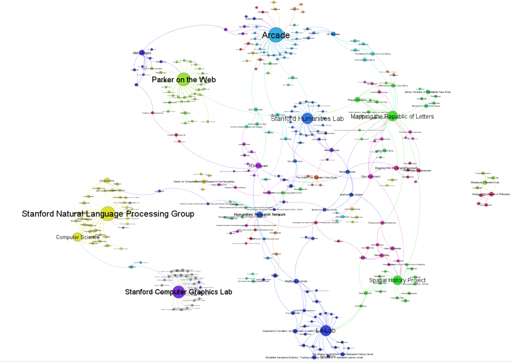
Updated DH@Stanford Thematic Graphs

The project-oriented and person-oriented graphs of the most updated dataset of the Digital Humanities network at Stanford are up on the Digital Humanities at Stanford page.  I played with some of the different algorithms, which made them messier.  As usual, feedback is welcome.

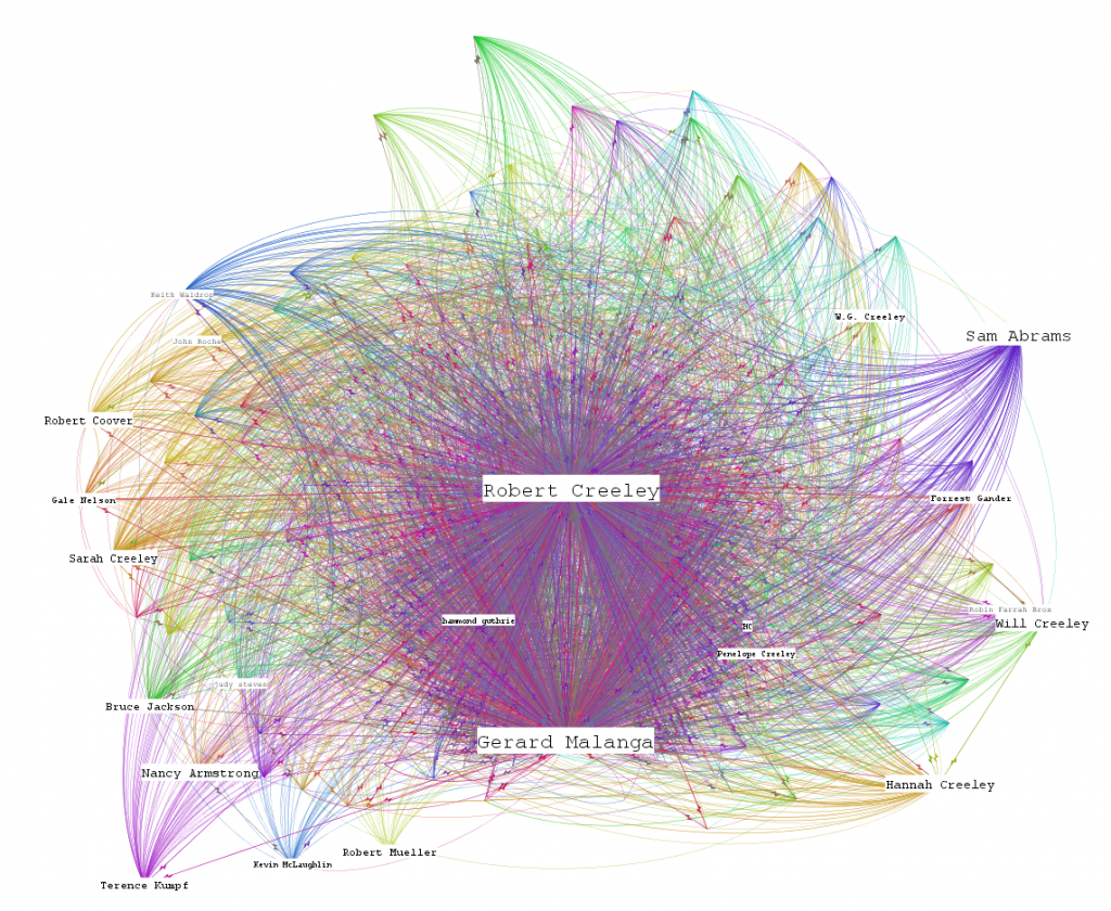
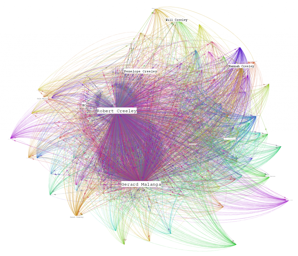
And, because I need more attractive, esoteric visualizations, I present a pair of Robert Creeley drafts.

Creeley's network based on outgoing popularity.

Creeley's network based on incoming popularity.

Posted in Digital Humanities at Stanford, Graph Data Model, Social Media Literacy, Visualization | Comments Off

Update to the Stanford DH Network Map

I won’t have a chance to give various formulations on it until next week, but the new map with the addition of the Stanford Computer Graphics Lab, the AIMS Project and the Stanford Natural Language Processing Lab can be seen here.

I've crudely represented known inactive projects by coloring them grey.

With the addition of the Stanford Computer Graphics Lab comes the inclusion of dated activity.  Gephi has been working more toward the introduction of date-aware functionality and I’ll see if I can fill out more activity periods for the existing Stanford projects and participants seen here and try to produce a changing network over time.

Posted in Digital Humanities at Stanford, Graph Data Model, Visualization | Comments Off

Robert Creeley E-Mail Correspodence Network

An early draft of poet Robert Creeley’s email correspondence network, emphasizing the connection between the poet and Gerard Malanga.  The ~50,000 item correspondence is being processed by the AIMS Project here at Stanford, which focuses on developing methods for archiving born-digital content.

This approximation of Creeley's network has been simplified to filter out a variety of artifacts in the individual email attributes,

Tools such as Gephi provide archivists with a way to express the shape of very large collections to researchers who may be interested in exploring them in more detail than is possible with a network visualization such as this.  For example, the subject matter of the emails themselves has not been analyzed and as such treats an incredibly important email filled with meaningful information as equal to the forwarding of a university public service announcement.  While automated thematic analysis of subjects and content may provide a more expressive network, it still pales in comparison to a motivated scholar exploring the collection in a directed manner with a research agenda and an understanding of the socio-cultural environment in which the correspondence is being crafted.

Posted in Graph Data Model, Visualization | 1 Comment

The Digital Humanities as a Network Map

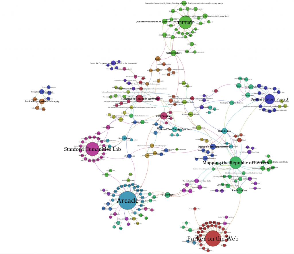
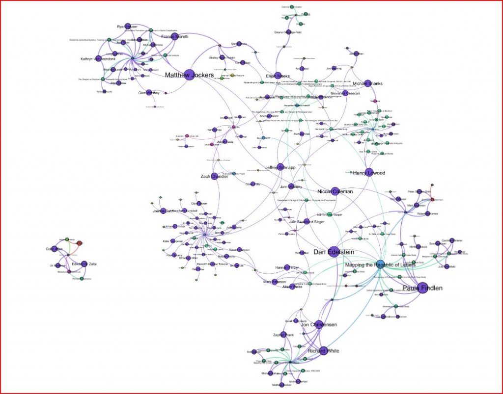
To facilitate discussion of metrics, definition and suitability, I’ve added a new page focused on visualizing and analyzing the Digital Humanities network at Stanford.  I found at THATCamp and here at Stanford that this can cause agitation and consternation and so I think an open forum on developing standards and practices for visualizing digital humanities networks (whether at Stanford or elsewhere) would prove useful.

Stanford digital humanities projects and participants sorted by modularity.

Posted in Digital Humanities at Stanford, Graph Data Model, The Digital Humanities as..., Visualization | 1 Comment

Digital Humanities as XKCD Community Map

Something tells me that Glen Worthey’s desired map of the Digital Humanities would look more like this:

XKCD Map of Communication, ver. 2

While enjoyable and probably not deserving of too critical a gaze, it illustrates the problem of metrics and visualization in dealing with large sets of data.  The implicit biases of the data collection and storage method are not made explicit.  While the transition from the prior map indicates change, I cannot help but think the definitions of the data that went into this map are far more important than the aggregation of said data–spatially, creatively or otherwise.

XKCD Map of Communication, ver. 1

Posted in Amusing Historical Map Features, Social Media Literacy, Spatial Humanities, The Digital Humanities as..., Visualization | 1 Comment

Multiscale Apps

This article is cross-posted on Ubiquity.

With Apple’s retreat from their position disallowing the development of iDevice apps using Adobe AIR–fundamentally the same technology used in Flash on the Web–and the growth in Flash-supported mobile devices, the much-heralded and by many much-desired death of Flash has been postponed (or, to continue to misquote Dr. Holmes and Mark Twain, greatly exaggerated).  While this is great news for Flash developers who want to build apps on the iPhone and iPad, it’s even better for Flash developers that want to reuse their code and present the same experience on a RIM device, an iDevice, an Android device, a Windows 7 Phone device or a web browser.  I have my doubts that the new RIM OS or Windows 7 Phone are going to find much traction, but it does seem to militate against the value of device-centric programming languages, for all the flak Flash receives for its performance.  While I’m sure a highly complex piece of software needs tuning in a native language for particular devices, there’s an vast amount interactive potential in mobile device without achieving the magic of Google Goggles.

It’s much more interesting than that.  Adobe AIR, whether we like or not, is the only way to develop multi-scale apps that could present dynamically different interactive profiles depending on which platform the app is being accessed from.  Christian Cantrell has put together a very simple example of just such a multiscale app:

In this case, it’s simple adjusting for screen size and aspect ratio and input-type, and it’s a relatively simple piece of software.  But with a spectrum of traditional and tangible input types, coupled with a variety of presentation options, one could imagine interacting with the same digital object using multiple scales of interactions.

Why is this good?  I have no idea.  But my intuition is that there exists the space for a multiscaled group experience wherein the particular devices provide different interaction vectors.  One could imagine a curated dataset such that a user at a Microsoft Surface may work with it from one perspective, while another user on an iPad works from another, a web browser providing a third, distinctly different experience, and so on and so forth covering not only the known interactive profiles that exist now but putative profiles that could be envisioned by the creator of such an installation.  In a sense, this is already the case with the Internet and the variety of social networking sites being accessed through a variety of browsers and apps, except this would be purposeful and designed from the ground up to for multiscale interaction.

And for those of you who hate Flash, it doesn’t need to be created in Flash.

Posted in Algorithmic Literacy, Multiscale Applications, Social Media Literacy | Comments Off

The Digital Humanities as THATCamp

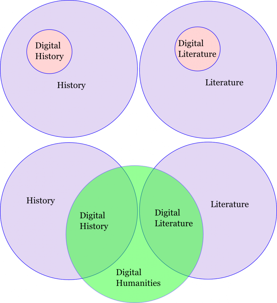
THATCamp SF is going on this weekend, and the self-organizing, hands-on event provided quality both of discussion and participant.  Glen Worthey suggested a session on mapping the Digital Humanities which devolved, due in no small part to my own distractive influence, into a discussion of the nature of the Digital Humanities.  Glen’s desire was to map the structure of the movement, with an eye toward non-standard representations that better reflect the confederate nature of the Digital Humanities.  We didn’t manage to get so far as to create an artistic representation of a Digital Humanities archipelago nation, and only developed two sets of anemic Venn Diagrams that managed to not only not overlap but to only include History and Literature.

The diagrams weren’t as bad as that, of course, they were being used to explore whether or not Digital History lived in History and Digital Literature lived in Literature or whether the Digital Humanities was the big circle with Digital History and Digital Literature coming at the overlapping borders between the Digital Humanities and History or Literature.

For my own part, I demonstrated my in-progress network map of the Digital Humanities at Stanford, which is both incomplete and misleading in its explicitness.  The map is meant to agitate, and has done so admirably, but like any seductive visualization it continues to argue its legitimacy despite my own claims that it is only useful as a tool to highlight the notable problems with mapping participation in the community:  First, self-identification favors the loud, and promotes the work of the very vocal and visible above the work of the quiet but brilliant.  Second, metrics–any metrics–runs the risk of undermining the value of the interpretive agent.

But besides the value of THATCamp to spur such discussions, I think THATCamp is the Digital Humanities in microcosm, with all its benefits and drawbacks.  THATCamp is charisma-driven, with sessions created by the vocal and visible, meandering (I’m guilty of consistently dragging a session about information back to the problem of lack of information) and chock full of brilliant people tackling interesting problems both inside the academy and out.

Posted in Digital Humanities at Stanford, The Digital Humanities as..., Visualization | Comments Off