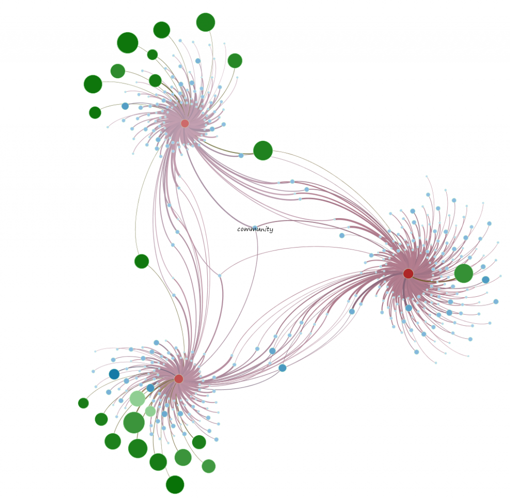
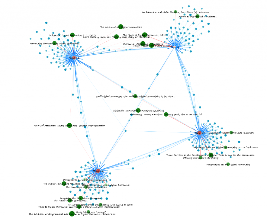
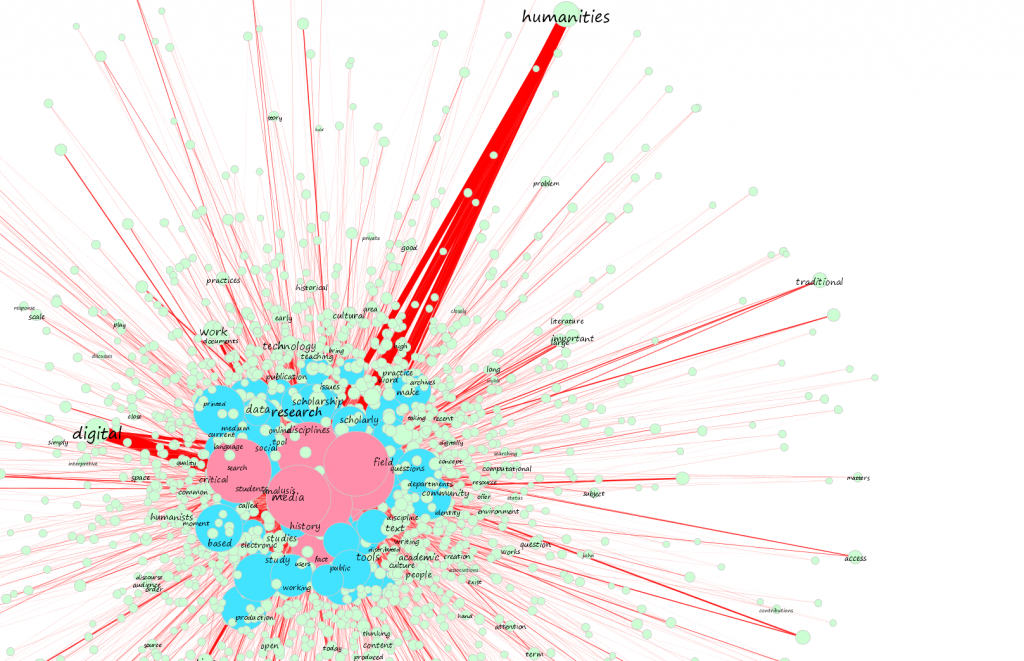
I’m in the middle of a rather large analysis of topic networks created using topic modeling and visualized in Gephi, of course, and simply can’t resist posting a few samples, because they’re absolutely stunning.
Categories
- Algorithmic Literacy
- Amusing Historical Map Features
- Big Data
- D3
- DH2011
- Digital Humanities at Stanford
- Digital Scholarly Work
- Drupal
- Gaming
- Graph Data Model
- HGIS
- Interview
- Multiscale Applications
- Natural Law
- New Aesthetic
- New Literature
- ORBIS
- Pedagogy
- Peer Review
- Reviews
- Social Media Literacy
- Spatial Humanities
- Text Analysis
- The Digital Humanities as…
- Tools
- Uncategorized
- Visualization
Meta


Really cool! I’d like to know the meanings of colors and sizes :)
Thanks Sebastien, I should have it all written up and public Friday or Monday where I’ll explain the process, scale, and such. Fortunately there’s no automatic legend in Gephi, so I don’t have to worry about it giving away my secrets…
Pingback: Tweets that mention Topic Networks | Digital Humanities Specialist -- Topsy.com
Hi Elijah,
Those samples look amazing!!!
I am quite new to Gephi and really impressed. I think it is very powerful.
I have seen several examples of topic networks (like yours) and of social media networks. What I would like to create is a combination, but I don’t know how. I am hoping you can help me in the right direction. Let me explain:
What I want to create is an overview of who knows who and who knows what. And I want to use my email for this. The email gives information about who knows who, by looking at the from and the to addresses. But it also gives information about who knows what by looking at the subjects of the emails.
What I have in mind is a graph that shows the social network, where the nodes represent the people. The edges would be the email conversations. Initially I would like to show the topics that were used most between two persons as a sort of a label for the edges. The words that were used most should be largest, like in a word cloud.’
But once that has been achieved, I would also like to turn it. The nodes should then represent the topics and as labels for the edges you should see the persons that have been sending emails about these topics. And again like a word cloud (the more, the bigger).
Do you think this is possible by using Gephi?
Thanks a lot for your advice!
You can do this quite easily with graph data and represent it beautifully with Gephi. We’ve been working on a number of different mixed networks simultaneously combine people, places, objects and concepts. They can be extremely interesting and your intuition about collapsing the topics into edges is actually the same system I came up with for representing correspondence.
First, you need to come up with some kind of system to aggregate the narrative data in your emails. You could topic model it, or simply pick out the most frequently occurring words (like wordle) or perform an expert-selection system where you manually determine categories. Once you have your categories in mind, you use the individual emails as a nexus between people and subjects so that an email will have sender, receiver(s) and subject(s). You may want to create interrelating links between your subjects to explicitly describe strong or weakly defined super-categories. Once you map it, you’ll see people and subjects and particularly emails group together into neighborhoods, and then you can play with network analytics to find the most central email or subject just as you would with a network of people.
The important thing to remember is that your curation of the data, whether it’s your actual delineation of subject matter or your decision to select a particular method to aggregate your data sources, is going to influence your network topology, and so you need to take it seriously and grapple with that issue.
Hope that helps, I’ll try to get into something like that in a later post. If you’re a student at Stanford, I’ll be doing a few workshops on this kind of thing.
Hi Elijah,
This looks amazing. I read from a post of yours that you’re using MALLET. I have just started using MALLET, but there are a few things that I could not find any documentation about.
Would it be possible for you to explain to me the output that the MALLET options produce:
–output-topic-keys
I see the file name, but I could not find any documentation about the numbers.
–word-topic-counts-file
I see words from the documents, but again the numbers and ratios are unclear.
–output-doc-topics
I see the top X number of words, but again I could not find out what the numbers mean.
Thank you for your time,
Phi
–output-topic-keys
Topic keys are a list of X number of LDA-derived “topics” (X being declared by you in running MALLET)
–word-topic-counts-file
This is a list, per word, of the instances of that word that are assigned to each topic, written as “TOPIC:COUNT”
–output-doc-topics
This is a space-delimited list of relationships to Topics, by documents, with weight of relationship. So, your first line is Document 0, and then two columns each for every topic you’ve created, with the first column being the Topic Number and the second column being a percent weight.
I’ll step through this in more detail when I post the results, along with turning these relationships into networks.