Fortunately, that was a question left to Matt Jockers. I thought, though, that I might post the slides I used to describe networks in general and the examples using network analysis and representation based on the literature network that Matt has produced for his research.
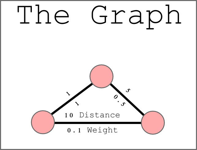 I’m never sure about who’s in a digital humanities audience and whether they need to have the most basic aspects of a network explained. As I said during the presentation yesterday, I think there are three pillars to DH research: Text Analysis, Spatial Analysis and Network Analysis. The network is not a social network or geographic network or logical network but rather a primitive object capable of and useful for the modeling and analysis of relationships between a wide variety of objects. I continue to have a sneaking suspicion that Image Analysis is something else that sits with the aforementioned three, especially after witnessing the presentations at HASTAC.
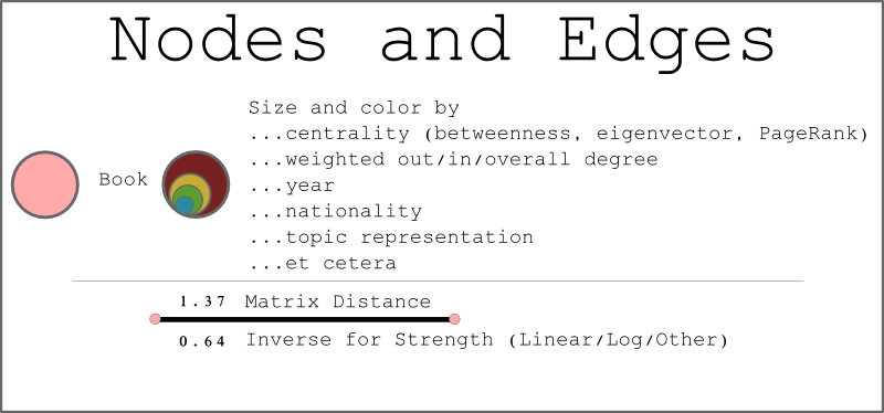 Continuing with an explanation of the basics of networks, here’s an overview of how you can change the size and color of a node to reflect a particular categorical or quantitative attribute. In the later images, we’ll see a variety of different values used to color the nodes (which each represent a book), some of which are based on metadata collected in the creation of the dataset and others are derived using network statistics.
Also of note is that each edge (or connection between nodes–the lines that link the circles) has two separate values. The first represents distance and comes from Jockers’ method for describing similarity between novels and the second represents strength of connection and is simply some kind of inverse of the distance. Distance is necessary for layouts that utilize network distance (like the Roman networks shown in earlier posts) while strength is necessary for force-directed layouts that rely on measured strength of connection between nodes. In practical terms, each of these values exists as a column in Gephi (or your favorite network visualization package) and is used as the Weight value of an edge when running the particular layout.
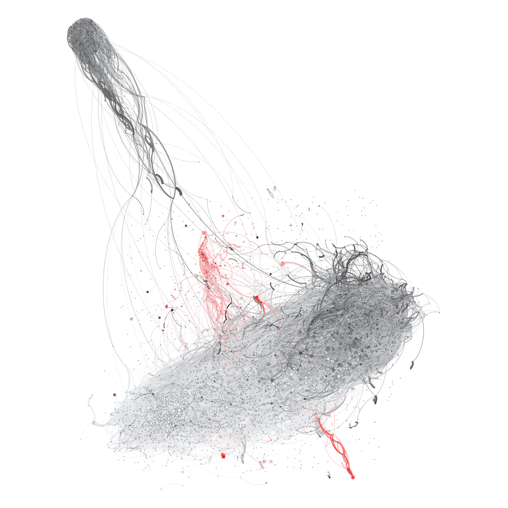
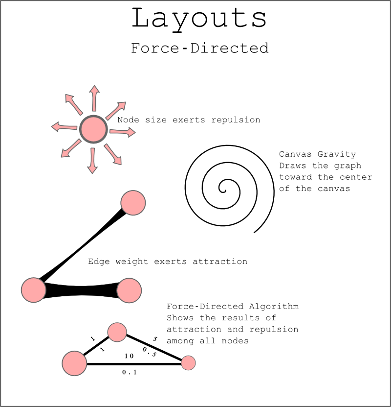 A force-directed layout, which seems to be the most common type of network layout, generally relies on three factors: The size of the node affects how much the node pushes away other nodes, the strength of a connection between nodes influences how much connected nodes are drawn together and some kind of gravity pulls the network toward the center of a canvas as these two factors play against each other. This is relatively simple to understand when thinking of three nodes with three edges pulling and pushing against each other, and the basic premise holds true when applied to 4,000+ nodes and 70,000+ edges, as seen in the force-directed algorithm ForceAtlas2 applied to Jockers’ network:
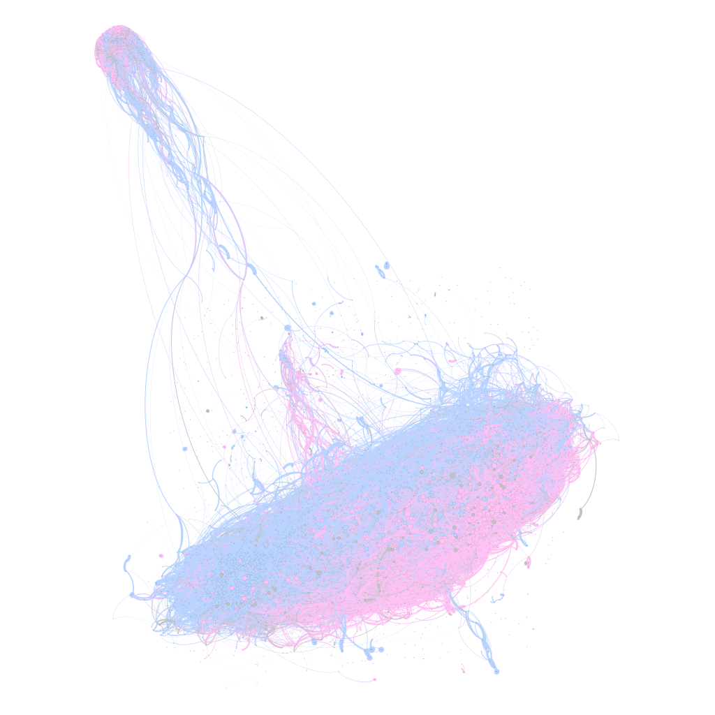
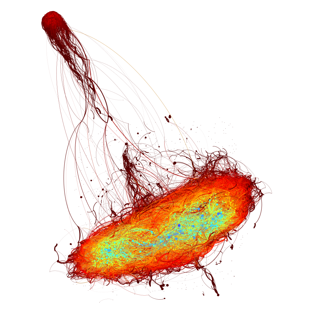
The resultant network can then be colored by node attribute, such as the date a novel was published, the gender of the author or the centrality score of the novel within the network.
The first two color schemes are important for the humanities scholar, the third, though is important as a check on the validity of the visual representation of the network. There is some concern as to the value of displaying large force-directed networks, because the visual position of a node is influenced by so many factors that it may seem to be clustered with other nodes when it actually has nothing to do with them.
This is similar to the optical binary of astronomy wherein two stars may appear to be orbiting each other when, in actuality, they are hundreds of light years apart but from the perspective of the earthbound viewer they seem to be close together. It’s my hope that by coloring the graph by centrality (in this case, measured as undirected Eigenvector centrality, which I’ve found to be a good, rough measurement) and seeing that the structure tends to be supported by the distribution of centrality scores, it reduces (but does not eliminate) the possibility that the visual structure is, at a macro-scale, masking the logical structure.
Humanities scholars have expressed some concern about the seemingly random nature of force-directed layouts, which produce different network shapes from the same set of nodes and edges due to changing (typically random) starting positions and the vagaries of the algorithms. Networks will lay out pointed in different directions or mirrored, and where a node was once will no longer be the case. I think this demonstrates the need for a more nuanced concept of canvas gravity that takes into account the density of graph structures so that, for instance, “heavier” components are treated differently than lighter components, or other more sophisticated but regularized rules could be developed to make graphs lay out by force but with reproducable structure.
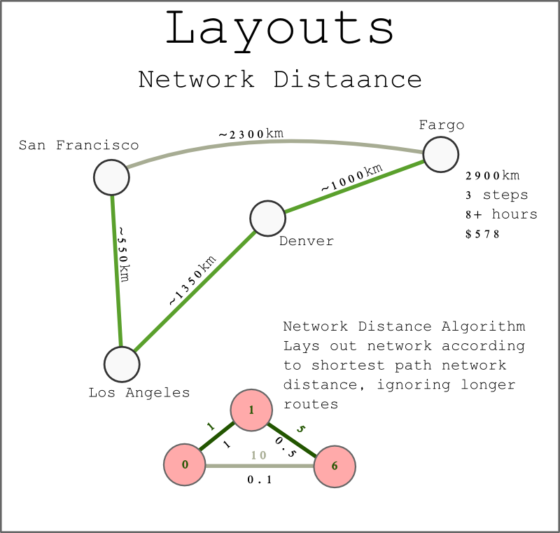 Representing a network through distortion of an existing (traditionally geographic) layout to represent distance is another useful method for visually displaying a network. Network distance is best thought of as the “driving distance” to a place, and for me will always be best represented by my attendance of the 2006 Computer Applications in Archaeology conference in Fargo, ND, which was chosen because it was at the “center of North America”. Of course, to get to the center, one had to take a series of ever-smaller aircraft, the results of which was traveling to a place that was actually much farther from most of North America regardless of whether one measured that cost in money, time or kilometers.
It may seem that this type of layout is only valid for geographic networks, but Jockers’ network actually describes similarity between novels as a measurement of “distance” between novels. As such, we can represent Moby Dick as well as Sense & Sensibility as the “center” of a network (the largest node below) with the remaining novels in the network arranged (and in the case of the examples below, sized) based on distance from that center. Network distance is determined by the shortest path through the network from one point to another, and so it’s possible that a book (like a place) will be “closer” via a less-direct route, though what this means for measuring similarity compared to measuring network closeness is another matter entirely.
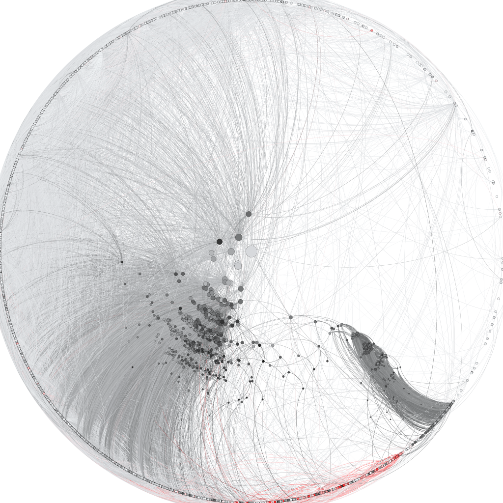 Moby Dick, which sits at the center of the above network, can trace a path via similarity through each “ring of books”. The radius corresponds to the total distance from Moby Dick based on this measure, with the visual position on screen based off of a distortion of an initial position created by the force-directed algorithm above. The ring of books at the furthest orbit from Moby Dick are books that are “unreachable” from Moby Dick, either because they were published earlier or because there is no path of similarity through the network. In the images below, these unreachable books are dropped out of the display.
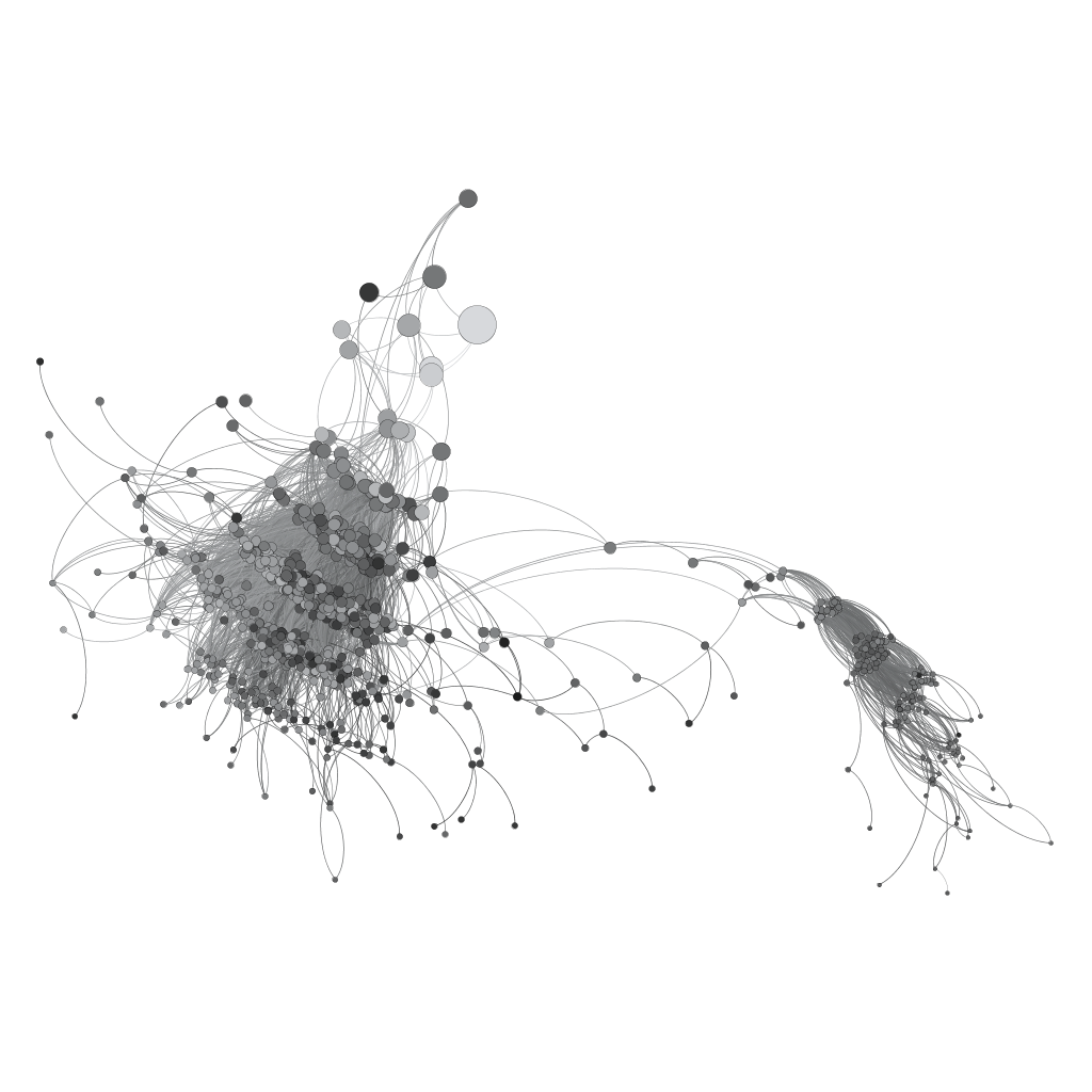
Another practical aside: Gephi uses a simple representation of direction in their curved edges–the left-hand edge is the “out” edge and the right-hand edge is the “in” edge. However, if arrows are preferred, you can turn off curved edges and display arrows.
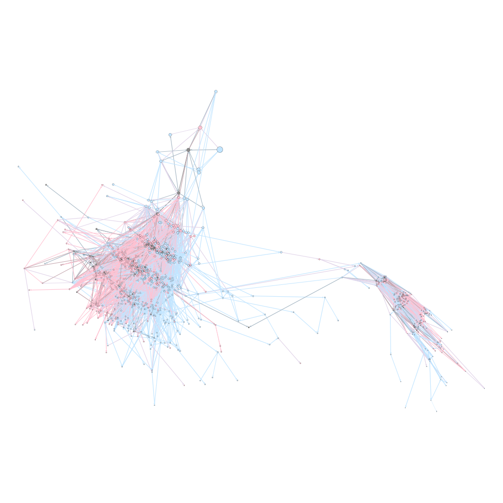
Sense and Sensibility, as would be expected, has a much more convoluted network.
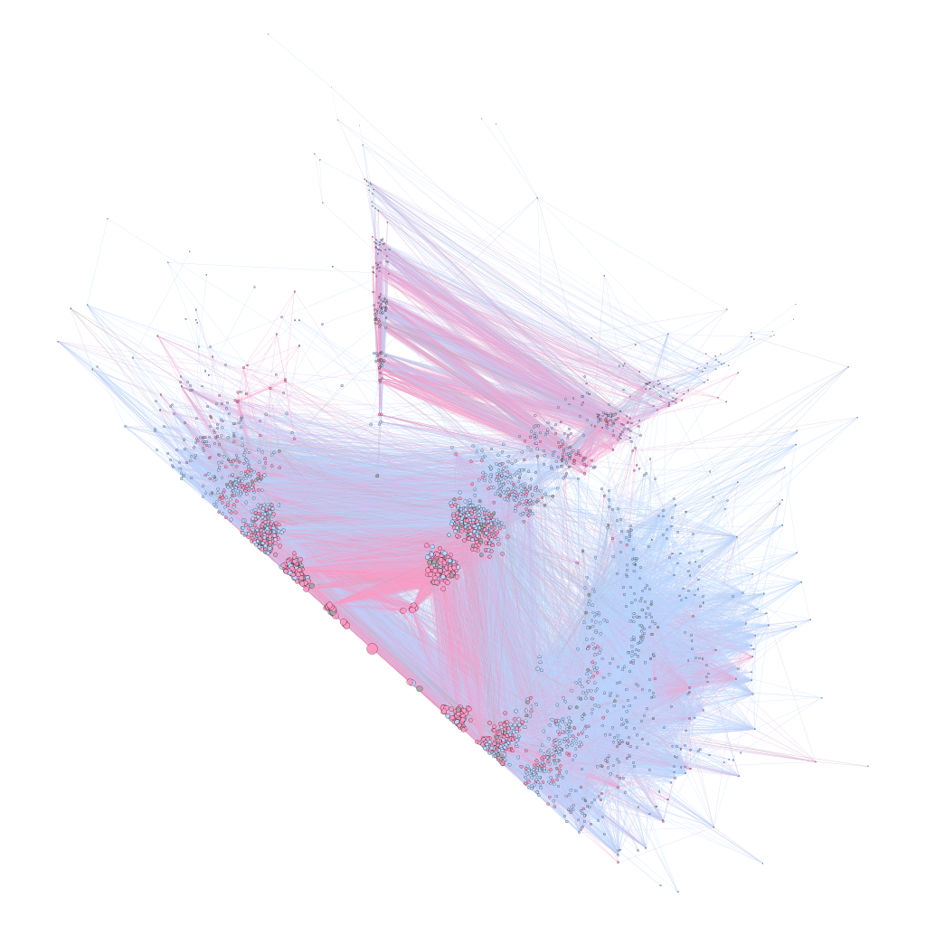
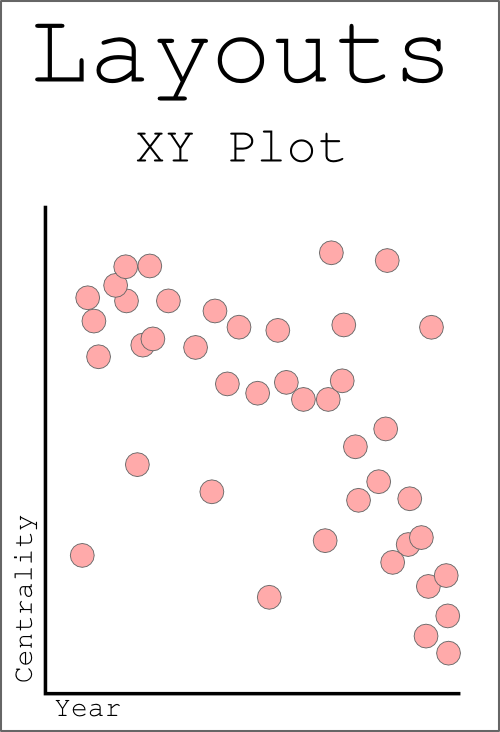 The final layout I presented yesterday was the traditional plot. XY position of points of data on a canvas don’t just make a beautiful line, but sometimes that’s the best way to represent relationships, even networked relationships. Below are a few examples.
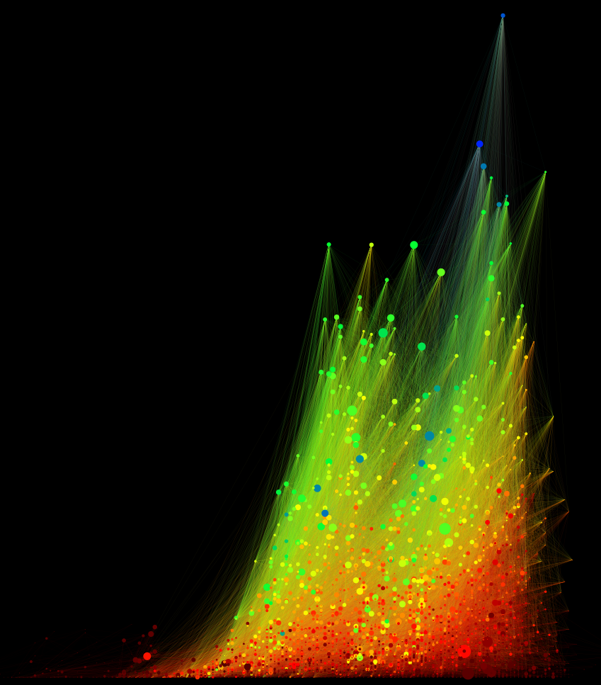
Ordered top to bottom by weighted in-degree (the total value of incoming connections), colored by directed eigenvector centrality (the strength of connection to strongly connected nodes), sized by betweenness (the number of times a node is touched if a network is traveled through in every possible path), ordered left-to-right by year (a relatively well-understood and undisputed unit of time)
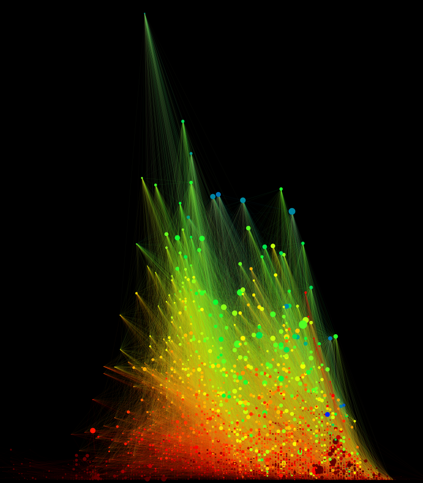
As above but with weighted out-degree (the total value of outgoing connections)
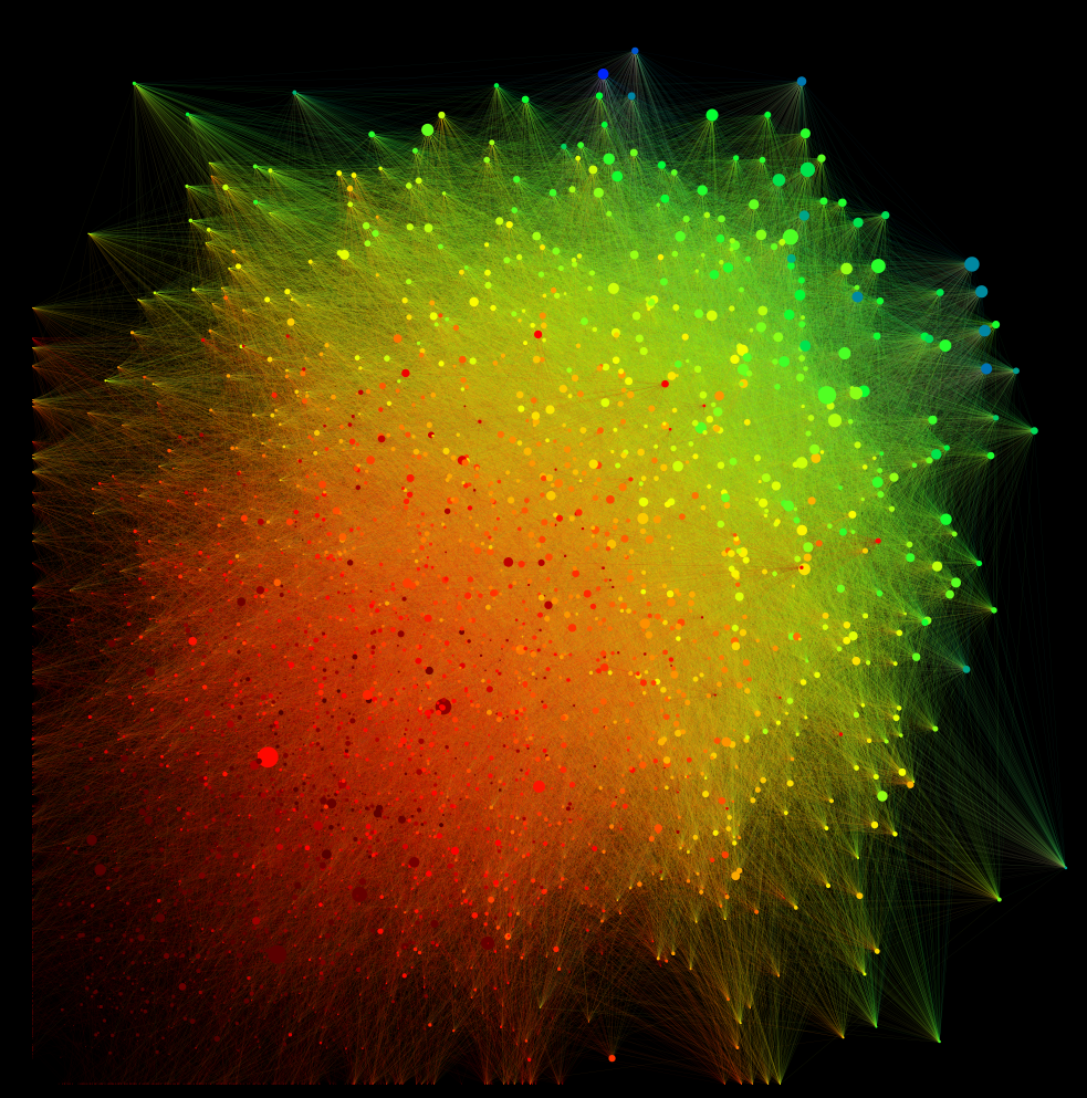
Weighted In-Degree on the Y-axis, Weighted Out-Degree on the X-axis, colored by centrality and sized by betweenness.
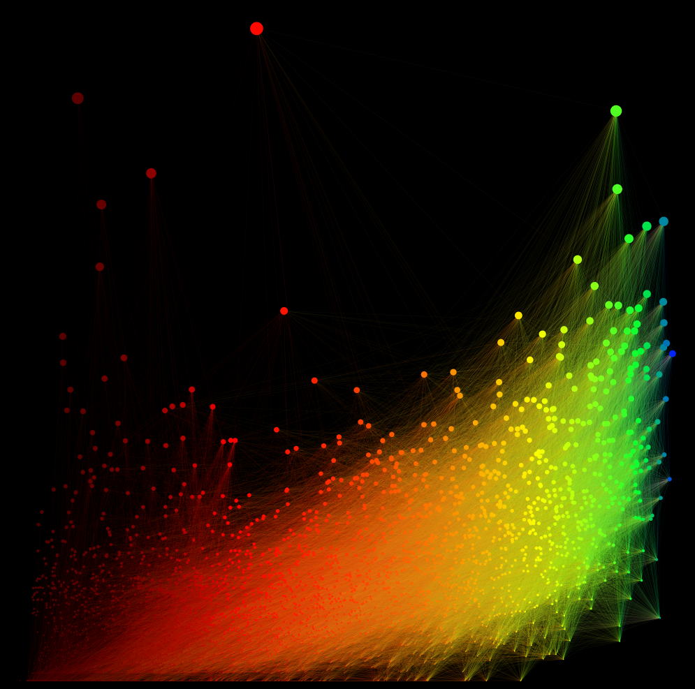
Demonstrating the aforementioned color and size metrics, with Eigenvector Centrality on the X Axis and Betweenness on the Y Axis.
Matt and I have put in to teach a workshop based on this during the Digital Humanities 2012 conference in Hamburg. I’ve left out any of the claims that are based on analysis of this data, because I’m not a scholar of literature. If you have any questions about the text analysis and scholarly claims being made with any of this, please direct those questions to Matt Jockers.

