A couple of variations on representing biodiversity databases:
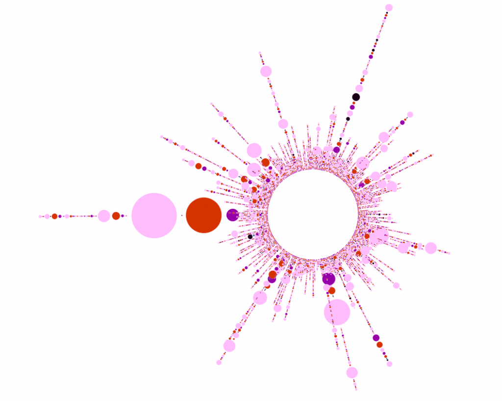
The first is the radial layout in Gephi, which functionally transitions an excellent network analysis and visualization package into a tool for beautiful representation of variation in non-network data. Color, once again, represents threat status. Pink is vulnerable, red endangered, purple critically endangered and black extinct. Each spoke is a country, and each class-status is given its own circle, so a rough concept of class diversity is also displayed.
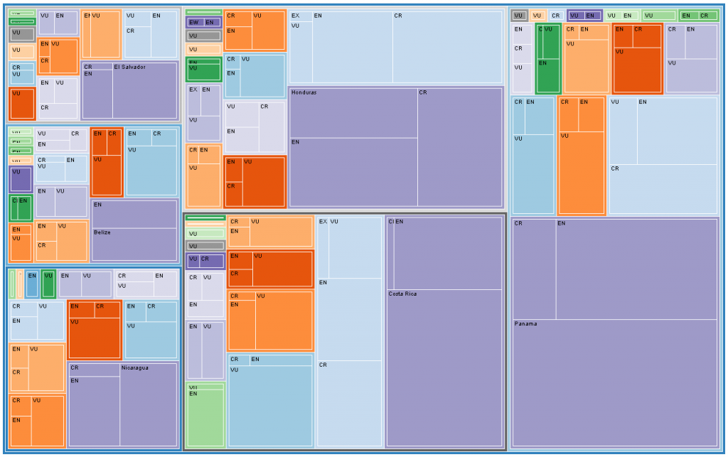
 The second uses Mike Bostock’s amazing D3 javascript infoviz library. This is the TreeMap layout, practically out of the box, showing threatened species reported in Central America. Again, each class is subdivided by threat status to give a general sense of class diversity. Vulnerable Magnoliopsida is replaced with the country name.

