Building a Scholarly Digital Object

I’ve been exposed to a lot of exciting digital humanities research since I came to Stanford, both in the formal projects I’ve been brought in on to support and in consultation with and exposure to ongoing research by various individual faculty and groups. But in all that time, I haven’t created a scholarly digital object (SDO)1 at Stanford, and I’m becoming more keenly aware of it as we get close to finally rectifying that situation with the upcoming release of the recent work done on Imperial Roman transportation networks.

That isn’t to say I haven’t produced anything that qualifies as digital scholarly media. Along with Authorial London, I’ve produced a number of different interfaces and objects for the exploration of data by humanities scholars using a variety of traditional methods of data modeling and analysis. In collaboration with Nicole Coleman and the Mapping the Republic of Letters project, I built a rather feature-rich (but sadly UX-deficient) Flex-based utility known as ConTEXT.
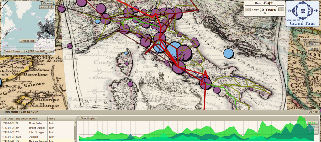
ConTEXT Browser for Mapping the Grand TourThis was followed by the cleaner but still UX-deficient Radial.
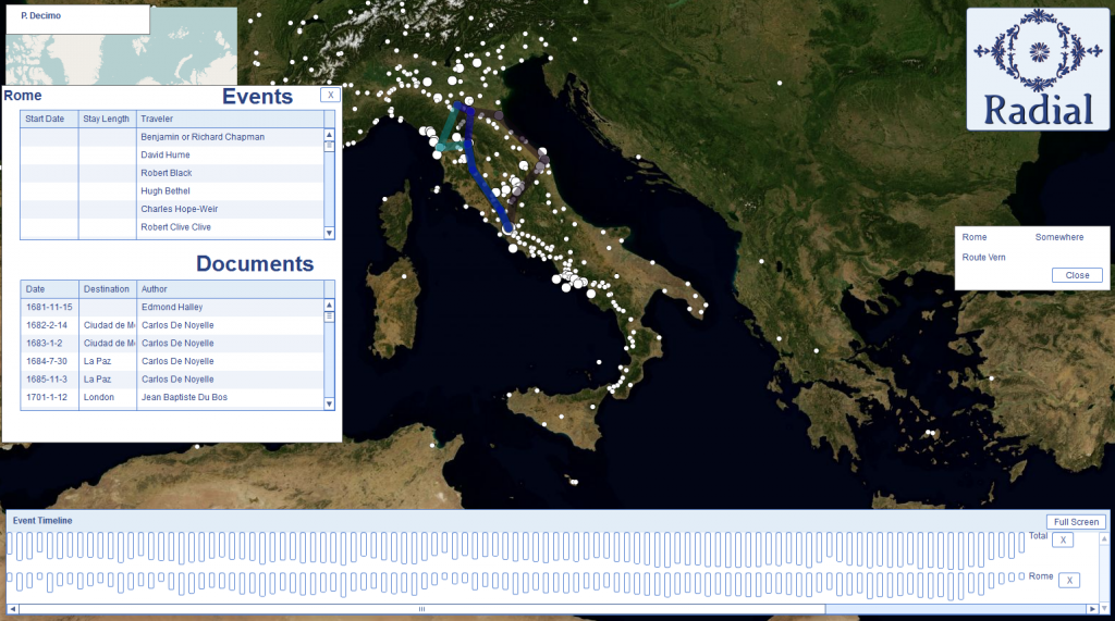
Radial BrowserRadial never saw the light of day. I wrote the structural elements at a time when Flash programming began to fall into disfavor, and as Radial was designed to be a generic map-based interface for searching and representing network, text and spatial data, it didn’t make sense to write it in code that wasn’t going to play on multiple machines. Nicole and I butted heads over Flash, and she recommended I use some kind of new age infoviz library called “D3“, while I argued that Flash worked and wasn’t going anywhere. Obviously, we all know who won that debate.
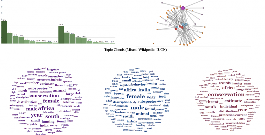
Topic Network BrowserIn case you never click on the link above, I’ll give you a hint and point out that the above interface, which allows scholars to navigate through topic networks, was built in Protoviz, the predecessor of D3. This was made, along with a number of static and interactive visualizations as well as datasets created using various methods, for my work with Ursula Heise looking at species biodiversity databases.

Still, I wouldn’t consider any of these to be SDOs because none of them was formally published. In that way I distinguish between the productive and, hopefully, valuable work I contributed to on these projects and something like the last (and only other) SDO I helped create: the Digital Gazetteer of the Song Dynasty (DGSD), which I built with Ruth Mostern while I was a graduate student at UC Merced.

It seems rather poor sport to claim that a raw database, released with a few screenshots of the data being represented statistically in spatial or plot form, is somehow a higher class citizen than the interactive, complex and visually more interesting (and hopefully more sophisticated) material referenced above. Thankfully, I’m not claiming that. But I do think that a Scholarly Digital Object (and hear I hope you’ll excuse me for not holding on to my still cumbersome and unfamiliar acronym) is something that can be peer reviewed, even if part of that review is to say, “You should have done more than release a raw .sql dump.” Amenability to being peer-reviewed is the most important trait of an SDO, but I think there’s more to it than that, so here’s my shortlist.

A Scholarly Digital Object must be:

1. A set of digital material that can be effectively constrained in its description.

A Scholarly Digital Object is not an ongoing project or tool, though it may have come from one and incorporate the other. I find it strange that when it comes to the Digital Humanities we can name many projects and tools but very few products.

2. Available for Peer Review of Technical, Theoretical and Substantive Elements

You cannot expect meaningful review of an SDO without making available the code that it uses to represent and model its elements, as well as the data itself and the theoretical description of how it was fashioned. Moreso, making available does not simply mean releasing source code or datasets but rather facilitating the review of the most sophisticated elements by building features that expose those elements. This is a failing in the release of the DGSD, which requires too much technical expertise to get access to the data–a failing I hope to eventually rectify by embedding the database in an interface that provides the scholarly reviewer with more opportunity to examine its contents and structure in relation to the claims made using that data. This also means, as Karl Grossner has been demonstrating to my unlearned eyes, that principles of UX/UI design are fundamental to the creation and definition of SDOs.

3. More than an archive or collection.

Digital translations of traditional texts and datasets are critical to the advancement of digital humanities scholarship, as are large and well-described archives of such material. But an SDO is not a dataset, and in fact the portions that are data might be so dramatically transformed as to be difficult to use by other scholars in later work. This is the most difficult distinction for me to make, and perhaps that’s a sign that I’m mistaken in this, but a tool coupled with an archive is still not an argument. Even the most intuitive tool for browsing the best-curated archive is not something that is reviewed based on the merits of its claims, but rather the efficacy of its implementation. The attempt to distinguish the SDO from the archive is not an attempt to denigrate the latter, but rather to expose the former to adequate peer review.

4. Published

With names taking credit for its contents in a formal and complete manner. There is a bit of an informal economy going on in the digital humanities, and it is maintained through informal mechanisms that assign credit for large and informal structures in vague and informal ways. I, for one, do not publish much in the traditional manner, and short of general praise by my colleagues and performance reviews and a string of conference presentations with cool-sounding titles, would not have substantial markers of my success in this field without formally defined products of my work.

5. Cool

Okay, not really, I just wanted my list to go to five.

In the coming weeks, I expect to bore everyone to death with a variety of presentations and posts describing a particular example of a Scholarly Digital Object that strives to embody the five requirements outlined above.

1Which would make a great file extension and which I’ve referred to earlier as in the category of digital scholarly media or, as has become more prevalent, digital scholarly communication.

Posted in New Literature, Peer Review, Spatial Humanities | Comments Off

Parallel Edges in pgRouting

If, like me, you neglected to check and see if pgRouting (the pathfinding library for PostGIS) handles parallel edges in its default shortest path query, then you’ve likely found out that it doesn’t. You can tell that something is wrong when the same least cost path query produces different results, this is because the query is pulling the first edge it finds, which may not be the same edge query after query, and also may not be the least expensive edge. It’s a relatively easy fix, but I figure I’ll point out how to handle it here.

Remember, when you’re pulling a shortest path it looks something like this:


SELECT
*
FROM
shortest_path(
'SELECT
gid as id,
source::integer,
target::integer,
cost::double precision
FROM
edge_table',
true,
false)

It’s how you select your table of edges that allows you to handle parallel edges in your shortest_path subquery. You can fashion a SELECT DISTINCT ON query that orders the edges by cost so that you ensure the Dijkstra distance algorithm is only looking at the least expensive available edges:


SELECT
*
FROM
shortest_path(
'SELECT DISTINCT ON (source, target)
gid as id,
source::integer,
target::integer,
cost::double precision
FROM
edge_table
ORDER BY
source,
target,
cost

',
true,
false)

Since ASC (ascending) is the default order, then this will only give one edge per source-target pair and it will be the least expensive edge. If you were looking for the least cost path but you had different edges representing, say, best and worst case scenarios, and you wanted to do a path for the worst-case, then I suppose you could ORDER BY source, target, cost DESC.

Now imagine doing this where you’re evaluating the edge cost based on different vehicle types and different months of the year and different possible costs (in the case of the Roman transportation network, we can determine the shortest, cheapest or fastest path, which is not necessarily the same path between two sites). In that case, you simply include the same expression that you use to determine your cost in the ORDER BY function. I’ll post the full PostGIS function when we release the network–it’s rather complicated–but I figured I’d post this little bit in case anyone else runs into the same problem that I did.

Posted in Algorithmic Literacy, Graph Data Model, Spatial Humanities | Comments Off

Network Visualization Gallery

I’d forgotten just how fun Gephi is. A few exploratory examples below.

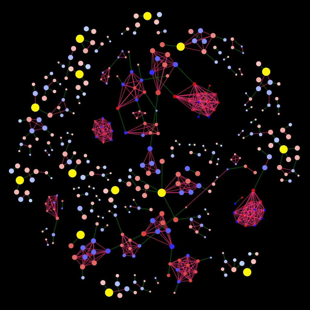
A genealogical network

A graph being examined.

A genealogical network

A random sample from the same network with which to compare the above sub-network.

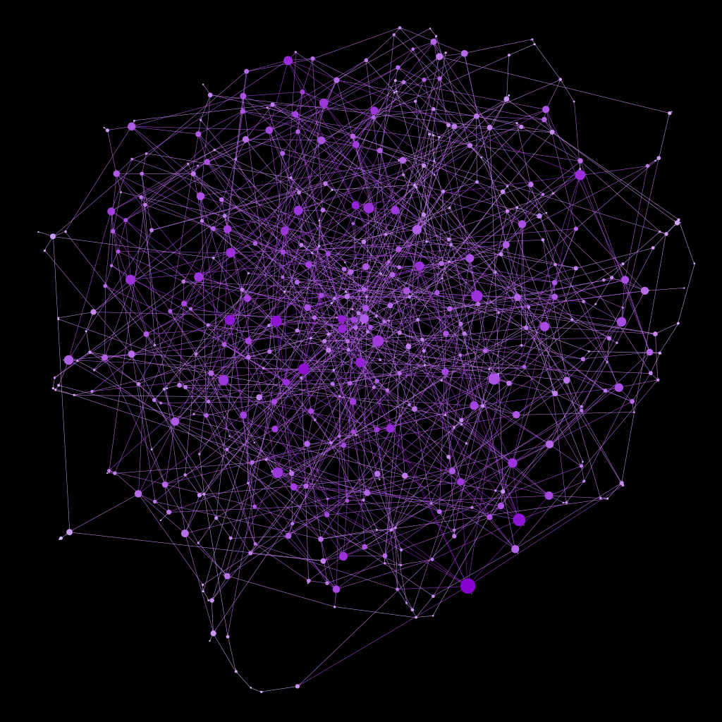
Randomly generated graph

A randomly-generated network with a similar number of nodes and edges. Obviously, I'll need to build a generator that better resembles the type of network we're studying.

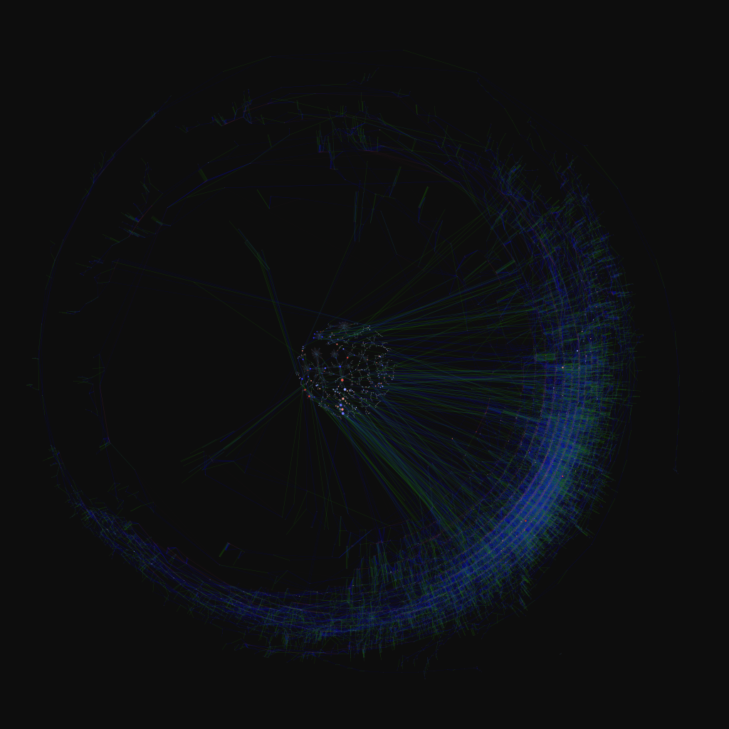
A genealogical network

the network above with a different layout (I'm becoming a bigger fan of the Strong Gravity option in ForceAtlas2) and only particular edge types turned on.

A genealogical network

The sub-network within the larger network.

Posted in Graph Data Model, Visualization | Comments Off

Comparing Geographic Visualizations to Network Visualizations

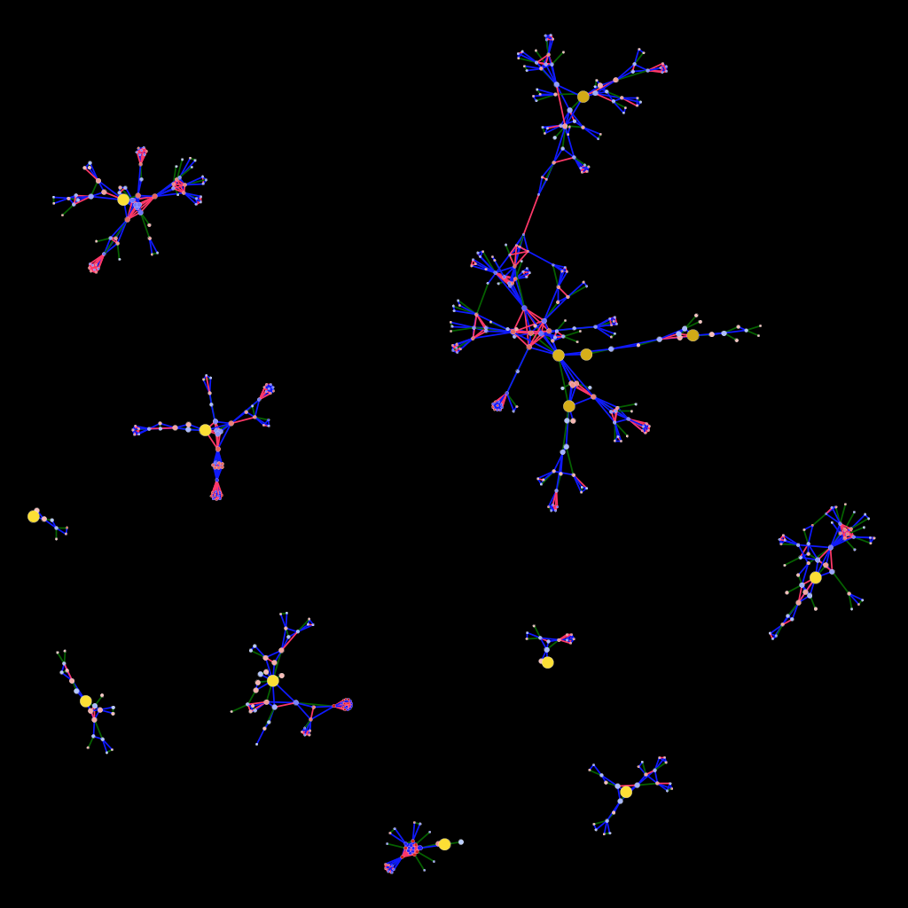
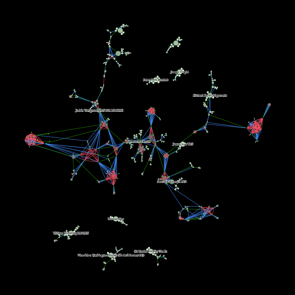
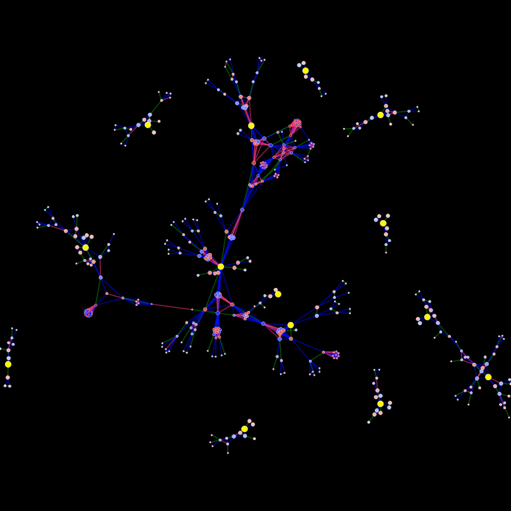
With March having arrived, it’s time for me to pivot away from Imperial Roman networks and toward new projects. This means stepping away from purely geographic networks and back into more abstract networks, specifically the networks made of genealogical connections. Just working with these networks a bit, and providing some support for social network analysis and representation being done in the Spatial History Project, has reminded me of how daunting network visualizations can be. Here’s a small set of family connections around twelve members of the Lunar Society:

The genealogical network of the Lunar SocietyGreen lines denote a marriage between two nodes, blue lines indicate lineage and red lines connect siblings. Size, in this case, indicates network distance from a member of the Lunar Society, while color indicates centrality within the entire 26,000 node network. I’ve noticed, whether the network being displayed is of genealogical connections or social connections between Chinese-Canadian immigrants, that when presented as a visualization, a typical response is to comment on the abstract nature of network visualizations.

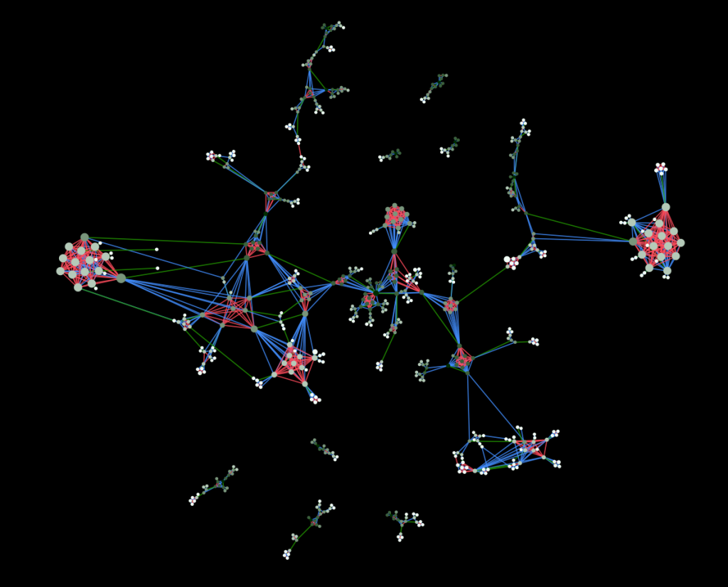
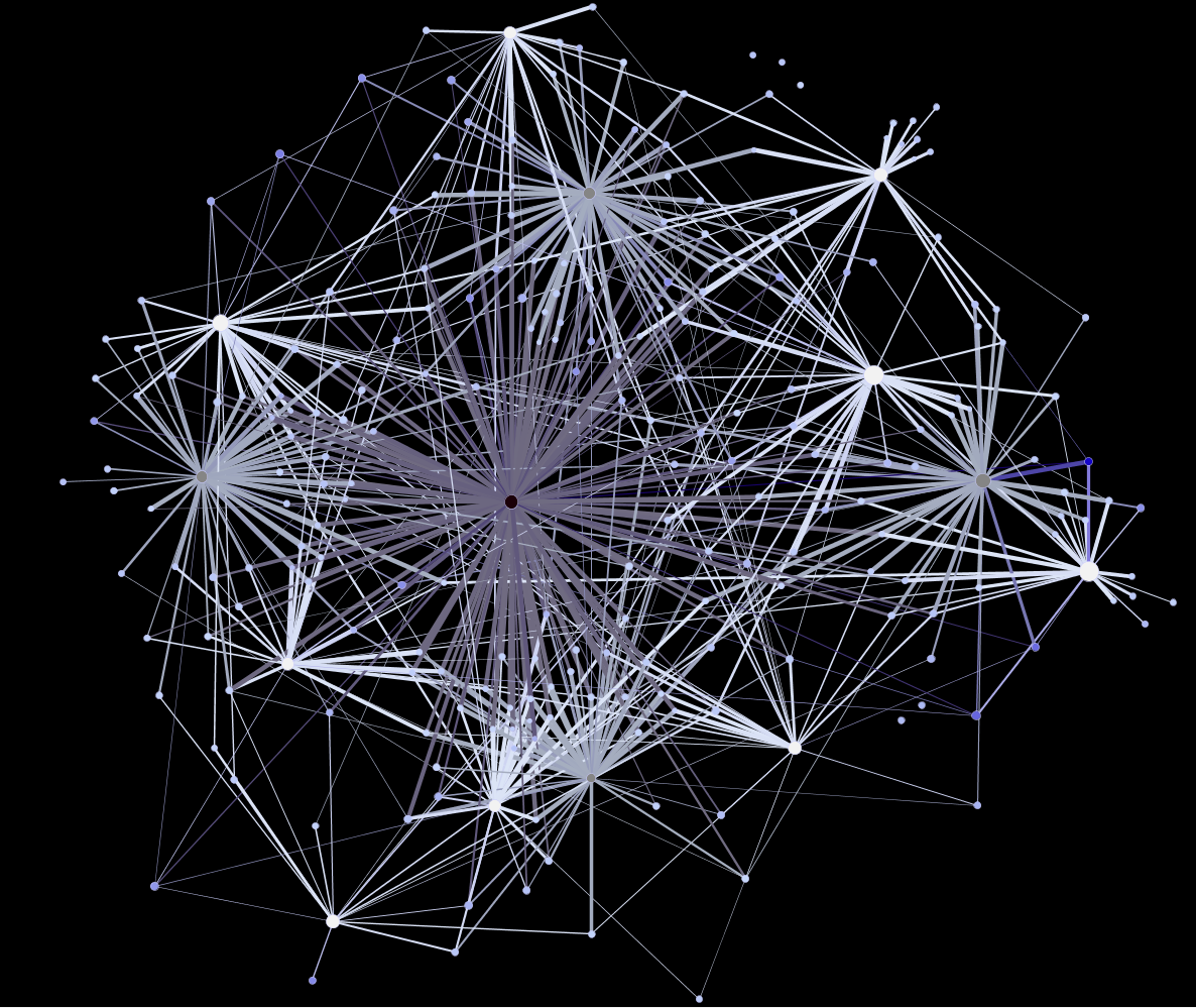
The genealogical network of the Lunar SocietyThis is made more apparent when I change the attributes from which the size and color of nodes have been derived. Above is a flipped version of the node size and color from the previous image. Now, node size indicates centrality and color indicates network distance from a Lunar Society member. The modified sizes of the nodes have affected the manner in which the network lays out and have thus changed the visual representation–some have argued fundamentally.

But it is my growing suspicion that we hold network visualizations to higher standards than we do to an equally abstract and complex class of knowledge representation: the traditional map. Despite the need for increased spatial literacy, it’s easy to see that there is a basic literacy in geographic visualization of information that should be expected in network visualizations. For instance, there is more information on display in the below than the two images above.

Roman network with natural earth background

And yet, without my even mentioning what is on display, a typical scholarly or lay observer would already have a grasp of the subject matter. This despite the likelihood that the observer is neither a geographer nor an astronaut, and so has little experience with literally seeing Europe from space or creating and analyzing spatial data. This basic literacy required to understand the representation of knowledge is contrasted with the fluency necessary to create such objects in the hope that we can develop a similar divide in the realm of network representations, which I think will only grow in popularity and ubiquity in the coming years.

Maps do not work because they’re somehow more rooted in a “real” physical geography. A much more abstract version of the above map will likely provide the same observer with a strong basis for understanding the information being presented

Delaunay triangulation in Rome

While it’s harder to see the patterns that indicate the Mediterranean and European coastlines, and it’s overlaid with a set of abstract connections between points, even an abstract representation of geographic data, such as this one, does not cause the consternation that I have seen result from even a simple representation of a network.

Here I have to pause and point out to my colleagues who deal with spatial phenomena that I know that networks are spatial, and that spatial data is not only limited to the geography of the Earth, and that spatial analysis is used to analyze all manner of things, including networks and (I’m not kidding) diapers. But that’s an argument between to fluent speakers about semantics, and I’m directing this at a larger audience that should not be concerned with fluency but with literacy. For them, the networks I showed above are different than the maps I’m referring to now.

Even though these maps are networks (as I’ve so often referred to the Roman transportation network) and most of the maps that people are familiar with actually display network data. But maps have a few basic standards in display of information that network analysis might stand to adopt. Some concept of representation of space (and even, to a degree, projection) as well as very simple standards like displaying water traditionally with one class of colors, and roads with another class, and so on, so that we develop a general sense of standard symbols for standard features.

For instance, even when I chose to represent the ocean with a gray palette, I still followed general principles for representing land and rivers below:

Roman networks in openlayersThere are even more basic agreements made with representations of geographic information, such as the arbitrary directionality of our representations. Even with the most abstract representation of the Roman network, I still leave north at the top of the map and south on the bottom and west to the left and east to the right. This is basic, fundamental, and difficult to translate into network representation, but I have a few ideas on how it could derived from the topology of a network.

Roman network in abstract color schemeThe point here, though, is not to focus on individual technical solutions but to emphasize the necessity for creators of network visualizations to open a dialogue about standards and practices as well as expectations of visual literacy of their audience. As the tools to represent and manipulate networks become more common, the level of fluency with network representation has begun to highlight the low level of visual literacy among typical observers who try to “read” such representations.

Posted in Spatial Humanities, Visualization | 1 Comment

Models as Product, Process and Publication

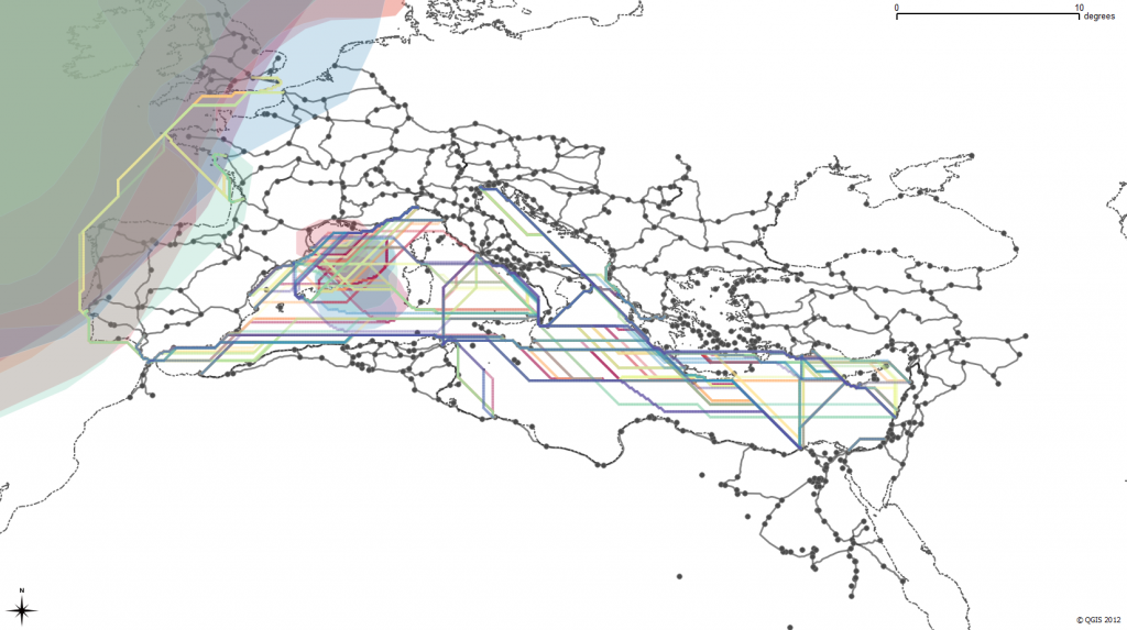
Possible paths of some historically attested Roman sea routes, constrained by monthly variation in wave height

Possible paths of some historically attested Roman sea routes, constrained by monthly variation in wave height

In building a transportation network for the Roman Empire and integrating it into a model of movement in the Roman Empire, I’ve found that the shift from creating, annotating and analyzing archives to modeling systems can have a profound impact beyond the (admittedly high value of) usability of scholarly material developed during a digital humanities project.  While the end result of this project will allow scholars to compute paths through a multimodal, historical transportation network, it provides two even more valuable contributions to the field at large just by virtue of it being a formalized system.

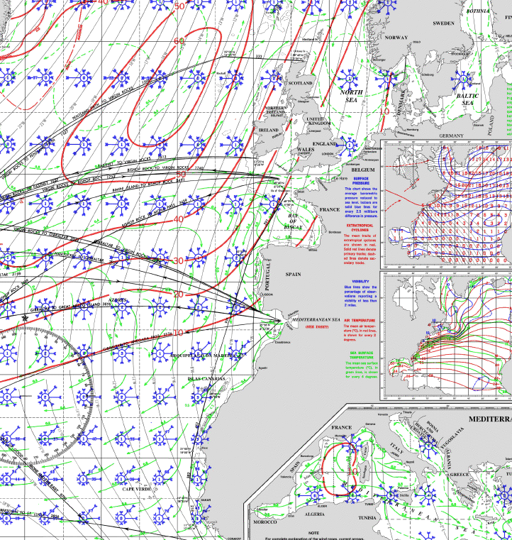
First, the model consists of several components that abstract the movement capabilities of various historical objects such as ships, armies, bulk goods and information.  These discrete subsystems can easily be replaced with an alternative or competing definition of movement costs and capabilities without disrupting the modeled system as a whole.  If a more complex or accurate definition of the movement capacity of an Imperial legion becomes available, it can be integrated within this model rather easily.  To explain this in more detail, I’ll focus on the most computational aspect of this model: the delineation of sea routes.  The length (in both distance and time) of a trip from one port to another is modeled by assuming certain capabilities on the part of Roman ships.  This starts with a modern pilot chart for the Mediterranean, Black Sea and Atlantic, like this:

A typical pilot chartSuch a chart contains a wealth of information on currents and wave height probabilities as well as wind force and frequency by direction.  From these variables we derive an average speed by direction of three different idealized Roman ships (known in the model by the exciting names “Slow”, “Slow2″ and “Coastal”) during a month to test against a set of historically known routes.  The results have been very positive–and this is what simulated sea travel in February looks like according to the model:
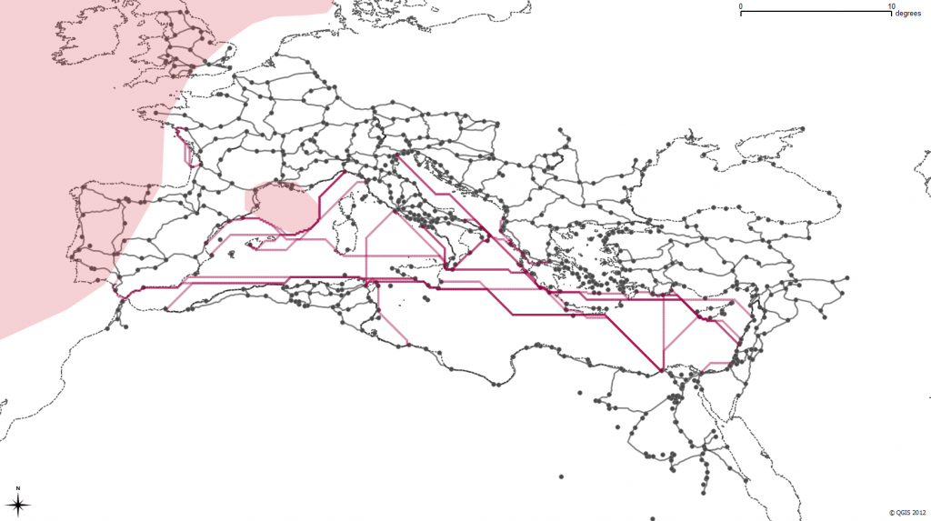
Sea travel in February according to the ORBIS sea modelYou’ll notice the shaded regions are avoided–these are areas of greater than 10% occurrence of waves with a height greater than 3m, which the model treats as impassible.  The actual path of the routes is directed least-cost based on the reported force and frequency winds from the pilot chart.  I’ve described a bit of the method used to perform this directed least cost in earlier posts here, here and here.

If you’re keeping score at home, that’s a lot of assumptions.  For one, it assumes modern wind patterns match historical wind patterns.  It assumes that certain wave height frequencies are impassible.  It also relies on a particular definition of Roman ship speed based on wind frequency and force that could be contested or expanded.  Beyond that, it provides no opportunity for probabilistic behavior and so cannot accurately represent a case where a route is very fast but extremely dangerous, except insofar as excluding it.

But the beauty of a model is that all of these assumptions are formalized and embedded in the larger argument (in this case, the most efficient ways for different types of actors to move across the Roman world during a particular month).  That formalization can be challenged, extended, enhanced and amended by, say, increased historical environmental reconstruction, experimental maritime archaeology or the addition of documented historically attested routes that adjust various abstractions.

Rather than a linear text narrative, the model itself is an argument.  Given how unfamiliar humanities scholars are with the structure of these models, it will still need to be presented with significant narrative explanation of its components and results, but in my mind that’s a matter of education and not scholarship.  We have to learn models and become literate in them before we can actively engage in them at a sophisticated level.  If we do, then they provide a much more nuanced form of knowledge transmission than the raw datasets or interactive and dynamic applications typically presented as the future of digital scholarly media.

A second, less visible benefit of models comes from an unexpected property of the interconnectedness of their components.  In typical collections of historical locations, correspondence or individuals, there is no mechanism to define how one piece interacts with another in a larger system.  Because that interconnection defines a model, the addition of new material becomes a much more engaged activity than the expansion of a typical collection or archive (or, to use a more agnostic term, dataset).  If you add new letters to an archive that is simply a collection of letters, then the lack or unevenness of metadata or name reconciliation does nothing to the archive.  However, if you add a set of new sites or routes to a model that defines interconnection between its components, the quality of that data will positively or adversely affect the performance of the model.  This enforces a higher level of attention to quality, scope and scale of data that might alleviate the various issues in metadata inconsistency that are so prevalent in existing digital archives and collections.

To use a rough analogy, if you’re throwing more books in a box, it doesn’t change anything about the nature of your box of books except in a general and effectively vernacular sense of quality.  On the other hand, if you start throwing more gears into your engine, you can see an immediate effect on the performance of that engine, from major improvement to catastrophic failure.  The above referenced model will be released later this year and it is my hope that major components of it will be replaced with better and more accurate abstractions of various systems, which rather than damaging the credibility of the original model will only reinforce its importance for spurring such activity.  A model is like an engine, and while these first models in the Digital Humanities will be rough and crude engines, they should improve quickly as we grow more comfortable with their use, description and integration into humanities scholarship.

Posted in Algorithmic Literacy, New Literature, Peer Review, Spatial Humanities | Comments Off

Adventures in Georectification – Mobile Edition

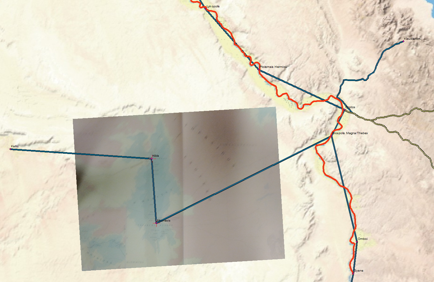
Georectified map photographed from a smart phoneWhile attempting to reconstruct the road from Mounesis to Coptos, I found the need to place a Barrington Atlas map into GIS.  Naturally, the solution was to take a photograph with it from my phone and email it to myself and georectify it with a couple control points.  This is probably not the best solution (the curvature of an open book and the angle of the camera as well as the poor resolution and quality of the image all mean that a high-quality scan will always beat it) but it is remarkably simple, convenient and quick.

Posted in HGIS | Comments Off

Infoviz and New Literacies

Topic Shattering

Melissa Terras’ recent visual summary of the Digital Humanities has brought attention to the growing vibrancy (and budgets) of the DH community.  It also feeds the cycle of debate about the efficacy, role and usefulness of visual display of information, especially the aesthetically pleasing kind.  Some scholars have responded with a criticism of the infographic as being misapplied or little more than a sales pitch.  While popular conception of digital humanities work has data visualization featured prominently, within and outside the community the value of that work is widely debated.

Not so long ago, information visualization in the digital humanities rested firmly on the general principles of clarity and brevity typified by Edward Tufte and utilized not only in generic data visualization but also spatial data visualization.1 The problem with this conceptualization of information visualization is that works like Tufte’s are dominated by the expectation that such objects be immediately comprehensible to a lay audience.  These are the infographics of such growing popularity and are meant for busy media consumers and executive summaries.  Charlie Park, in an exploration of when to use a particular visual method known as a slopegraph, highlighted this issue in relation to Oliver Uberti’s use of a slopegraph to represent health care spending efficacy:

Uberti also gave some good reasons for drawing the graph the way he did originally, with his first point being that “many people have difficulty reading scatter plots. When we produce graphics for our magazine, we consider a wide audience, many of whose members are not versed in visualization techniques. For most people, it’s considerably easier to understand an upward or downward line than relative spatial positioning.”

I agree with him on that. Scatterplots reveal more data, and they reveal the relationships better (and Uberti’s scatterplot is really good, apart from a few quibbles I have about his legend placement). But scatterplots can be tricky to parse, especially for laymen.

It’s just this kind of assumption in visual representation of data that causes humanities scholars to critique digital humanities work and also prompts digital humanities scholars to defend themselves by excoriating the visual representation of knowledge.  Michael Whitmore, in response to Stanley Fish’s recent bloviating, has echoed a common refrain against using information visualization as anything more than a helpful illustration or exploratory tool but ultimately separate and less valuable than the linear narrative explanation of the same phenomenon:

As traditionally trained humanities scholars who use computers to study Shakespeare’s genres, we have pointed out repeatedly that nothing in literary studies will be settled by an algorithm or visualization, however seductively colorful.

There’s a very real subset of digital humanities scholars who feel it necessary to maintain their bona fides with traditional scholars through the criticism of analytical and visual methods that they themselves use via language adopted from critics of the digital humanities as a whole.  It’s a way to disarm a predictable critique brought on by the aesthetic appeal of data visualization and it’s rooted in a desire to have digital humanities scholarship treated as equal to traditional scholarship.  I’ve often used the term “seductive” in my description of the various tools for analyzing and representing data and I’m also aware of the very many opaque or chaotic but impressive-looking representations of complex phenomena that are growing so popular today.

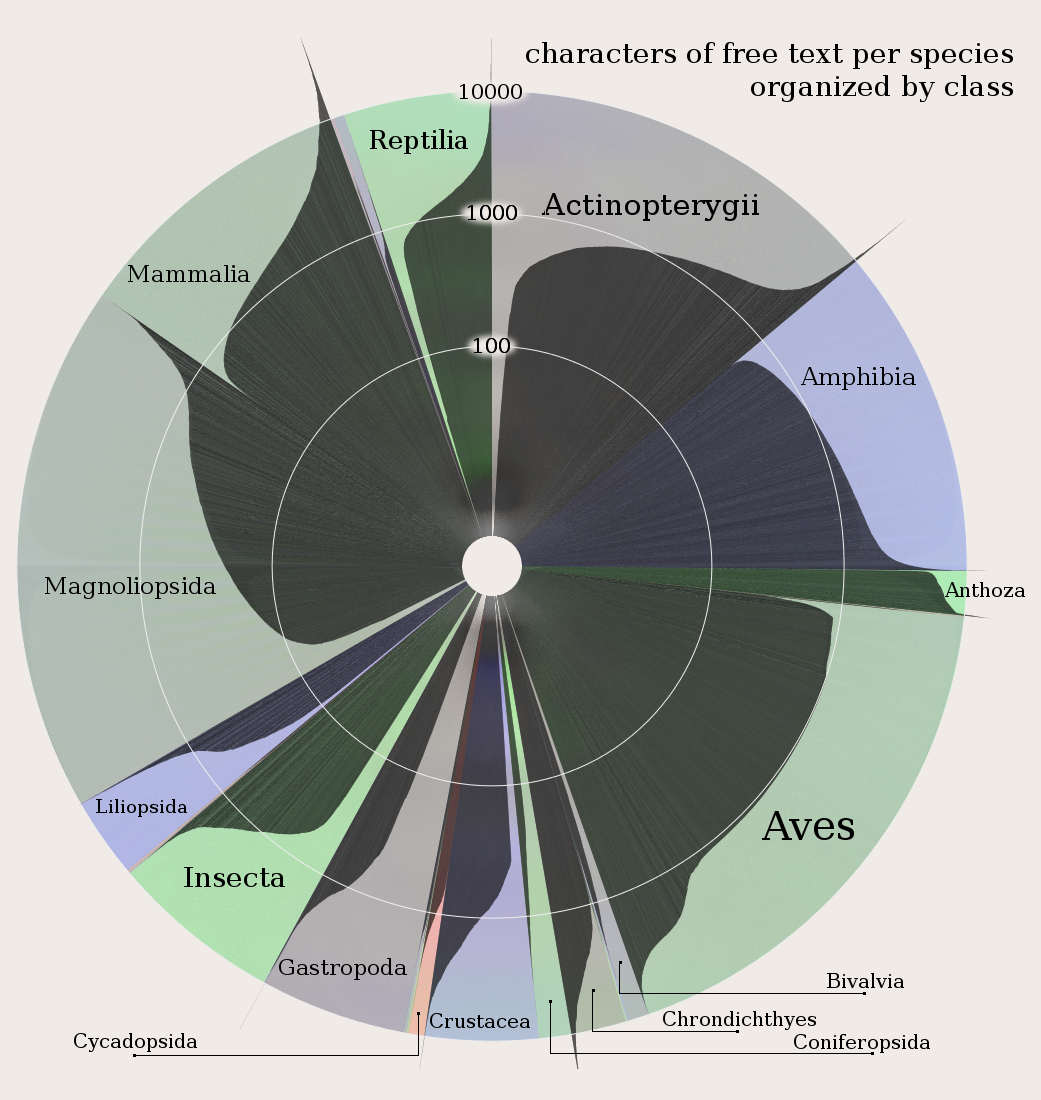
Amount of writing about species by class in the IUCN Red List DatabaseIt may be that nothing in literary studies will be settled by an algorithm or visualization, but if so that may be a problem for us to solve rather than an inescapable truth of existence.  Stepping away from algorithms and focusing on visual display of data reminds us that the lack of visual literacy necessitates that visual arguments cannot be sophisticated.  Just like representations in National Geographic, data visualization in the digital humanities is heavily influenced by a bottom line focused on accessibility to a lay public and assumed unsophisticated audience with little time to examine the visual argument and less education in how to examine it.  If we had same bottom line for linear narrative arguments, then it would be equally impossible for a journal article or monograph to “settle” anything in any field.

To that end, I hope that the digital humanities can act as an impetus to demand better and more varied forms of literacy from our general academic (and by extension, public) audiences.  The communication of information should not start by assuming poor visual literacy, network literacy and spatial literacy but rather should foster and demand increased levels of each.  Along with turning the tables on the reader and placing an equal demand that they expend more effort to understand a non-narrative argument, we need to formalize principles of visual representation of knowledge through the development of serious standards for topics like network cartography and general visual literacy.

As it stands, a “good” visualization is one that is seductive, immediately comprehensible to a wide audience, requires little explanation and takes barely any time to absorb.  These are, not coincidentally, the same standards one has for a good newspaper article.  Another definition of good needs to be developed for sophisticated visual communication that gains its inspiration not from newspaper articles but from monographs and journal articles.  This already exists for certain formalized visual expressions in particular domains, but the growing use of these methods for communicating knowledge among a larger scholarly and public community demands that we not create a few new jargons for a few new fields but forge a general literacy in the creation and appreciation of such communication.

A Socio-Environmental Model

I don’t want to lose track of another piece to this puzzle.  It is particularly interesting that Whitmore includes the algorithm with the visualization, because algorithmic visualization using model builders is an allied subject matter.  Algorithmic literacy is not a demand that everyone learn how to program, but another step in the development of higher standards for complex, modern communication.

The first step, I think, is to acknowledge a distinct category of data visualization for the sophisticated expression of complex phenomena that does not resemble the executive summaries and journalistic infographics commonly associated with data visualization.  A simple Google Image Search of “mathematica” should give enough examples of just how complex visualizations can be.  After that, it’s a matter of developing and formalizing standards for common visualization techniques by practitioners.  My current work is with spatial data, which has a long tradition of developing just such standards, though representation of dynamic and interactive elements in spatial data, along with more complex spatial phenomena, still need effort.  As a result, maps can be much more complex and sophisticated than network visualizations and general data visualizations, without much complaint about their communicative power.  As network analysis and representation becomes more common (especially among humanists, who know that aesthetics and rhetoric are not actually bad words) we should strive to develop similar standards and expectations of literacy in relation to that and other forms of data visualization.

1 I suppose some people still call this cartography, but I think of cartographers to be somewhere with philologists and alchemists in the dustbin of historical professions. I kid, but for some reason the word feels so archaic, unless it’s used in conjunction with some unexpected modifier, like “network cartography” or “ludic cartography”, in which case it’s the archaism of cartography that draws light to the need to enjoin cartographic principles into the representation or analysis of spatial data in networks or games.

Posted in Algorithmic Literacy, Visualization | 2 Comments

Why I Stopped Coding in Flash and Learned to Love the Bomb

Irony

I thought Steve Jobs was dead wrong when he condemned Flash back in April of 2010.  The first interesting code I wrote was in Actionscript 3, which I found efficient and remarkably easy to use.  Where JavaScript maps and information visualizations were slow and cumbersome, Flash APIs provided far more impressive performance.  Most telling, I thought, was that so many interesting applications in the arts and humanities were done with Flash.  Flash worked.  From a technical perspective, it didn’t make sense to drop Flash in favor of HTML5.  But that perspective is naive.

During DH11, after a presentation on Civil War Washington–which used ESRI’s ArcGIS Desktop and Server to process and create geographic data–I asked if it was important for digital humanities scholars to advocate for open source or open standards.  While I think it is incumbent on academics to advocate for these things, I could sympathize with the argument in favor of big, proprietary packages like ArcGIS. It’s the same argument in favor of Flash: ArcGIS works.  If I work at Stanford for scholars at Stanford, where we have unlimited ArcGIS licenses, should I invest my time with QGIS purely for the purpose of advocacy?  Since then, I’ve found out that ArcGIS doesn’t work, at least not for what I want it to.  As I became more familiar with using QGIS, PostGIS2, Geoserver and OpenLayers, I found that using ArcGIS instead of QGIS was actually slowing me down.  And so I’ve made a gradual shift with spatial tools toward open source and open standards, but this time rooted in functionality rather than the decision of some distant icon.  Still, it was no more “sensible” than the shift away from Flash simply because it had sound technical reasons.1

Software, especially the kind of software developed in the digital humanities, does not live in a purely technical world.  Obviously, there are community factors that are also technical factors:  My adoption of Drupal 7 is directly related to the strong Drupal community here at Stanford that actually makes Drupal easier to use and more functional. And I would not have invested so heavily in Geoserver if the Geoserver community was not so helpful.  But the pressure to move away from Flash was different: the strong community was one united in pushing it away rather than in attracting to a more useful platform.  Still, how a community influences the adoption of a platform or language is not so important a detail as the fact that community is a real factor in choosing development paths. It’s nonsensical to ignore it and pretend that all issues related to technology are technological.  I’ve since tried to keep this lesson in mind as I’ve evaluated various platforms, libraries and tools to account not only for performance and features but also the strength, size and direction of the associated community.

Naturally, we can overcorrect and choose a well-known and well-supported but inefficient library over a little-known but high-powered library with a small (or, more often, curmudgeonly) community around it. The point here is to account for this in evaluating solutions. Open source software is long-matured as a development process and communities of support around various platforms/libraries are measurable and important and both can have as much to do with the success of projects as robust functionality and blazing speed. Likewise, we can find out own background and preferences influence the selection of a tool or platform that might be the easiest for us to develop in but a less-than-ideal solution for the community for which we are developing.

1 Of course, since that time technical reasons have developed to ensure that Flash withers: the remarkable dominance of the iPad over Android tablets seems to have led to Adobe’s decision to phase out the platform.


Posted in Algorithmic Literacy | Comments Off

Drupal for Humanists

Quinn Dombrowski and I are writing a manual on using the Drupal 7 CMS for digital humanities projects.  Titled unimaginatively Drupal for Humanists, it is meant to provide first an understanding of how to install and configure Drupal and then a series of case studies representative of Drupal’s use in humanities research and the library, with a special emphasis on how these sites can evolve in an agile manner when the original project reveals new opportunities for future research, pedagogy or publication.

We’ve shared a Google Document that has the proposed case studies for this text listed for comments from DH scholars and Drupal users and developers. Please feel free to add any details or concerns that are you feel are important.

Posted in Multiscale Applications, Pedagogy, Social Media Literacy, Tools | Comments Off

The Digital Humanities as a Growth Industry

I feel very fortunate to have the opportunity to announce that Karl Grossner has joined me here at Stanford as the new Digital Humanities Developer.  Karl holds a Ph.D. in Geography from the University of California, Santa Barbara (2010), and a B.S. in Instructional Design and Technology (California State University, Chico, 2005). His research interests lie principally within geographic information science (GIScience), and include geo-historical knowledge representation and ontologies, computational models of place, and spatial thinking generally, including the development of transdisciplinary spatial learning objectives. He spent 2011 in a postdoc position at UC Santa Barbara’s Center for Spatial Studies, where he led the conceptualization and development of the TeachSpatial web portal.

Karl will join me in supporting digital humanities research here at Stanford, which includes not only the development of digital tools and objects for scholars but also consultation on project management, data modeling and research agendas.

Posted in Digital Humanities at Stanford, The Digital Humanities as... | Comments Off