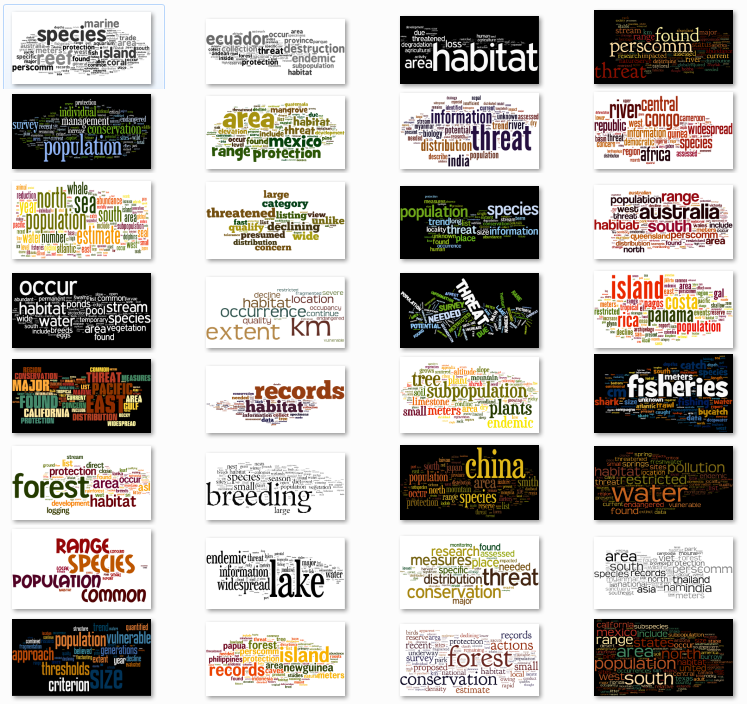
A year ago, I painstakingly formatted the topic modeling results from MALLET so that I could paste them, one by one, into Wordle. I was happy with the results, if not the workflow:

First, an aside. There are folks who consider word clouds to be heinous data visualizations, especially now that Wordle has made them so easy. It seems to me that to establish your data visualization credibility, you have to trash some particularly popular form of expressing information. Ben Fry famously trashed networks, Jacob Harris trashes word clouds, Tufte trashed circles. I’m sure somebody out there hates bar charts and everyone, it seems, thinks stream graphs are made out of equal parts heroin and the bad stuff from The Fifth Element. But it actually shows a lack of understanding of the primary principal of data visualization to condemn a form, and though it makes for better copy to declare word clouds to be “harmful” or say that “almost nothing” should be shown as a network, it’s really the application and not the method that is being criticized. Word clouds, for instance, are really good when paired with topics generated from topic models.
For those of you who are unfamiliar with topic modeling, it’s a family of algorithms that look at a set of documents to find words that are highly co-located across documents. There have been many and varied explanations of it, including my own visual representation of it*. Typically, the results of a topic model are a list of the top words that appear in a particular topic. But a simple list of words hides the fact that the ratio of words is another dimension that is important for understanding topics. Hence word clouds. While the typical use of something like Wordle is to drop in a document and let it count the instances of words, you can also format a list of words and values and it will generate the same cloud. Easily enough, one of the outputs of topic modelling software like MALLET is just such a list for every topic discovered. And so a topic cloud represents not only the words that make up a topic, but the ratio of those words, and can include just the top 20, or the top 100, or all of them if you have the real estate.
You can see in the example above that sometimes terms dominate a topic, and other times there is a more even spread of terms, and all the rest of the distributions of tokens that one would expect from such statistical processing. By exposing this distribution, it makes interpretation of topic model results far more sophisticated.
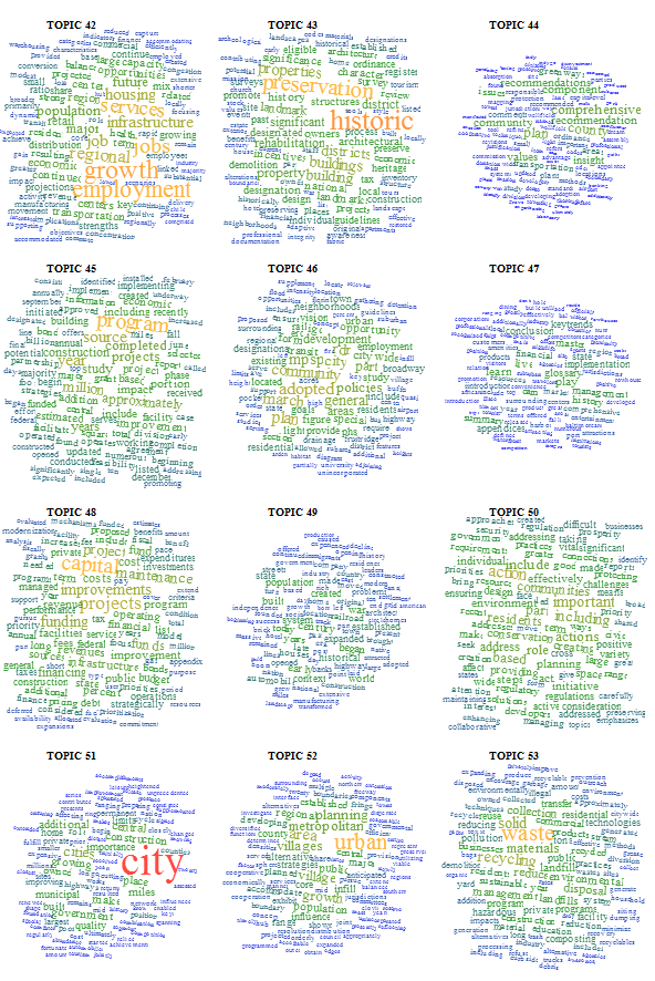
Now, back to the workflow problem. This kind of solution is great, but formatting the results and manually inputting them into Wordle and setting the color scheme and layout and font to be the same every time is miserable. On top of that, it abdicates the capacity to use the various dimensions of a word cloud to pass more information in the visualization. Color and rotation are arbitrary in Wordle and typically in word clouds, but they need not be. Color could be used to indicate part-of-speech, and rotation could be used to indicate named entity type. Or, they could be used to reinforce incidence of the word. With that in mind, and given my growing addiction to the D3.js information visualization library, I thought I’d do something a bit more efficient this time. Fortunately, Jason Davies has already built an incredibly robust word cloud layout for D3, and all I had to do was use it in a ‘for loop’ for all the topics that I’d generated, with some code to color and size the words using a scale that I thought was appropriate. The result is a simple web page that easily shows word clouds made up of the top 100 tokens (or more or less, if you’d prefer) for the 100 topics in the topic model I’m using, and with significantly less carpal tunnel.

The toughest part was getting the topics in order, since D3 calls the CSVs asynchronously and therefore needs to have the 100 SVG canvases put onto the page and identified before they’re populated. But I solved that by creating the 100 SVG canvases first, giving them unique IDs based on their order in the creation, and then calling the specific canvas during the word cloud creation. You can find the code on Github here.
Updated on 8/16
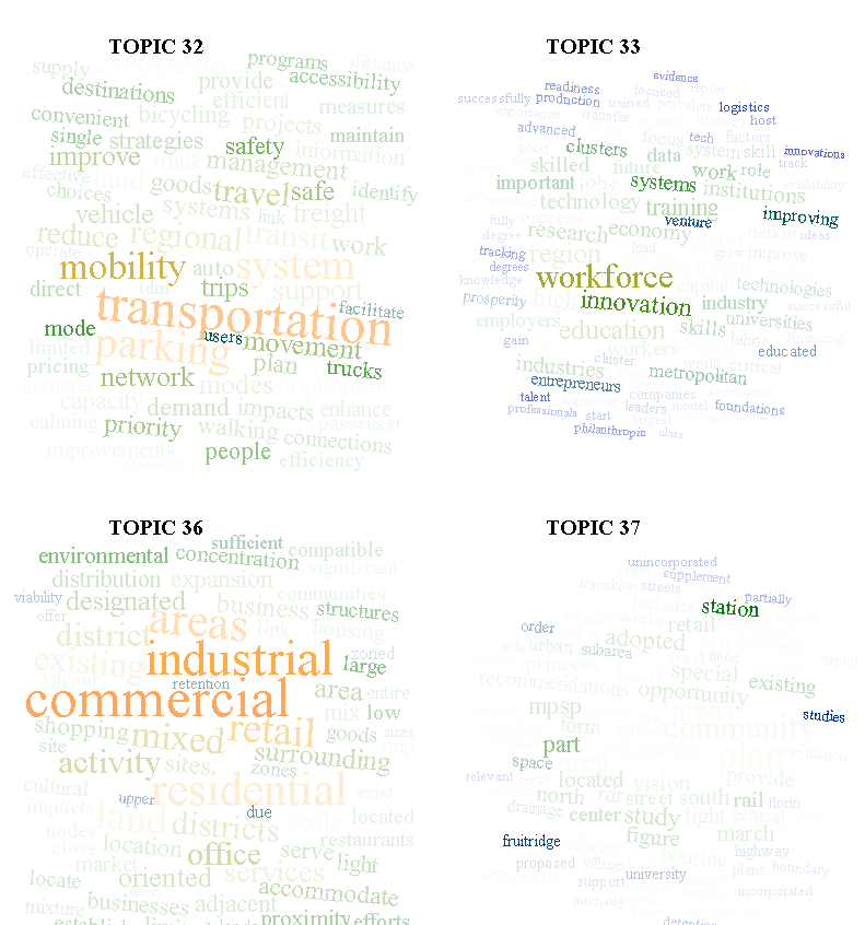
I showed this code to Ryan Heuser, who runs the Literary Lab here at Stanford, and he immediately improved it by suggesting that another dimension to be represented from topic model output is the percentage of a word represented in a topic out of the total number of that word represented in a corpus. For instance, if the word “housing” shows up 10000 times in a corpus and 9000 times in a topic, then it has a different character than a word that shows up 50000 times in a corpus and 9000 times in a topic. This percentage can be represented in a number of ways, but Ryan and I found that opacity was the best, causing words that were represented across topics to recede more than words that highly corresponded to a particular topic. Here’s an example:

* Using network visualization where topics, words, and documents are all represented with circles. I know, I should be ashamed of myself.

Apologies for being exactly that kind of visualization critic you rightly question! Given that these are custom, it seemed like a good opportunity to talk about what else these could do.
First, what does color represent in your versions? Is it just dual coding the same measure as the font size? Any way to add a global legend somewhere?
Good avoidance of some of the glaring problems with word clouds. I still think there are a few additional challenges/opportunities, though. Using font size at all means that word length distorts relative importance. Position is also meaningless and, especially for a project doing fairly in-depth text analysis, seems like it could be used to better effect. For example, topic 51 above with the big red “city”? That cloud also has “cities”, but it’s hard to scan and mentally combine those terms that may have similar meanings in a particular context. My biggest complaint with word clouds (and I’m sure you’ve heard it plenty of times) is that, if all we have are a set of words with no additional information about how they might relate, the world cloud presents the same information as a frequency bar chart (which could also have color and opacity codings), but in a way that’s harder to parse.
I do think changing opacity is a slick addition, though! I really like the idea of comparing overall frequency to topic frequency.
Thanks so much for sharing.
Excellent points!
First, the easy stuff: color is simply providing the same information as size, based in part on your next point, which I’ll get at below. Also, any final representation of this should have a legend somewhere, as well as some explanation of the actual scales being used. This visualization in its final form will be interactive and tied to several other representations of the topic model, and better have a decent legend (preferably a dynamic one) or there’s something wrong.
Now, the really cool point. The size of the word is a simple css font-size based on a scale derived from the frequency, which would, as you’ve noted, seem to create an even more severe problem of misrepresentation of information than Tufte’s oft-quoted concern about using circles to represent numerical values. For those not aware of this, if you base the radius of a circle on a value being represented then the circle, being pi * r2 of that value, would actually misrepresent that value because the area of the circle is growing exponentially while the value is growing linearly. It would seem, on its face, that doing the same with words, which have a variety of lengths, would be worse. However, I actually don’t hold with Tufte on this issue and think that there’s nothing inherently wrong with representing linear values with logarithmic sizes, because I believe the human eye and brain, on seeing a circle that is “value 1″ and another circle that is “value 10″ can actually mentally map the scale. I think the human mind also recognizes this effect with words, especially if they’re dual-coded as is done here. I am not a cognitive scientist, and have not studied the effect of this, but I when I see “historic”, I know that it is more represented than “preservation” despite “preservation” taking up more space. In short, I think our brains actually are trained to recognize font size, through long experience with typography, just as I think our brains are trained to recognize radius, and if we use that as our representation of value, then I don’t think it’s necessarily overridden by area.
I disagree, though, about the bar charts. Each of these topics is 100 words, with several dimensions of information, and to represent that in a bar chart would be fundamentally unreadable, primarily because we’re dealing with 29,000 tokens, which would make the x-axis label just look silly. I think a sparkline or bar chart would be great as a small “distribution fingerprint” with no x-axis label and a y-axis normalized for the entire corpus or relatively, but I’ve found, experientially, that word clouds actually provide better understanding not only of distribution but of distribution plus ratio (topography, fundamentally) of words in a topic and across topics than a list of such word tokens and their values, or a network representation of them, both of which are fundamentally better designed to display this kind of information than a bar chart. It may be that this is part of the hidden, seductive appeal of traditional word clouds. Everyone focuses on the simple word counting, but really, a word cloud also reveals the ratio of words in a document, which as topic modeling reveals is a critical component in understanding the context of those words. You don’t get that in a bar chart because it’s fundamentally dichotomous, with the bars on top and the labels below the x-axis, so you see frequency and distribution of words generically, but only know word frequency of a particular word by scanning the legend and then looking up at its bar. I’d put a list of words and their values as more effective than that.
Thanks so much for your critique!
Great stuff. I’m quite happy with word clouds, when they’re based on the right criteria. I think we could really use a way to dump the output of MALLET into a web page and get these sorts of clouds. Several teams have workflows of that sort that come close to being automatic — but so far, in practice, they all require a lot of tinkering. Metadata is the tricky part, I guess.
Surprisingly, there is no hard-and-fast consensus formula for ranking terms within a topic.
But a lot of people use the formula David Blei uses. I can’t reproduce it here, because it’s got a lot of Greek letters, but it’s on page 6 of Blei & Lafferty, 2009. Basically, it’s prominence of word V in topic = probability of V in topic * log (prob of V in topic / geometric mean prob of V in all topics).
I would personally prefer that formula to a graphical logic based on two separate variables. But different people are going to have different preferences for this sort of thing.
Thanks Ted! I personally prefer the lack of Greek, because that’s all Greek to me. I’ll try out Blei’s function and see how it looks, thanks for the citation.
For me, the visualization is not just for communication but for my own learning process, something that fits with my own understanding of the models and processes in a way that Greek or plate notation don’t.
This really is great work, and I want to second Ted Underwood’s idea of MALLET to web output. I recently produced a primitive script that spits out some HTML tables and D3 bar charts based on MALLET data, and it wouldn’t be hard to integrate this word cloud script. But I’ve yet to see a really useful web-based topic model browser. We desperately need better ways to visualise our data.
I actually built a topic browser in Protovis about a year and a half ago. It had a network component to show how the selected document was connected to other topics and through them other documents, as well as a word cloud like this (though not nearly so sophisticated in the dimensions of data being displayed) and a simple bar chart showing how this document was represented differently across different topic models. You can see it here:
http://dhs.stanford.edu/dh/species_detail.html?iucnid=219
I expect to be building a much more fully-featured version in D3 shortly–perhaps it will prove useful to the larger community.