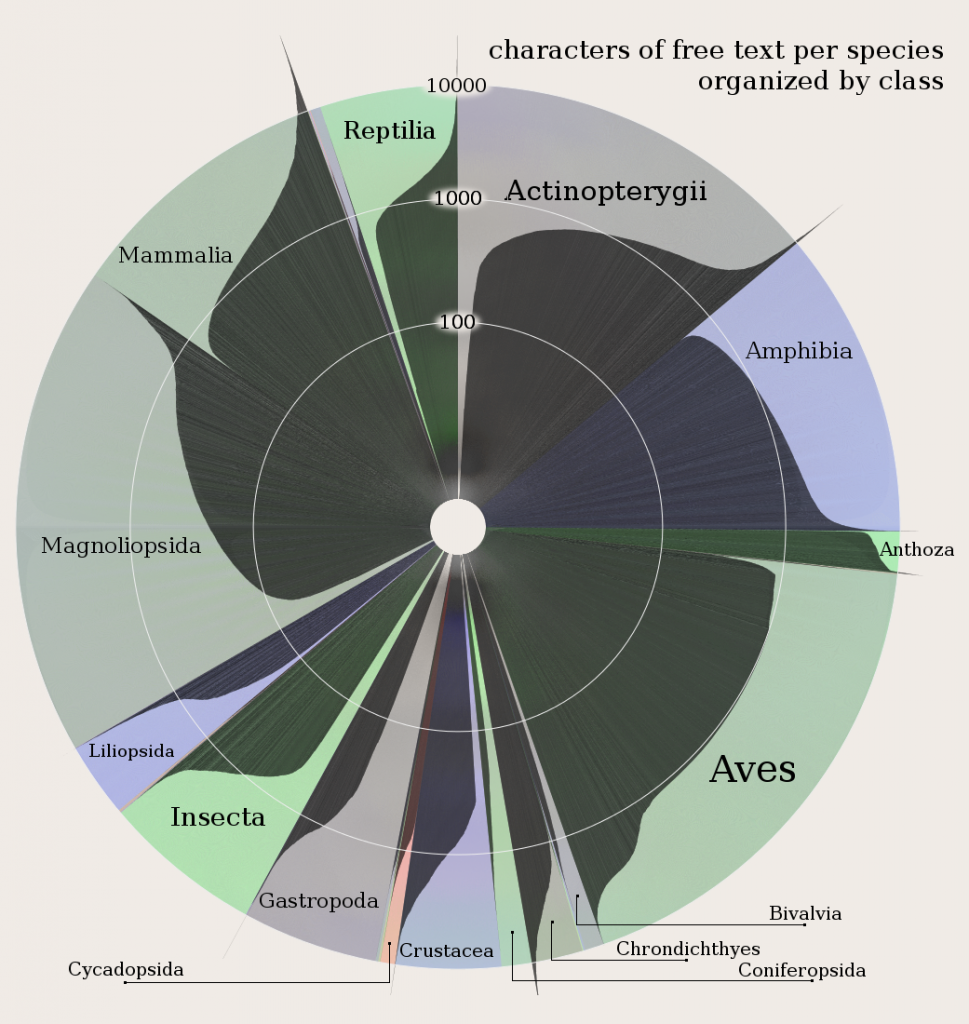
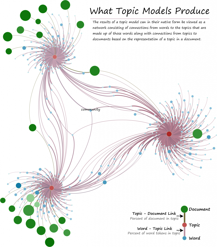
I submitted six pieces to the Information is Beautiful Awards, which is a contest for data visualization and information graphics. Of those six, I’m proud to be able to say that three of my pieces are in just-announced Long List for their categories. This consists of two pieces in the data visualization category:
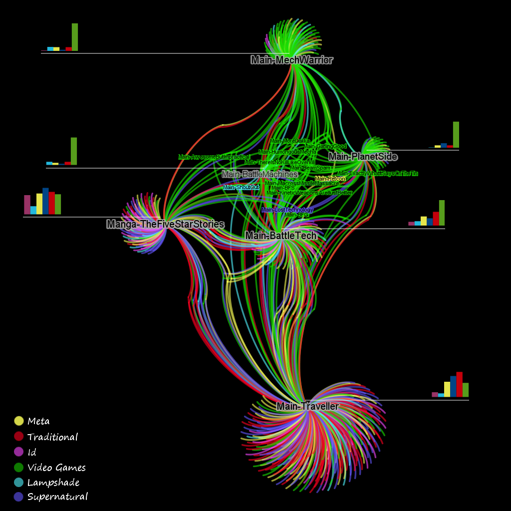
And one piece in the Data Journalism category, which consists not of a single data visualization but of my series analyzing the structure of TV Tropes. The results consisted of an analysis of similarity measures, the graph structure of the database and its suitability to visualization. Here’s an example of how I represented the TV Tropes entry for Battletech, with links by shared tropes colored by community-detected regions like “Lampshade”, “Video Games”, and “Id”:
Given the number (over a hundred) and quality of the data visualization entries, I have my doubts that I’ll place in that category. Both of my pieces are rather spartan and dealing with esoteric aspects of esoteric subjects. I hope that the complexity of the information being represented, especially with the topic model visualization, gets taken into account, but I don’t expect to compete with the modern pallettes and popular subjects. If I had a vote in the data visualization category, I’d give it to Huffman’s Columbia River System, part of his excellent series on river systems as subway maps. On the other hand, I cannot imagine a more complete and data-driven analysis of a complex and interesting modern phenomenon as I’ve done with TV Tropes, which takes apart a giant database and examines it in a four-part series, so I’m a little more optimistic about its chances.


