I’ve just finished my first Gephi plugin, which distorts a geographically laid out network to emphasize network distance. The NBM can be found here and the source code is on GitHub. The layout takes the XY coordinates of the node and maintains their angle from a defined central node but increases the distance to match network distance. This is better shown than written. It was created for Walter Scheidel, who wanted to see how the transportation network of Imperial Rome would look if subject to the same transformations he’d seen applied to the London Subway network.
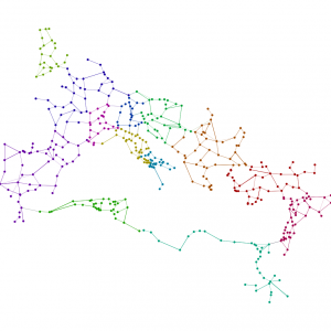
To demonstrate its function, here’s the land transportation routes in Imperial Rome:
The plugin, known as TubeMap Layout in honor of Tom Cardin’s original experiment, gives you a few options:
- Scale simply sets the pixel size of the layout
- Center Node is the Label of the node you want to set as the 0,0 point
- Extrapolate allows you to work off of existing positions and is explained in more detail below
- Log Scale allows you to output the results logarithmically, which can be seen in action below
- XCoord is the field from your data you’ll be using to plot the X Axis–typically your latitude field
- YCoord is the field from your data you’ll be using to plot the Y Axis–typically your longitude field
To demonstrate, if we set the “center” at Rome the network above looks like this:
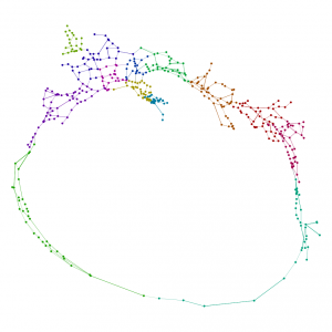 You’ll notice some geographic distortion because it’s simply plotting the XY coordinates without any projection, but otherwise we see the distortion of the network based on network distance from Rome while maintaining the angle of the point in relation to your “center”. As such, every point in the above visualization is as far from Rome as its actual network distance. Another way to see this is to color the sites by network distance and superimpose the results on a series of concentric rings, the first set to 300km distance and then doubling in distance after that:
 Everything of the same color in the above map is the same network distance from Rome. Since we have no sea routes in this network, this makes North Africa and Egypt extremely far from Rome. TubeMap Layout treats edge weight as distance, and so the above distances are based on actual calculated lengths of historical Roman roads, but the layout will also work on networks that only track “jumps”, such as this network of US Airports:
 If we run TubeMap with a major hub like Salt Lake City International (By typing SLC in the “Center Node” field), we get this:
Whereas the same network centered on JFK looks like this:
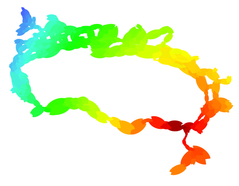
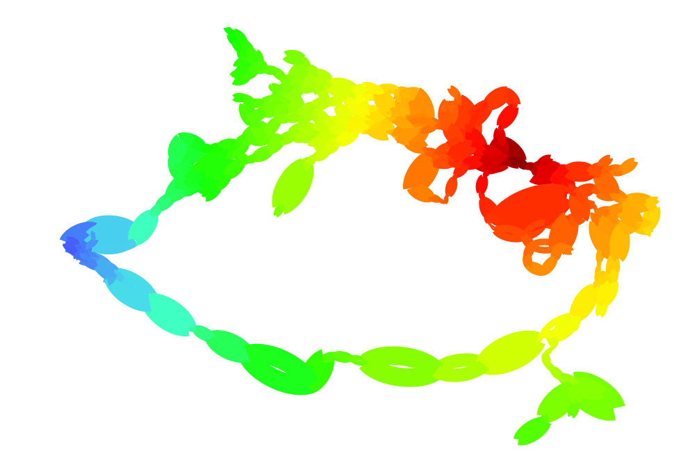
 The log-mode option gives a more exaggerated view of the network, with distant places converging at the horizon and nearby geographies hinted at, though exaggerated. The Italian peninsula, the Bosporus, England and the Nile all dominate in this case, with the remainder of the empire distant and crowded.

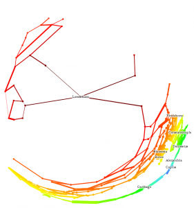

 Finally, the plugin gives an Extrapolate option, which will run the same transformation on the network as it sits in Gephi. This way one could lay the network out using Yifan Hu or ForceAtlas2 and then run TubeMap to emphasize the network distance.
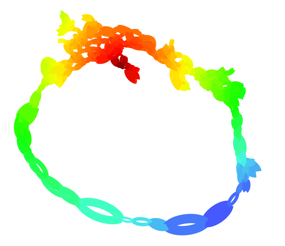
Below are a few more examples of how it works, using the network of Rome.





Very nice. I looked at the modification of the Tube map example, and I found that concentric circles helped a lot understanding the resulting layout. Probably something useful to add for the users of your layout, in the post-production stage!
Congrats for your first plugin, I admire the hard work!
Thanks, Clement. Mathieu keeps mentioning custom renderers–that should allow for automatically building the concentric circles.
Hi Elijah,
This is fantastic – can’t wait to try it out. For me personally, your example of the Roman network resonates because I tried to examine the network metrics for Roman itineraries a few years ago using Ucinet and Keyplayer. I then used Netlogo and a simple information diffusion model to look at the implications of the network for ideas surrounding Romanization. Using your plugin for Gephi & the now much more developed network models in the latest versions of Netlogo, one could get not only excellent visualizations, but also explore emergent consequences much more rigorously than I did.
Thanks so much, Shawn. Once we have time-enabled route data, I’m most excited to see how distance in the empire changes based on time of year or period. I’d love a link to the work you did to see where our research matches up with yours. Feel free to let me know if you need help getting any data into Gephi so you can try out this tool.
Hi Elijah,
I will – thanks!
In the meantime, here’s my Itineraries paper – http://carleton-ca.academia.edu/SMGraham/Papers/602645/Networks_agent-based_models_and_the_Antonine_itineraries_implications_for_Roman_archaeology