Last night, Trulia hosted a small event in San Francisco showcasing beautiful cartography. It included presentations by a host of smart people, including Mike Migurski, whose Modest Maps API has been very good to me, and Julie Sweetkind-Singer, who directs everything cartographic, geospatial and rare-map-related here at Stanford.
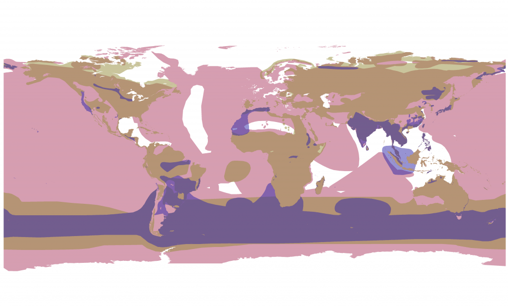
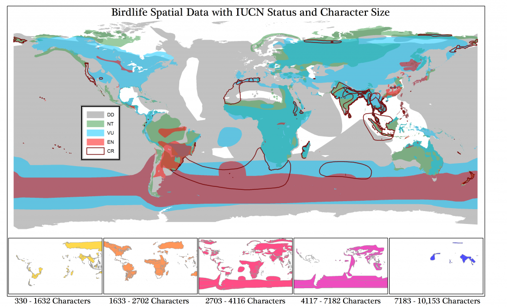
In honor of that, here are two maps based on BirdLife International’s spatial data combined with species information from the IUCN Red List, including the amount of narrative written about each species, measured in characters. The first shows only three broad categories of endangerment: data deficient; near threatened and vulnerable; endangered and critically endangered. The second includes a legend for the orthodox.
These maps are part of Ursula Heise’s exploration of the species database as modern narrative, which includes an examination of the spatial database and GIS as structures within which narratives are shaped.


