Pragmatism, Practicality, and the Anti-Sublime

Imagine an interactive JavaScript globe. It could take many forms. This one is built in D3, based off Mike Bostock’s excellent example and, like most interesting JavaScript visualization, runs smoothly in Chrome and Safari and poorly in Firefox (I haven’t tested it on IE9 and it won’t even show up on Ie8 or earlier):

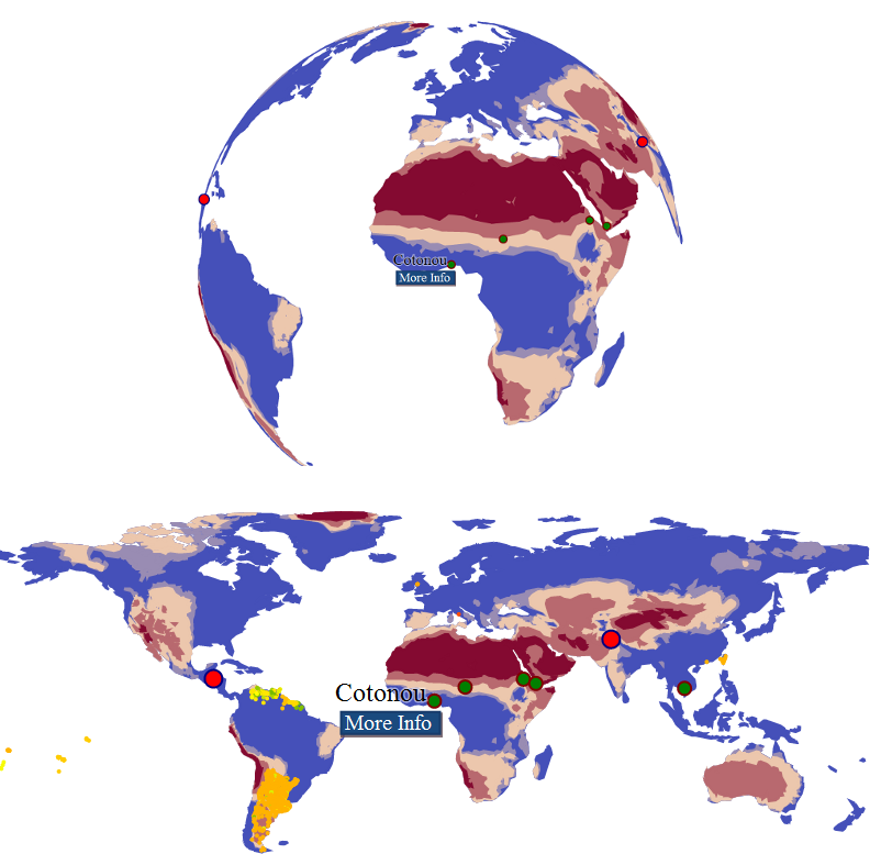
The interactive globe, typified by Google Earth, is an interesting choice to represent geographic data visualization. For datasets that cover the entire world, geographers prefer a projected, flat world, because the globe only allows for representing half the world at once and heavily distorts the edges. Here, geographers are aligned with the limitations of the code, especially for globes that run in your browser without any plug-ins. The globe above is an orthographic projection, with a point of origin determined dynamically based on the movement of your mouse. The code is quite elegant, and understanding it was an extremely valuable lesson in understanding geographic projections–another little argument for algorithmic literacy. But all that math means I’m limited in the amount of additional data I can provide. That’s why data visualizations that leverage something like this are going to provide little more additional dynamic material. If I wanted to lose the spinning globe, and utilize a traditional flat world map, I’m provided with enough additional capacity to drop a thousand or so points on the same map, to be dynamically styled based on other factors.

The above is practically all the same code and the same data (for the polygonal area and the points), also in D3, and while they’re very small, there are about a thousand or so extra dots on that map which, if you’re using a modern browser, can be tied into whatever data-driven scholarly argument you’re providing.

And yet, there’s something appealing about a globe, whether virtual or real, and I think it has something to do with its perceived physicality and the same ludic, interactive appeal found in ORBIS. You can rotate a globe, and in doing so you’re doing a sort of primitive spatial query. It adjusts and responds, providing a natural fisheye effect. I think this behavior aligns with Warren Sack’s concept of the “sublime” in information aesthetics.

…many data visualization projects can properly be called “antisublime.” But, the neologism ‘anti-sublime’ is understandable as within the bounds of what scientists and engineers discuss as ‘user friendly,’ or, more simply, as ‘easy to understand.’ This characterization of artistic data visualization as an exercise in beautiful image making to render data ‘friendly’ or ‘easy’ is unsatisfactory for most artists and designers concerned with information visualization. It is tantamount to an understanding that the artistic work is only an attempt to ‘pretty things up,’ i.e., to make computer images easy to understand.

While Sack refers to data artists, I think the same applies to any attempt to expand the boundaries of what makes a “successful” data visualization beyond simple measurements of accessibility and uptake. It aligns, in my mind, with the sense that along with the creators of data visualizations having a responsibility to craft comprehensible objects, there needs to be a concomitant push for visual information literacy through an expectation that the reader has a responsibility to put in real effort to understand sophisticated concepts. But this is more an acknowledgement of the perils of the anti-sublime. I think there needs to also be an acknowledgement of the value of the sublime from a pragmatic perspective, acknowledging that some of the traits we consider “fun” or “pretty” are actually valuable and can make it worth eschewing conventional, practical, utilitarian measures of successful presentation of data.

Posted in Algorithmic Literacy, Visualization | Comments Off

Some of My Information is Beautiful!

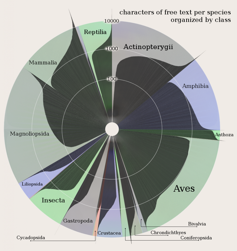
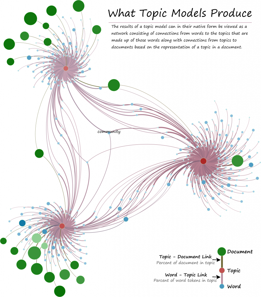
I submitted six pieces to the Information is Beautiful Awards, which is a contest for data visualization and information graphics. Of those six, I’m proud to be able to say that three of my pieces are in just-announced Long List for their categories. This consists of two pieces in the data visualization category:

Amount of writing about species by class in the IUCN Red List Database

What Topic Models Produce

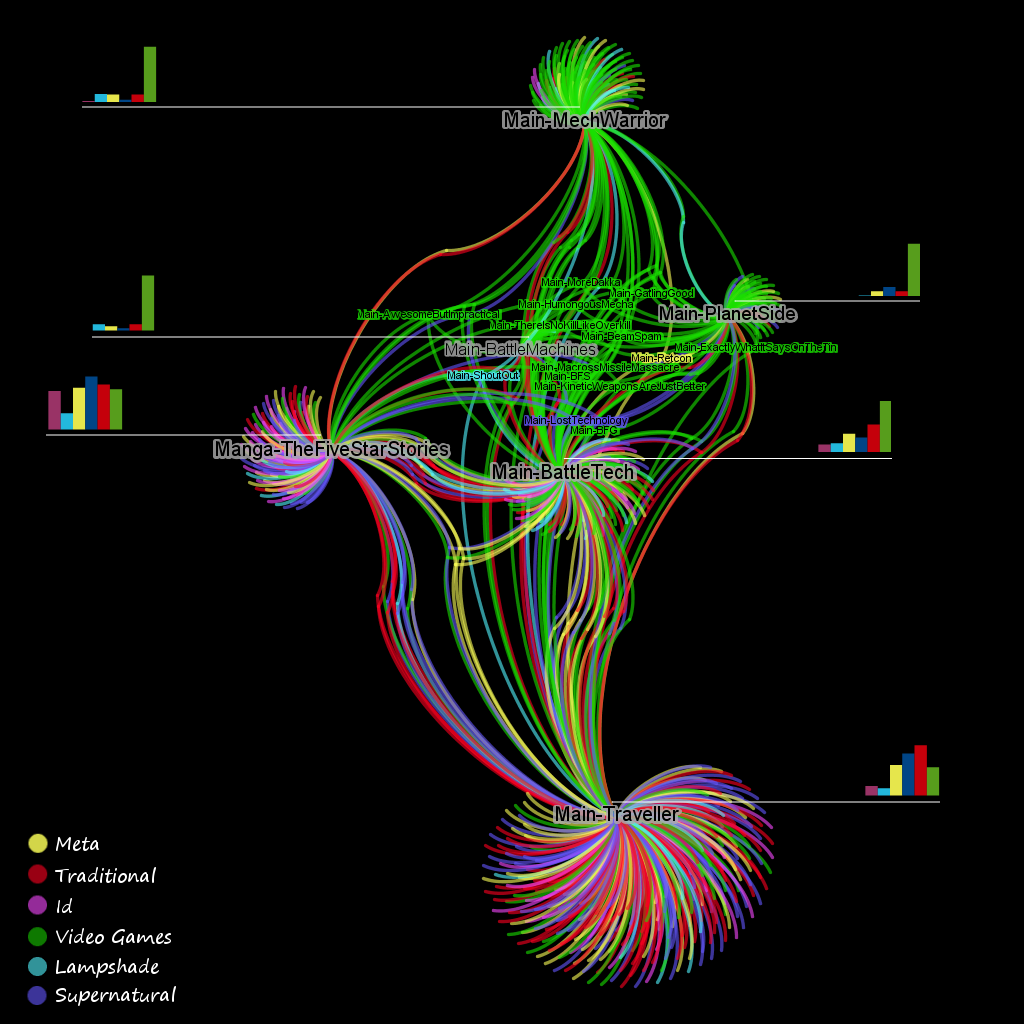
And one piece in the Data Journalism category, which consists not of a single data visualization but of my series analyzing the structure of TV Tropes. The results consisted of an analysis of similarity measures, the graph structure of the database and its suitability to visualization. Here’s an example of how I represented the TV Tropes entry for Battletech, with links by shared tropes colored by community-detected regions like “Lampshade”, “Video Games”, and “Id”:

BattleTech and connected works with legend

Given the number (over a hundred) and quality of the data visualization entries, I have my doubts that I’ll place in that category. Both of my pieces are rather spartan and dealing with esoteric aspects of esoteric subjects. I hope that the complexity of the information being represented, especially with the topic model visualization, gets taken into account, but I don’t expect to compete with the modern pallettes and popular subjects. If I had a vote in the data visualization category, I’d give it to Huffman’s Columbia River System, part of his excellent series on river systems as subway maps. On the other hand, I cannot imagine a more complete and data-driven analysis of a complex and interesting modern phenomenon as I’ve done with TV Tropes, which takes apart a giant database and examines it in a four-part series, so I’m a little more optimistic about its chances.

Posted in Visualization | Comments Off

A Map to Nowhere

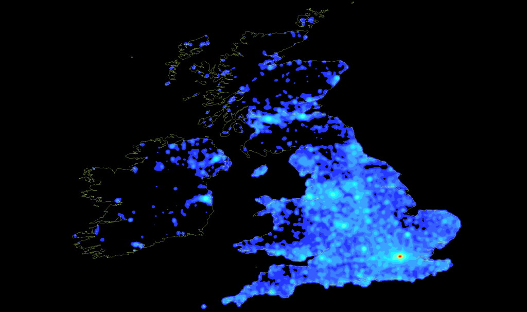
Wikipedia articles located in the UK

While the United Kingdom is the most dense region from a global scale, on closer examination it would seem that there is a sort of Hadrian's Firewall as far as Wikipedia is concerned.

The mayor of Salt Lake City recently took issue with his city being described as significantly smaller and less connected than London. There are many ways to gauge importance from a social and cultural sense, such as calculating the centrality of the Salt Lake City Airport in a network made up of world airports, or measuring the number and type of notable individuals a city produces. We struggle with just such a question of metrics all the time in the digital humanities, and so I’ve experimented with several more off-the-wall measures. One that I think provides a sense of cultural density, especially in the English-speaking world, is a measure of the quantity of Wikipedia articles associated with a place. It’s very rough, and meant to be one of the ever-useful “gestures” at meaning that are used in the humanities (while the sciences have perfected the proxy, the gesture is truly the most valuable humanities commodity). A while back, I mapped Wikipedia, or at least the geolocated articles that were easily available via DBPedia. While it’s not perfectly accurate, it does give something more than just population density. From this measurement, at least, it does seem to support the argument that London is slightly more central in the consciousness of the world from a social, historical, and cultural perspective.

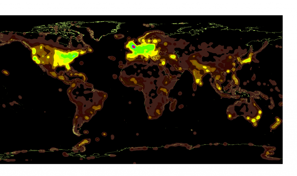
Here are a pair of article density maps of Wikipedia from a worldwide-scale. The same data is being shown, just with different coloration. The London region is in a completely different category than the rest of the world.

The world as seen from Wikipedia

The world of Wikipedia, with brighter areas having a higher density of geolocated articles.

DBpedia Article Density Worldwide

DBpedia Article Density Worldwide

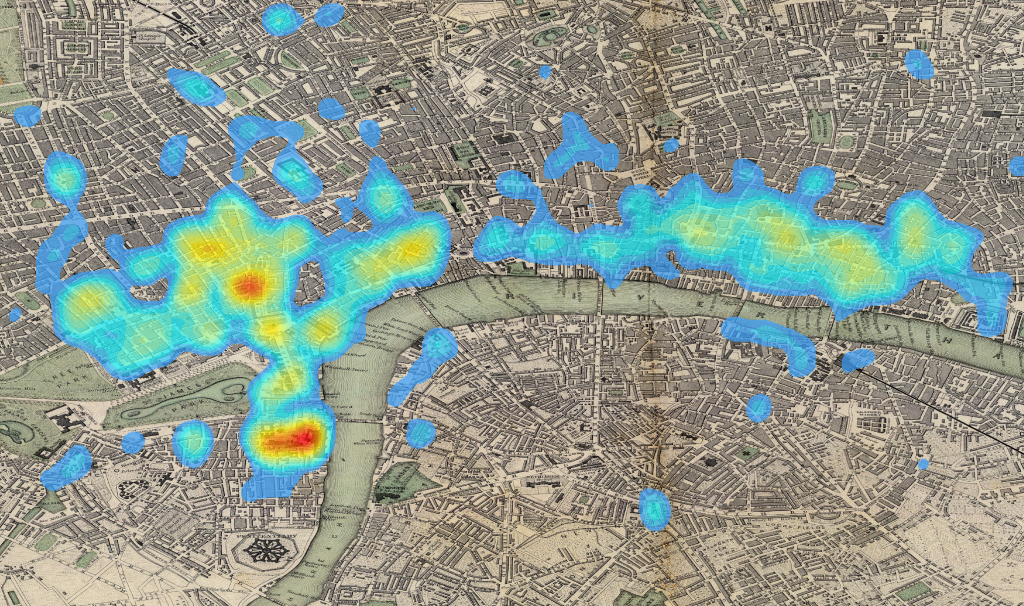
And here is a close-up of London Wikipedia article density, overlaid on a lovely 19th century map of the city, showing the densest regions within the city proper. The place where Sir Walter Raleigh’s head divorces his body seems to be of particular prominence:

Wikipedia articles located in London, overlaid on a 19th century map of the city

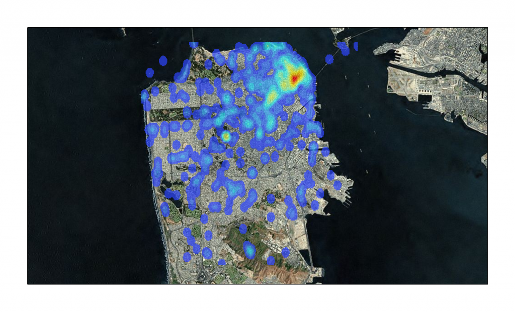
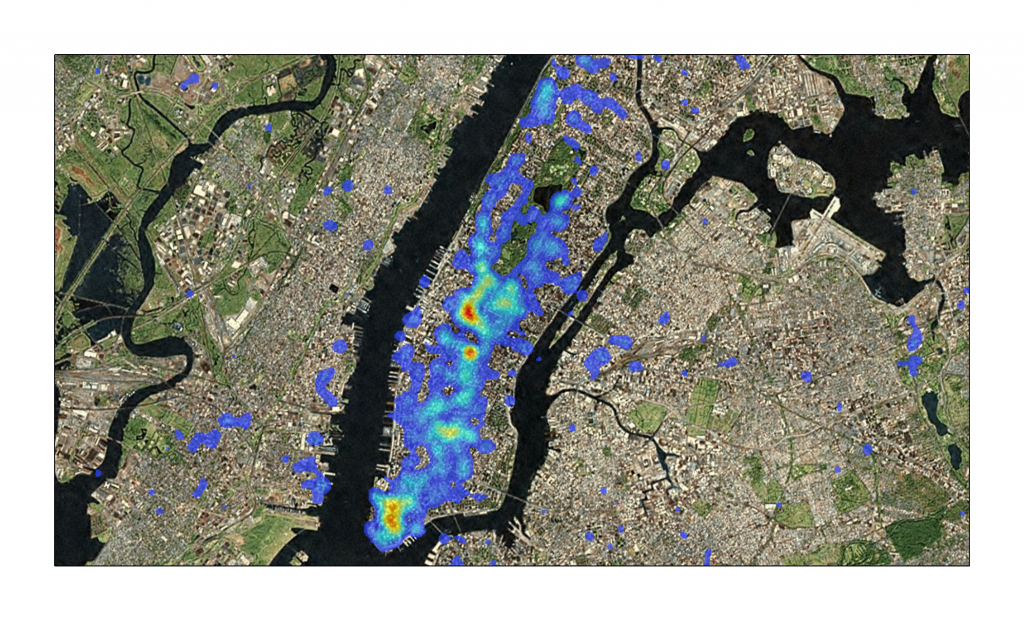
Unfortunately, I never made a map of Salt Lake City. But I made several maps of several other US cities, such as San Francisco and New York. Perhaps these will serve as selling points for their hosting of a future Olympics:

Wikipedia articles located in San Francisco

Wikipedia articles located around Manhatten

Posted in Amusing Historical Map Features, Natural Law, Spatial Humanities, Visualization | 2 Comments

An Unsatisfying Intro to D3.js

Last week I had the opportunity to give a short introduction to the JavaScript information visualization library D3. The intro, which took place at the Center for Spatial and Textual Analysis (CESTA) here at Stanford, was directed at an extremely broad audience, from skilled coders who wanted to learn a new library to scholars who wanted to better understand how information is represented dynamically and interactively. I’ve been using D3 more and more lately, for instance for the timeline in the ORBIS route-finder map, as well as for the Dynamic Distance Cartogram in ORBIS, but in both cases, these were rather simplistic uses of the library. D3.js is just one option for information visualization in the browser, and allows you to build a wide variety of rich interactive elements in your website, such as this force-directed graph I created a while back:

Still, it’s difficult to discuss a specific software library with such a diverse audience, because you want to explain to half the audience how to make something work, while explaining to the other half why it’s important that they understand how it works, and both constituencies are suspicious of the legitimacy of the latter claim. I’m convinced that there are enough faculty, students, alt-ac staff, and so on that such a general introduction is useful, but as you can tell with the title of this post, I have a my own suspicions. I’m also hamstrung by the fact that my interesting interactive material is still unreleased, and relates to the projects I’m currently working on here at Stanford.

Partly, though, that’s a dodge, since I doubt I’m a skilled enough coder to teach a real course on D3. So, while I’m happy to explain the sort of work I’ve done with it, I feel like coders who want to learn D3 should look to a pair of excellent resources: The first is a set of tutorials written by Scott Murray, who had to take a break from writing the tutorials to write an O’Reilly book on web visualization (which I expect will feature D3 prominently). The second is an interactive tutorial written by Vadim Ogievetsky, which demonstrates many of the most interesting features of the library.

As a point of reference, I used to code in Flash/Flex and really enjoyed ActionScript3, so my adoption of JavaScript (js) for information visualization was slow and cantankerous. I didn’t like the performance of js, or the way that it was structured or the coding environments or any number of other complaints that were, on reflection, rather naive. I’m not a software engineer, so I have no idea about professional or theoretical reasons why one language is superior or not, and my non-perfomance-related reasons for avoiding js boiled down to my comfort with the syntax and structure of ActionScript3.

The performance issue is still an issue, though, as is compatibility. D3 runs best on Webkit browsers (Chrome and Safari) and not so well on Firefox and not at all on Internet Explorer 8 or earlier. This is because D3 relies on scalable vector graphics (SVG) to render its graphical content, and SVG has only just begun to be supported as of IE9. Technically, you can use D3 to manipulate div elements and color them and thus show working dataviz on IE8, but I think it’s fair to say that D3 is not a suitable solution unless you’re comfortable losing anyone with an older browser.

Vector graphics like SVG are textual expressions of shapes that are displayed by your browser at runtime. They have numerous benefits, not least of which is that they can be styled and interacted with like any other element on a website, and also provide humanists with the pride of knowing that their visual objects are fundamentally textual. So for instance, to draw a circle with D3, one would code:

circle.attr("r", 5).attr("fill", "blue").attr("stroke", "red")

Which is the equivalent of telling the browser in natural language to, “Draw a circle with a radius of 5 [pixels] that’s blue with a red outline.”

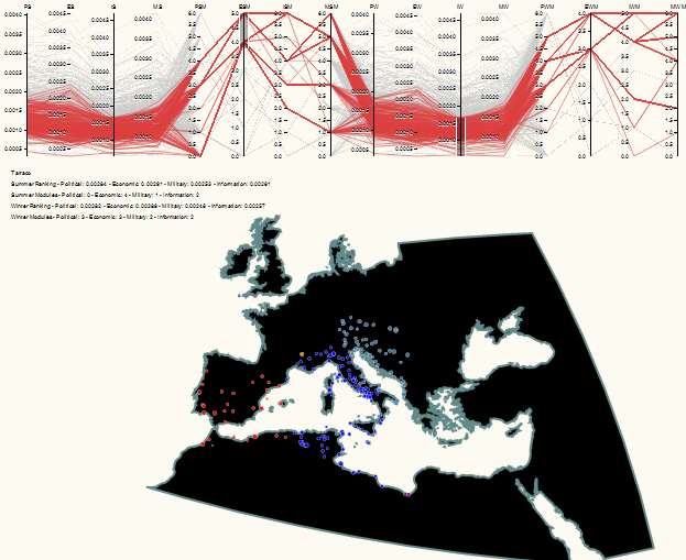
There are other ways of displaying this kind of content in the browser, such as using the canvas element or using VML, which are especially attractive because they overcome the compatibility issues with a pure SVG solution. JavaScript libraries like Raphael, JIT, and Protovis are all alternatives to D3 that use canvas or VML or both. I prefer D3, which seems cleaner and thus more amenable to the non-standard data visualization that typically occurs in the work I do. D3 also has robust support for geospatial visualization, and so it’s easy enough for me to use similar code to show flows, networks, globes, flat maps, or parallel coordinates. This makes it easy to chain together, for instance, a map of sites in ORBIS and a parallel coordinates system that lets me analyze sites having divergent centrality values based or community membership that is determined using different definitions of edge weight.

Parallel Coordinates and Geospatial in D3

Or to represent data using an interactive globe alongside or in place of a traditionally projected world map.

Globe versus flat

The globe spins, but there’s no way I could place 1000 tiny circles on it like I can on a flat map, so there are trade-offs within the trade-offs. At some point, I’ll actually manage to demo the interactive forms of all of these, and hopefully they’ll have a well-designed interface.

Posted in Algorithmic Literacy, D3, Visualization | Comments Off

Humanities CMS

It’s a good time to be humanities scholar in need of a complex content management system. While WordPress in all its convenience and glory will always be there for the writer who simply wants to write and publish digitally, there are more complex CMSes for the rich display and collaborative creation of humanities scholarship that are growing in accessibility.

Neatline, which is a set of geospatial and temporal extensions to Omeka, is now available to give scholars out-of-the-box capacity to represent complex and sophisticated collections of spatiotemporally-annotated information. I hope to soon put up an extensive review of Neatline, which I’ve been working with for a few months now for two projects here at Stanford, with a third in the process of getting set up. Any digital humanities scholar thinking of creating and presenting rich data should try out Neatline.

There’s also a little thing called Drupal, which while being far more extensible, is also far more intimidating. Quinn Dombrowski and I are in the process of writing (out in the public) a manual on how to use Drupal, oriented toward humanities scholars. Drupal for Humanists is rather rough right now, but will progress and grow to explain this robust content management system for the domain of humanities scholarship. I want to stress here that my role in this is very much an “and bordering on with” because Quinn is far more of the Drupal Guru here than I, with my real contribution coming in an explanation of how to use Drupal’s surprisingly robust spatial data capabilities.

As a note, the forhumanities.org domain was registered with the intent that any digital humanities scholar that wanted to build a similar manual for other tools or methods in the humanities (Whether it was Network Analysis for Humanists or Gephi for Humanists, or Text Analysis for Humanists or MALLET for humanists) would be welcome to do so.

Posted in Drupal, Spatial Humanities, Tools | 1 Comment

How the UVA Crisis Can Help Us Break Out of the Upgrade Path

This year’s eyeo festival focused not on beautiful information, or on amazing new visualization libraries, or data transformation techniques, but rather, as Megan Miller put it, on failure and slow data. That’s horrible, isn’t it? It’s wrong, or at least somehow antithetical to the upward-and-onward march of progress through technology* that acknowledges everything will be out-of-date in 18 months. Of course, slow data isn’t about baud rates and failure isn’t really failure–rather, these are movements toward longer, more contemplative engagement with data and the process of processing data. As I’ve mentioned before, I think the overwhelming amount of data and its incredible growth rate means we’ll have to move away from concepts of data management toward less idealistic terminology (such as “data harnessing”) to reflect the change in how we deal with innovation, data, digital integration, and the rest of that messy tangle midwifed for us by a man whose 100th birthday just passed.

Would that Alan Turing could have seen the effect that computing machines have had upon people, most especially those people who little understand them. I think it is no longer controversial to recognize how completely out of touch the University of Virginia Board of Visitors must be to look at their university and blanch at its digital pedigree. Instead, they relied on the notion that all is in constant flux toward the next big technological shift, despite the fact that there is growing evidence among data practitioners that the shift is actually social, inward, and philosophical. Digital artists increasingly look toward 8-bit aesthetics, information visualization is hand-drawn with colored pencil or made to resemble textile patterns (or made into textiles), humanists and OpenGeo developers increasingly distance themselves from traditional GIScience, and network visualization and analysis continues to be used in reprehensible fashion by madmen who little understand the dangers of a tripartite hypergraph.

The slow growth of digital innovation at UVA has produced remarkable success and resources technological, theoretical, and personal, all of which I have looked to in trying to achieve success in digital humanities work here at Stanford. That this would be ignored, and hastily set aside in the pursuit of some kind of poorly-understood Massively Open On-line Course, or other Great University-wide Upgrade, is yet another example of university leadership mobilizing to fight the last war.

What if the upgrade cycle no longer defines digital innovation? What if certain technologies and methods are mature? It makes more sense to interpret the popularity of Massively Open On-line Courses as a sign of the stabilization of Internet-delivered content, rather than some ground-breaking innovation that would result in a Khan Academy Google Doodle a hundred years from now. If that’s the case, then institutions like the University of Virginia should be on exactly the opposite course, not trying desperately to catch the latest wave but rather promoting the slow growth of their existing, successful digital initiatives. This could be called “incrementalism” but I prefer the term “slow innovation” and it focuses not on identifying hot, new trends, but deep investment in digital commodities, by which I mean the infrastructure, expertise, and research that utilize the growing stable of mature methods, libraries, and technologies. That’s what the university should do, and the library in particular, which then affords motivated scholars the opportunity to expend their effort on sophisticated, pathbreaking work. How do I know this would work? Take a look at the incredible work coming out of the University of Virginia as a result of its sober and long-term commitment to digital innovation.

One of the great signs that universities might be moving away from an infantile fascination with hip, technological boosterism is that the justification for removing UVA’s president has been almost universally derided as hip, technological boosterism. Much of the professional and scholarly academic community that I’m exposed to has grown quite comfortable with that which Turing’s machines have wrought. As a result, they and the digital natives they teach are much less willing to treat it as magic. I’d like to imagine that there was an intuition among the staff, faculty, and student body that the upgrade path is broken, and that appeals to it should be enshrined as a particularly modern logical fallacy. But I don’t know how much of this had to do with the reaction to the mess at UVA, or how much of it had to do with neo-Jeffersonian angst, or even how those would differ. It’s my hope, though, that one of the lessons we can take from this debacle is a more mature view of digital innovation in academia.

*Like better living through nuclear energy.

Posted in Natural Law | Comments Off

Introducing ORBIS|via

The following also appears in the Applying page of ORBIS.

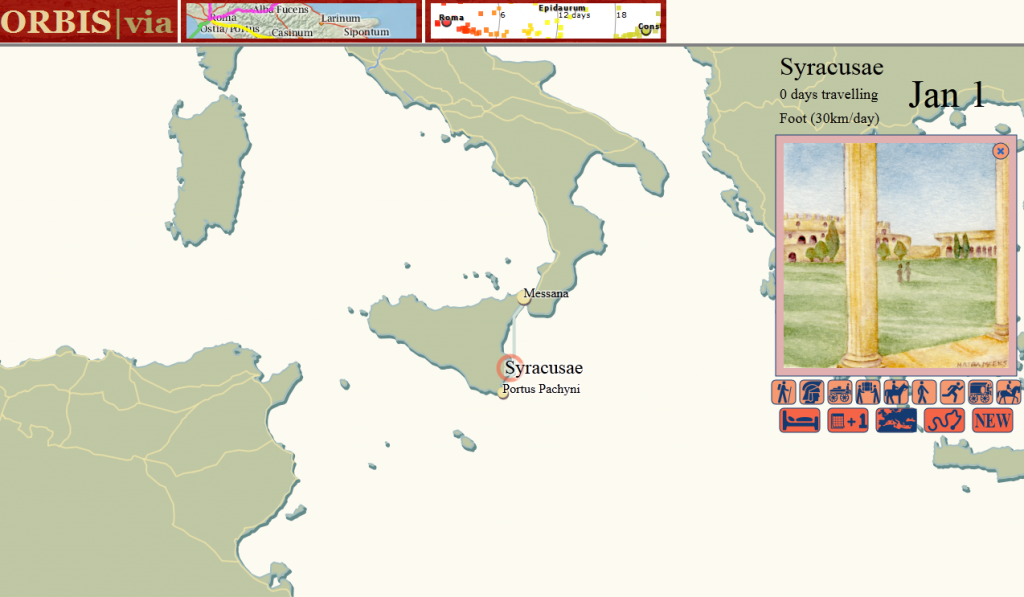
Syracuse in ORBIS|via

ORBIS|via: A Situated Perspective of a Transportation Network Based on Computer Gaming Principles

ORBIS|via can bee seen at orbis.stanford.edu/via/

The initial response to the release of ORBIS: The Stanford Geospatial Network Model of the Roman World has relied on the use of metaphor to describe the type of knowledge conveyed. This is typically demonstrated by descriptions of ORBIS as a “Google Maps for Rome” or its equivalent.[1] That there now exists an entire genre of interactive network transportation models, and that they are common enough (and commonly understood enough) that such an abstract thing can be expressed rather easily, is in large part the reason for the broad popularity of ORBIS.[2] The effectiveness of ORBIS in its ability to relay complex information about the transportation network of the Roman World is dramatically enhanced by how literate modern society is in transportation network models. It stands to reason that, if the purpose of scholarly publication is to be as effective as it can be in presentation of knowledge, then the existence of these ready metaphors should be taken advantage of in digital humanities scholarship whenever possible. This may lead to a “Twitter for Trees”, or a “Facebook for Dead People”, which, while sounding frivolous, would take advantage of the ubiquity of complex software representation of various phenomena having raised the literacy in such phenomena (such as social networks or correspondence networks) if presented in the manner of these emerging genres.

In the case of ORBIS, another significantly large category of responses focuses on a different metaphor: gaming. Users of ORBIS have suggested that it would be useful for improving strategy games and wargames, such as the expected sequel to Rome: Total War. Similarly, gamers in different media, such as pen-and-paper role-playing games, have pointed to the usefulness of ORBIS in generating fantasy worlds as well as better understanding pre-modern travel conditions. While these all evaluate ORBIS in its capacity to improve games, one individual game continues to be mentioned in the same metaphorical space as Google Maps: The Oregon Trail.

Originally written in 1971, The Oregon Trail is a simulation of travel from the east coast of the United States to Oregon territory in the 19th century. Popular in schools in the late 1970s and 1980s,[3] The Oregon Trail simulated various aspects of travel, including illness and injury to travelers and their draft animals. Along with a simple description of locations along the eponymous trail and the travel between them, it gave players a few mini-games based on hunting, river crossing, and rafting. It is, in a sense, entirely unlike ORBIS, which presents the Roman Empire as a modern structure from a strategic, not situated, perspective.[4] But in another sense, ORBIS is very much like The Oregon Trail, and not just because it shares the subject matter of historical travel. Users of both intuitively understand that The Oregon Trail is a network–albeit a simple one with only a few branches–and that they are making decisions about how to traverse that network. This situated perspective within the network provides a different point of interaction with its structure that allows users to experience the network model in what is obviously a memorable and intuitively powerful manner. ORBIS|via provides such a local view of the ORBIS network, to complement the strategic view offered by the route-finding map and the world view offered by the dynamic distance cartogram.
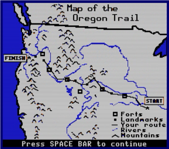
The Oregon Trail game map, emphasizing its network characteristics.

The Oregon Trail game map, emphasizing its network characteristics.


There are no gamified elements in ORBIS|via, either from the modern perspective of using gamification to provide users with rewards for desired activity or in the introduction of simulated activity within a ludic framework. This was considered and tested out in various iterations of the work. One possibility was the “random danger” model in The Oregon Trail often referenced by players (as well as ORBIS users). Travel between sites in the game triggers random events drawn from historical dangers such as wildlife and disease. While it would be easy enough to replace consumption with the Antonine Plague; “pepperony and cheese” with The Dying Gaul; and snakebite with huns; this didn’t seem like it would add any meaningful value and would only highlight how far from being a game ORBIS|via really is. The only game-like elements are those that emerge naturally from the model, such as choice of vehicle and path.

A simple mercantile model was considered, with users purchasing or extracting resources at one site and then actively traversing the network to sell them at another. But there is little in the way of reliable, data-ready resources that describe the Roman Empire from an economic or demographic perspective, though groups like the Roman Economy Project are working toward rectifying this. Additionally, there is already marked confusion about interpreting the cost to move goods and passengers in the ORBIS route-finder.[5] With these factors in mind, only travel speed is accounted for in ORBIS|via.

These and other expansions in functionality were also avoided because they would require more research and domain knowledge than was available for ORBIS|via, which was designed to demonstrate the multiple points of interaction afforded by models in the digital humanities, and not to provide a fully-realized piece of educational or entertainment software. As such, it will likely not satisfy fans of The Oregon Trail who expect to ford the Rubicon. But as a demonstration of the flexibility of models it provides a significantly different view on the same digital object while still maintaining a focus on the subject of the model: the shape of the Roman world.
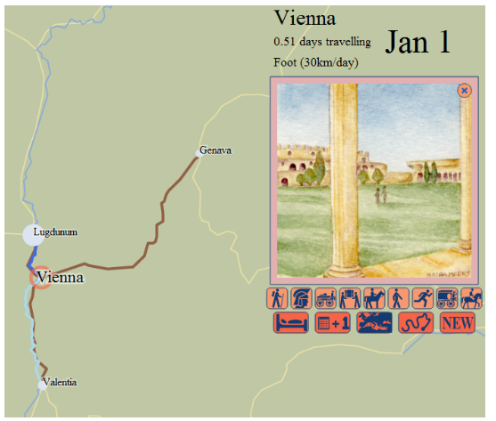
The watercolor vignette signals to the user the mode of travel and the site ranking.

The watercolor vignette signals to the user the mode of travel and the site ranking.

Some game elements are maintained within ORBIS|via. Most obviously, the use of illustrated vignettes to symbolize the type of travel and site was a common method in early computer games before storage and processing allowed for fully animated 3D worlds. In this case, the vignettes are used to highlight the pastoral nature of the Roman world, in contrast to a depiction that focuses on the urban environment. The use of icons to represent the restricted activity that a user can perform enables a highly abstract and simplified interface.[6] By emphasizing the time of year and the duration of travel, ORBIS|via reinforces that a situated perspective of the network depends not only on the speed and location of the individual in it, but also the period in which the travel takes place. A tally of activity within the network, both in the form of the path of travel as well as some simple statistics about modes, is also a common game element.
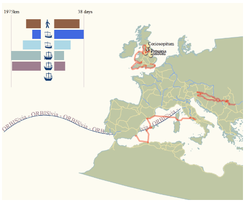
The path of a user's route selection and the summary statistics for the time and distance spent on each mode of travel.

The path of a user's route selection and the summary statistics for the time and distance spent on each mode of travel.

As big, linked, spatial data becomes more familiar to scholars and developers, the integration of such data into projects, as well as the integration of means to allow data from such projects to link with others, becomes paramount. It stood to reason to demonstrate some data integration despite the inability to discover any readily available demographic, environmental, or economic data for the period and region. To that end, travel between sites in ORBIS|via provides a simple list of locations from Pleiades as can be found within a small buffered zone around the path of that segment, with links to the Pleiades entries for those points. This is only a crude example of the integration of datasets for interactive scholarly works, but it provides some indication of the kind of work that is possible. 
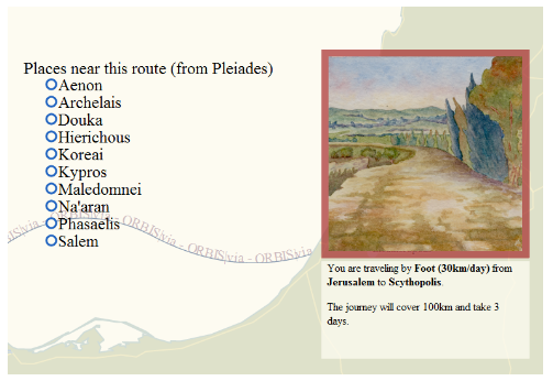
A list of up to ten sites from Pleiades that are located within a 15km buffered zone around the route but not within a 15km buffered zone around the start and destination sites.

A list of up to ten sites from Pleiades that are located within a 15km buffered zone around the route but not within a 15km buffered zone around the start and destination sites.

The situated perspective is not simply a tool for entertainment or education. Its creation and testing revealed errors in the network structure that were difficult to discover when examining the network as a database or using the route finder. What a situated perspective into a historical transportation network can provide beyond that is the capacity for located, temporal, personified perspectives of structures within the network. This is especially useful where events are modeled, as the situated perspective provides a ready and comprehensible filter for events. Perhaps the most useful aspect of the situated perspective is that it provides scholars with a theoretical framework for designing and testing agent-based models.

Notes

  1. Other metaphors for ORBIS gleaned from press and comments are: Das “Google Maps” der Antike, Een TomTom voor het Romeinse Rijk, and Stanford’s Mapquest for the Roman Empire
  2. This was expressed rather succinctly by Rebecca Rosen in her article in The Atlantic.
  3. I wrote this without having first heard of situated perspective as it is used in computer and cognitive science. While a brief review of its use in those areas seems to broadly agree with my use here, I simply mean to situate a reader or user within a digital object, providing them with a view of the network “on the ground”. When I was originally considering this concept, I referred to it as a “first-person perspective” but felt this was too limiting.
  4. The Oregon Trail continues to be popular, spawning versions for the Wii, iPhone and Facebook, among other modern platforms.
  5. ORBIS lists costs for routes when speed is the determining factor (the fastest option) but that cost assumes either a carriage for private travel or a donkey or wagon for grain. Despite noting this in the documentation and the results, users often refer to the expense to transport passengers via 24-hour horse relay or military march. The price per kilogram of grain is also sometimes confused with the price for passage of an individual. Another ambiguating factor of the price to travel is that it represents, in the case of passengers, a price that would not be paid on land if the traveler used their own vehicle. A later revision to the ORBIS route-finding interface will attempt to highlight these factors.
  6. ORBIS|via uses icons from The Noun Project, all of which are public domain or CC0 except:
    1. “Horse Riding”, Marc Serre, from The Noun Project
    2. “Bed”, Christopher T. Howlett, from The Noun Project
Posted in Digital Scholarly Work, ORBIS, Spatial Humanities | 2 Comments

Population Intensification, Agricultural Intensification, Ecological Degradation, the Game

Looking back over some old notes of mine, I was reminded that I made this game in Flash three years ago:

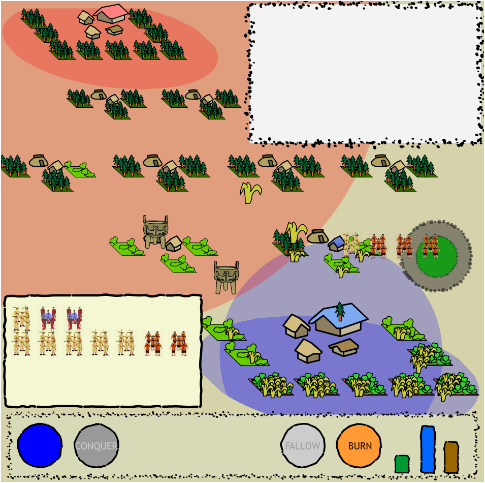
Socio-Ecological Processes as a GameYou control a small early historical site surrounded by virgin woodland. The forest provides lumber, but if you burn it down, you can use it for agricultural production. Of course, the forest provides enough food to maintain a small population, but not enough to allow for specialization. Once you’ve begun to specialize, you can flip your farmer units into military or political specialists, the former can be sent out into nearby villages to conquer them and the latter send out trade goods and increase your sphere of influence. It’s necessary to increase your sphere of influence because otherwise conquered neighboring villages will quickly revert to neutral status.

But what separates this from a typical game of conquest is that all the while the fragile ecosystem you inhabit is suffering. For instance, when you first burn down a fully forested square, you’re given agricultural land with soil rich enough to provide abundant crops, but continuous cropping depletes the soil and results in lower and lower yields, forcing you to bring more land into production just to meet the same food production requirements, but since your increased production has caused increased population, there is even greater pressure to provide more food, which necessitates conquering nearby villages to burn their forest to bring more land into production.

It is an attempt not only to show this socio-environmental feedback loop but also to illustrate forest fallow and brush fallow cropping (as per Boserup’s definition), since you can let the land sit fallow until it is restored to forest, at which point you can burn it to fertilize it, or, if there is too much pressure, burn it when it has only grown back to brush. There are other factors, regarding trade and the need for lumber, all of which try to reinforce the pressures on early cultures and the resultant administrative and social technologies that arose from the transaction costs of managing such a turbulent system.

To be very clear, it isn’t much of a game, and is likely incomprehensible and not fun, but it’s embedded below, in case there’s some desire to see it in action. As a teaching tool, something like this (though better realized) would be capable of presenting several complex systems principles to an undergraduate or even high school or earlier audience, but it is in the formalization of claims as to how certain historical processes work that most interest me. By building these small, abstract models, we are forced to define basic processes beyond a prose explanation that, while sophisticated, is ultimately unable to be integrated into large, interactive representations of historical systems.

Posted in Algorithmic Literacy, Digital Scholarly Work, Gaming, New Aesthetic, Pedagogy | Comments Off

CC-BY for Icons?!?!

A cast of thousands of attributions for icons

I'd like to take a moment to thank the several dozen people who helped make this possible by drawing icons...

I just submitted a few nouns to the Noun Project, which is the right thing to do considering I’m using a few of their nouns in a new project. When you submit your icons to NP, you have two options: CC-BY and CC0. CC-BY has become the standby for design good guys, and you can see that hold true if you browse through NP’s catalog of icons. CC0, on the other hand, is public domain.

At first, I thought what everyone thinks when they’re about to license something they made: “Attribution has value.” Which is well and good, until you think about what icons are used for and how they’re used. CC-BY for an artistic piece that will be used to derive another artistic piece is great, and manageable, and will end up with a nice little attribution that fulfills the above value proposition and doesn’t place an onus on the usage of your work that precludes its integration into further works.

But icons are used in great numbers and as a result I think CC-BY for icons causes damage to their usage and thus to the free flow of information that Creative Commons licensing is meant to support. I don’t think the intention of icon creators is to force a developer into keeping a long attribution list so that every little star and Roman helmet that appears in my interface can be pointed back to an individual creator. It’s absurd that I’ll need a blockbuster movie-like credits roll because I want to use a couple dozen icons in an interface. I’d prefer even a no-attribution but viral (like GPL) license over CC-BY, and for my own (paltry catalog of currently four) icons I’m using CC0.

So, please, for common sense and usability, CC0 your icons, don’t CC-BY them.

Posted in Algorithmic Literacy, Natural Law, Visualization | Comments Off

Catastrophic Success

There have been a few times over the last two weeks when I thought traffic to ORBIS was finally leveling off. The novelty factor of the work is high–there are very few Imperial Roman Mapquests, or Google Maps for Rome, or Ancient Roman Garmins, or other interesting attempts to express what the site does that’s just so intriguing. And I’m perfectly happy to take advantage of novelty to raise the profile of digital humanities work, the work done here at Stanford, and especially the work being done by modern university libraries. But while I’m sure that there will be a general level of traffic to the ORBIS site that will be lower than its honeymoon peak, that honeymoon peak is starting to get serious.

ORBIS traffic as of May 25thArticles in Bild, The Atlantic, and the Daily Mail have raised the visibility of ORBIS among traditional audiences, but the true drivers of traffic are places like io9, Ars Technica, Fark, Reddit, Facebook, and Twitter. As a result of all this traffic, I’ve had to learn about Varnish and pgpool-II, and otherwise learn what goes into making web sites that receive more than a couple hundred visits a day. ORBIS has been able to handle its unexpected popularity with the timely support of Digital Library Systems and Services, which has had experience building and running high-traffic, production sites. It’s gotten to the point, though, that we’ve left up the generic warning about site performance. By June 5th, if we make it that far, we’ll have a much more robust infrastructure in place to support ORBIS and other interactive scholarly works like it. As someone who has been arguing that it’s the right time to pursue this kind of infrastructure, I feel exhilarated and not a little terrified.

Only time will tell if ORBIS maintains any significant portion of its current popularity but if it does, and I think it will, then it signals something as exciting as the popularity of Stanford’s massive on-line courses. ORBIS is still a rather crude example of what an interactive scholarly work can be, but it evokes such enjoyment from readers that they actively engage with and share it. As Rebecca Rosen described in the Atlantic:

Rather than encounter history as a linear story, we see it as a world more like our own, one in which we’re actors with sets of competing choices laid out before us.

In this sense, the interactive nature of ORBIS, and that it uses a standardized format to present that interactive nature, is not really novel, but simply expressive of knowledge in a format that readers are now more accustomed to receive. Presenting geographic network information in the form of a tiled map with a route-finder interface is actually not new or exciting, just as putting symbols, in ink, on paper is not. Rather it’s the right format for the expression of this kind of knowledge and, more importantly, a format for which we can have high expectations of literacy.

There are many timelines that have been torn asunder by the response to ORBIS, and I’d like to take a moment to point out that we will be releasing the code, not only for the site but for all the PostGIS functions and PHP data services that it requires, so that anyone can build their own version for another state or period. There is also one more component to ORBIS, a proof-of-concept view into the network from a different perspective and inspired by other media, but we can’t turn that on until we’re sure that we can handle the increased traffic.

Posted in ORBIS | Comments Off