ORBIS in JDH

The Journal of Digital Humanities came out with Vol. 1 No. 3 today, which includes three articles about ORBIS. Two of these are written by Karl Grossner and myself, and consist of an introduction to ORBIS and an examination of ORBIS and interactive scholarly works in general. The third is a review of ORBIS by Stuart Dunn.

If this keeps up, it might one day be feasible to list interactive scholarly works on a CV…

Posted in ORBIS, Peer Review | Comments Off

The Digital Humanities as a job at Stanford

Stanford has been hiring digital humanists for some time now, though only occasionally by name. It’s currently looking for another, though the title is technically Academic Technology Specialist for History. I’ve heard some trepidation about this position, and positions like this, from several constituencies. The first is a general insecurity on the part of possible applicants in regard to the technical requirements of the position, which I think is an outgrowth of the general disciplinary insecurity in regard to the digital humanities that Ted Underwood engages with. Let me then sacrifice myself at the altar of truth for the sake of undercutting some of this fear: I’m a terrible programmer. The one programming language that I felt comfortable with when I got to Stanford (ActionScript3) is now extinct. I struggle with understanding how network analysis statistics work, even though I’m called on to explain them to very smart people. I only took a few classes in GIS and when I got to Stanford, I didn’t know anything about the spatial analysis world beyond ArcGIS. On top of all that, I’ve been working with real professional web designers lately and so now I have to find out on an almost daily basis that I know practically nothing about design.

And still, I did all right. You can, too. If you’re creative, and you get it, and you’ve got some experiencing doing sophisticated digital stuff with humanities research, then you can come to Stanford and do good work. To be clear, if you’re a programming wiz and you were snickering at me through the entire last paragraph, then you should still apply for the job, but so far the number of DH people who laughed at my “I learned how to multithread in Java” joke is in the low single digits, so I assume you guys don’t need this kind of advice.

But there’s a second reason I could see why this position is worrisome, and it’s because it’s #alt-ac and that means taking a position like this kills your chances of being tenure track faculty. Sure, it pays double what a post-doc makes, but a post-doc is still respectable to the right people, and being staff means you’re forever looking up at the faculty. I don’t think that’s the case, though, especially with jobs like this ATS position, which has its feet firmly planted in research support. Part of the job description describes working with CESTA, which is a federation of DH labs here at Stanford that involves the Literary Lab, the Spatial History Project, and Mapping the Republic of Letters. That’s a lot of opportunity for a young scholar to make connections and pad their CV with interesting research, and then take off for a job at whatever university is doing their DH cluster hire in 2016. Or maybe you’ll find out that you’d prefer to work at Google or Apple.

Regardless, the position is one of a number of DH roles here at Stanford, among a thriving community of practice full of folks with a proven track record of success in most everything that defines DH.

So apply for the job, already.


Posted in Digital Humanities at Stanford, Natural Law, The Digital Humanities as... | Comments Off

On blogging

more people have read my shirt than read your blog

-a t-shirt

Criticism of blogging is nothing new. As a self-published platform, the medium itself connotes a lack of standards, editorial control, or peer review. And, while it makes sense to maintain a blog when one is outside an industry that rewards writing, it might seem wasteful to do so within academia, where time spent writing could be time spent writing content for traditional publication. This tension, and others, bleeds into the medium itself, and causes people to describe anything that uses WordPress for its CMS as a blog. The Journal of the Digital Humanities, for instance, uses WordPress to publish a traditional scholarly journal, and is in no way a “blog” in the traditional usage. But I’m less concerned with the state of on-line publishing and more with the typical, mockable blog. Blogging continues to be attractive among DH scholars (both #alt-ac and faculty)–despite its being so contingent, and easily mocked, and widely regarded as a low priority for prospective scholars. It’s attractive enough that there can be pressure put on staff and faculty to maintain and contribute to blogs because it raises the visibility not only of the individual but of their department or unit or project.

I’m not sure where I stand on this kind of policy. I created my blog as a repository for work that I do, out of a legitimate concern that my portfolio or CV may not accurately reflect the level of scholarly or creative effort I put forth in my time here at Stanford. Without tenure, research developers have great pressure on them to constantly produce. We cannot trot out the same old tool developed years ago and dusted off for each conference, nor spend years working toward an uncertain goal that may prove unprofitable. While the former is not a situation I would ever strive for, the latter is one of the basic premises of tenure and extremely attractive. I prefer base funding–the pay is better and it makes more sense from an institutional perspective–but the alternative of a poorly paid and fragile post-doc or other grant-driven mechanism at least affords the opportunity for the latter.

Part of the reason why I find the time to write here is because of priorities. Data, data modeling, and data manipulation seem more aligned with what I do than trying to extend arguments in a traditional humanities field. Much of it is liminal and draws broadly from different fields, methods, and practices. In that sense, the blog serves not only as a record of my work, but as an exploration of topics held to a broader but not necessarily lower standard of review, by academic and industry professionals.

Maintaining my blog has brought me an unexpected level of visibility and (sometimes) credibility. The growing movement toward review and acknowledgement of blogs by such organizations as HASTAC and PressForward makes this situation even more striking. But it’s sometimes hard to take myself seriously when I look over the history of my posts. The culture of the Internet inflects this medium and my writing such that entries can consist of little more than a grainy screenshot of Bo Jackson from Tecmo Bowl, or are written more as notes to myself than a coherent narrative. Hipster Kitty and Yo Dawg surely bring down the average quality of my posts from the perspective of traditional scholarship, though perhaps they act as signaling to the broader digital culture of another kind of credibility. I’m not sure.

That said, if you look at the quality of each individual entry put together by someone like Scott Weingart, you can see that not all of us are littering our blogs with advice animals. Compared to my own oscillating from stream-of-consciousness to code investigation to almost-academic-discussion, Scott comes across as a one-man Journal of Literary and Linguistic Computing. That said, it’s my hope that the willingness of the scholarly and professional community to accept the unevenness of my own blog can be seen as liberating to other prospective bloggers who feel incapable of writing sober mini-articles every week.

As I’ve already alluded to, blogging is both communication and documentation. I’m always in favor of public documentation of theory and practice in the digital humanities, but anyone who’s taught knows how well writing assignments can turn out. There’s nothing worse than a blog that’s just a series of status updates followed by five months of silence, then a short article, and then five more months of silence. It’s doubly worse if someone is active in Twitter, G+, or Github, and they’re tasked with maintaining or contributing to a blog because the former are misunderstood or undervalued. But I think the act of public, long-form writing is also intimidating when it shouldn’t be. I’m sure I’ve made a fool out of myself several times with my blog, whether by exposing some basic humanities or coding concept that I don’t grasp, or by posting pictures of a cat in a sweater, but that has apparently not so damaged my reputation among my peers as to counteract the positive effects of maintaining an active blog.

Posted in Natural Law | Comments Off

Accessing Data

The Chronicle of Higher Education has posted an interactive network diagram of institutions. The data is based on the reports given to the Department of Education indicating a list of peer institutions for each university. It’s an interesting little exploration into the emergent attributes of a network, but it’s also an interesting dataset that outside researchers (especially those at schools like Stanford) would probably want to examine. 

CHE Peer University Graph

Because they used the gexfjs library for this interactive page, it was simple to download the entire dataset and play with it in Gephi. For those interested, you can find peers.xml here, but you’ll need to rename it peers.gexf to load it into Gephi. Mike Widner and I played around with this dataset this morning, and here are some other aspects that network analysis could reveal, as well as some of the issues with representing and working with network data without sufficient grounding in the basics of network analysis.

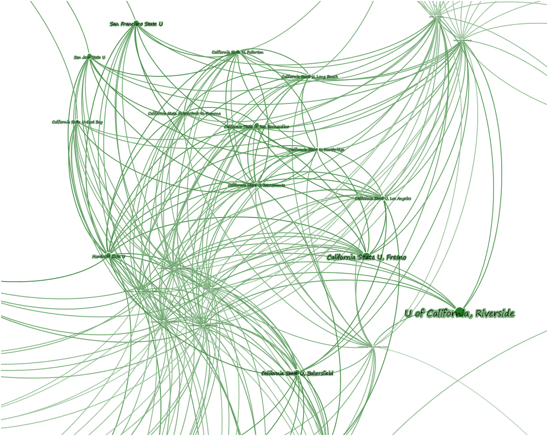
Schools are sized by their centrality, but centrality in a network has many different and sometimes competing or contradictory definitions. The Chronicle’s choice of PageRank over Eigenvector centrality deserves some examination, given that PageRank is typically used in Gephi because it is edge-weight aware, but this graph doesn’t have edge weights (which might be useful to implement and would help to correct for the oversampling from universities that claim many, many peer institutions). But it makes sense from another point of view, in that the use of PageRank naturally penalizes nodes with many connections, whereas other centrality scores like Eigenvectory centrality assume that this kind of “gaming the system” doesn’t take place. As a result, universities that claim few peers are rewarded by this measurement of centrality. At least in this sense, snootiness is statistically quite useful.

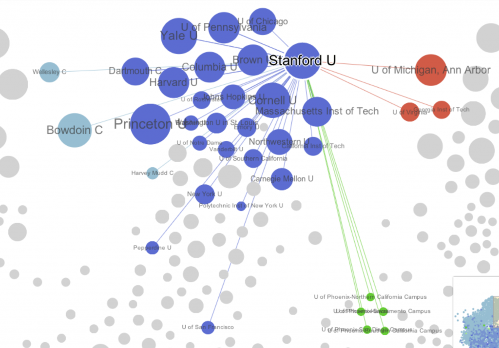
The network is a directed graph where a link from one institution claiming to be the peer of another is not necessarily (and often simply not) reciprocated. One issue with the Chronicle’s visualization is that it conflates in-links with out-links. In other words, the links an institution’s self-reported peers are indistinguishable from other institutions that claim that institution as a peer. Take Stanford as an example: it claims 12 peers, yet clicking on Stanford in the Chronicle’s visualization shows many more connections. It is impossible to determine from the graph itself which institutions Stanford claims as peers and which claim Stanford, and forces one to examine the long list at the side.

Stanford links in the Chronicle visualization

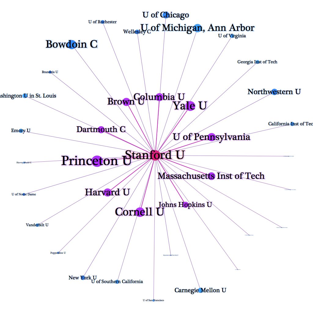
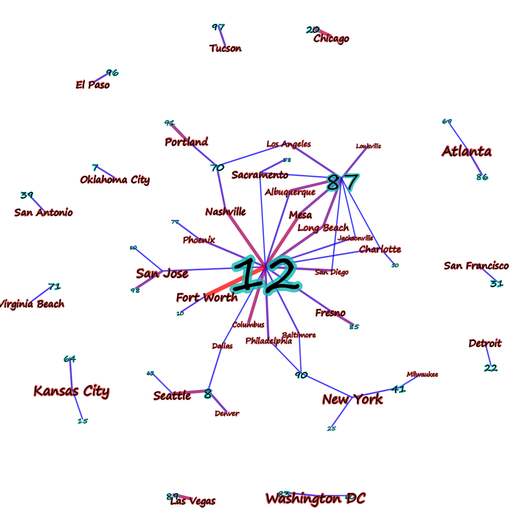
Here, then, is an alternate version that makes this distinction:

Links into and out of Stanford based on claims of peer connection

The universities in the inner ring (in purple) are those Stanford claims as peers. Those in the outer ring (in blue) are those that claim Stanford. The font size represents the Page Rank value of each institution: larger fonts indicate a higher ranking. This image fits very well with our expectations of who Stanford would claim as a peer institution while also showing the aspirations of others.

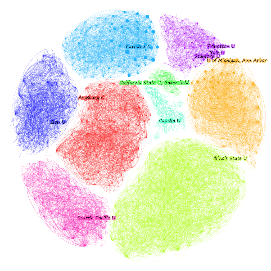
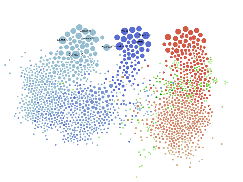
For the whole graph, the Chronicle not surprisingly used Gephi’s “default” force-directed algorithm to lay out the network. There are other ways to lay out networks, and I’ve grown partial to plotting networks on XY axes based on node attributes, but force-directed layouts and especially ForceAtlas2 are traditional. What this means is that the network’s strange, hierarchical organization, with highly-ranked schools literally found on top of three distinguishable pillars, is actually a part of the network–except for the “top” part, since the network could be rotated as a whole and still remain unchanged, but being at the end of a cluster of nodes and having (at least what seem to be visually easily distinguished) clusters is really quite interesting. To see if there is a significant community signal in the network that reflects our visual appraisal, we can test for modularity using Gephi’s built in modularity function. The graph has ~.57 modularity, which is a somewhat weak community signal, likely caused by the over-reporting universities, though they do have an interesting configuration. Coloring the network by community and turning the edges on makes it look much less sedate.

CHE Peer Institution Graph

The communities themselves are, as network communities tend to be, very interesting. It would take too much time to explore each exhaustively, but I’ve labeled the most central (according to PageRank) university in each module. In the case of the Ivy and Ivy-like schools, I labeled the top three (I work for one of them, and wouldn’t want to leave it out).

CHE Peer University Network Communities

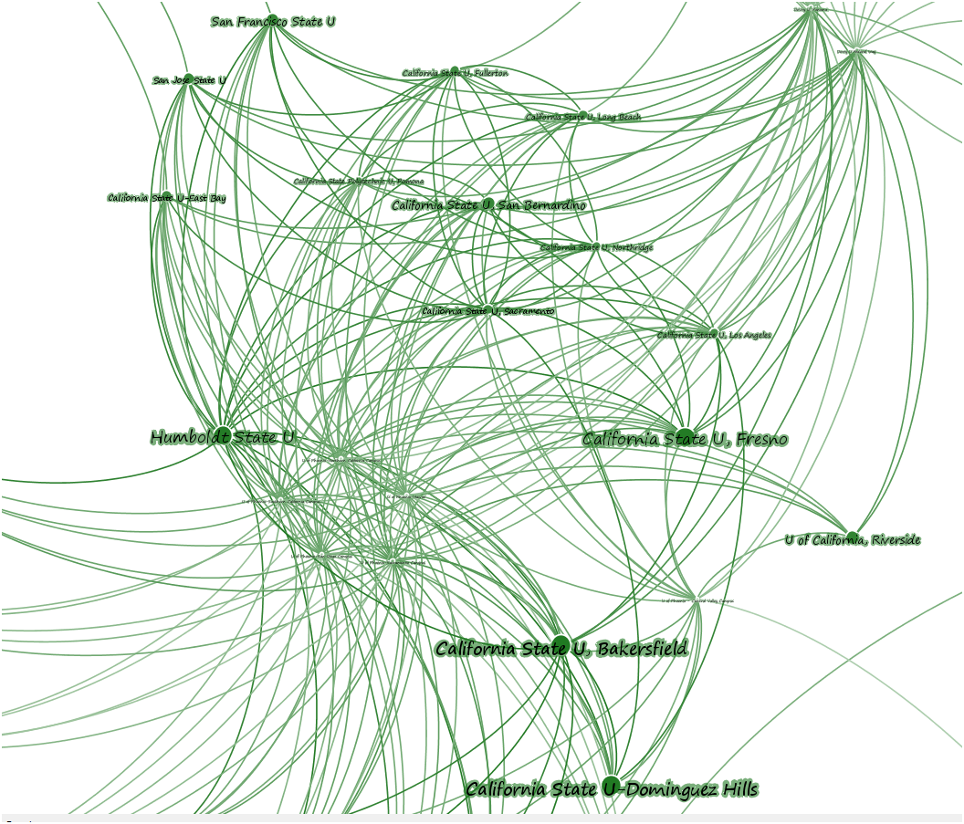
Looking closely at one of these modules, you can see the difference between Eigenvector centrality and PageRank. First sizing the nodes by PageRank:

California Modules CHE

And then Eigenvector:

California Module

While this could go on and on, I think that’s enough to demonstrate the need to really engage with data-driven journalism like this, which is only possible if the data is clearly marked and accessible. To help support that, I’ve taken the gexf I’ve been working on above and left it here so that other researchers can examine this data.

Posted in Algorithmic Literacy, Graph Data Model, Natural Law, Visualization | Comments Off

A few networks

Documents–in this case aggregated based on city–connected to topics based on the strength of representation of that topic in that document (or in this case, meta-document, since its a collection of documents tagged with a city name).

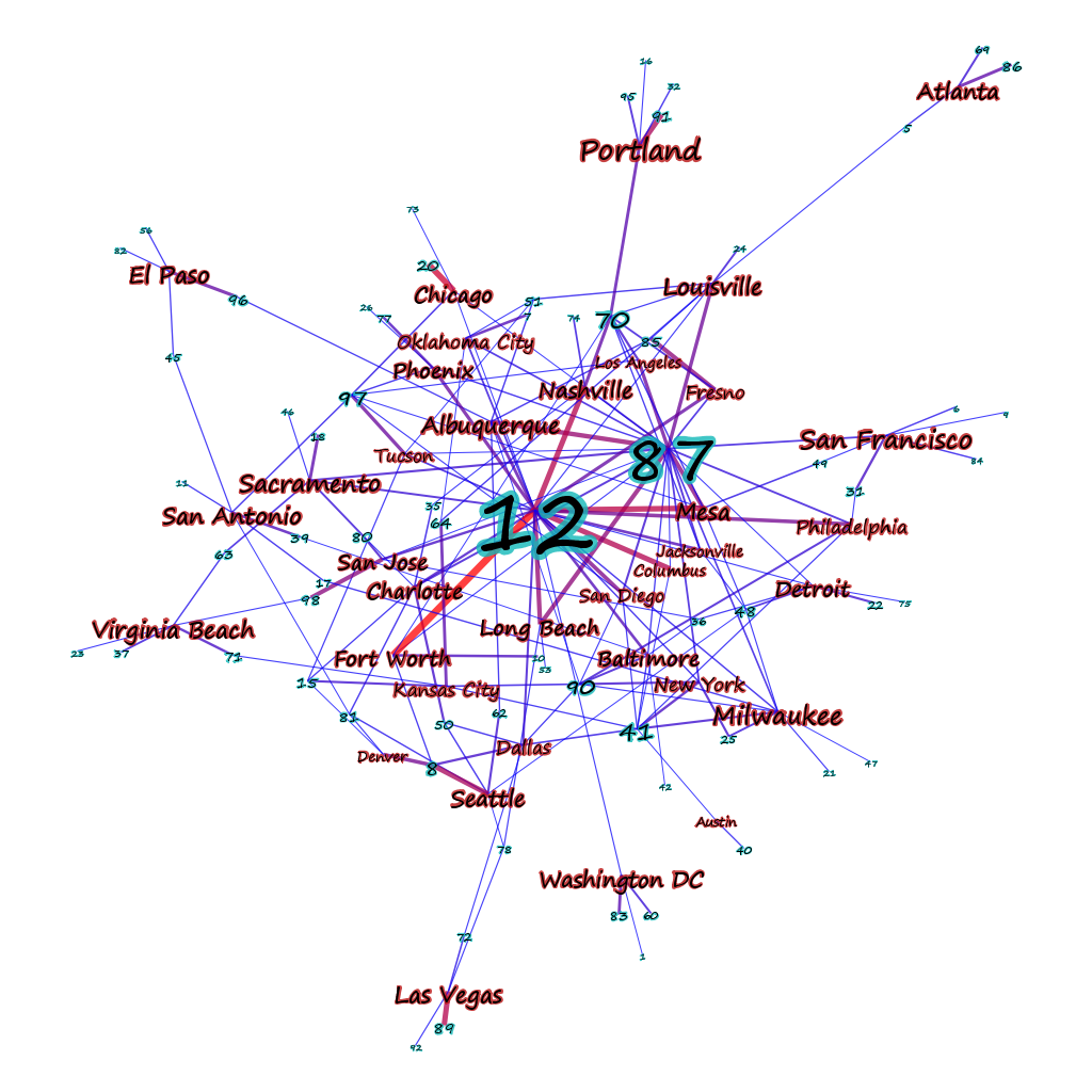
Topics shared by cities

The above image shows “strong” connections to topics that make up over 10% of the topic representation of a document. If the threshold is lowered to 5% the picture becomes a bit less clear.

Moderately connected documents to topics

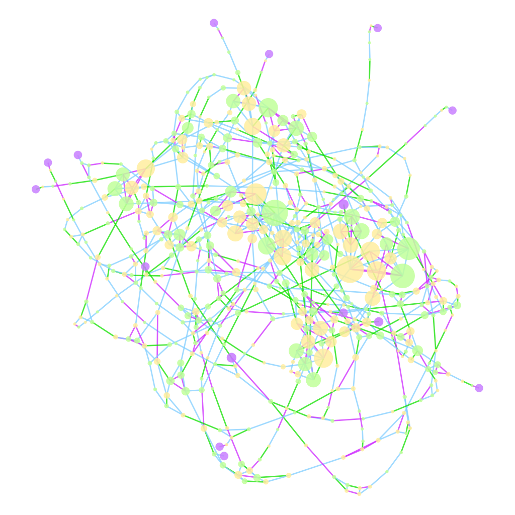
Reducing the threshold any more than that shows too many connections to make drawing the data worthwhile, and is best approached using statistical measures. We already do this when we show a network that has nodes and edges sized and shaded based on particular measures–the above uses PageRank (since it’s the only centrality metric in Gephi that currently takes into account edge weight) to determine node sizes and edge weight to determine edge color. In comparison, a rather cluttered network of genealogical connections tying together a group of British admirals (in purple):

Genealogy of British Admirals

The centrality measure determining size in this case is Eigenvector centrality, since the edges are unweighted and undirected, which contrasts nicely with betweenness to and closeness to see develop a proxy of who’s connected, who’s necessary, and who’s important. Edge color indicates type of connection, whether lineal (blue), sibling (purple), or spousal (green). It’s very difficult for a visual description of such a network to do more than convey a sense of how messily connected the British ruling class was.

Posted in Graph Data Model, Visualization | Comments Off

Topicography


The topography of a corpus, as represented with topic modeling to produce 100 topic clouds.

topicography or corpus topography via topic clouds

Posted in Text Analysis, Visualization | Comments Off

Using Word Clouds for Topic Modeling Results

A year ago, I painstakingly formatted the topic modeling results from MALLET so that I could paste them, one by one, into Wordle. I was happy with the results, if not the workflow:
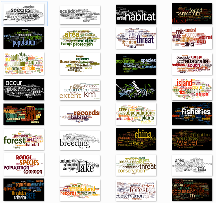
Topic Model Topics Using Wordle

First, an aside. There are folks who consider word clouds to be heinous data visualizations, especially now that Wordle has made them so easy. It seems to me that to establish your data visualization credibility, you have to trash some particularly popular form of expressing information. Ben Fry famously trashed networks, Jacob Harris trashes word clouds, Tufte trashed circles. I’m sure somebody out there hates bar charts and everyone, it seems, thinks stream graphs are made out of equal parts heroin and the bad stuff from The Fifth Element. But it actually shows a lack of understanding of the primary principal of data visualization to condemn a form, and though it makes for better copy to declare word clouds to be “harmful” or say that “almost nothing” should be shown as a network, it’s really the application and not the method that is being criticized. Word clouds, for instance, are really good when paired with topics generated from topic models.

For those of you who are unfamiliar with topic modeling, it’s a family of algorithms that look at a set of documents to find words that are highly co-located across documents. There have been many and varied explanations of it, including my own visual representation of it*. Typically, the results of a topic model are a list of the top words that appear in a particular topic. But a simple list of words hides the fact that the ratio of words is another dimension that is important for understanding topics. Hence word clouds. While the typical use of something like Wordle is to drop in a document and let it count the instances of words, you can also format a list of words and values and it will generate the same cloud. Easily enough, one of the outputs of topic modelling software like MALLET is just such a list for every topic discovered. And so a topic cloud represents not only the words that make up a topic, but the ratio of those words, and can include just the top 20, or the top 100, or all of them if you have the real estate.

You can see in the example above that sometimes terms dominate a topic, and other times there is a more even spread of terms, and all the rest of the distributions of tokens that one would expect from such statistical processing. By exposing this distribution, it makes interpretation of topic model results far more sophisticated.

Now, back to the workflow problem. This kind of solution is great, but formatting the results and manually inputting them into Wordle and setting the color scheme and layout and font to be the same every time is miserable. On top of that, it abdicates the capacity to use the various dimensions of a word cloud to pass more information in the visualization. Color and rotation are arbitrary in Wordle and typically in word clouds, but they need not be. Color could be used to indicate part-of-speech, and rotation could be used to indicate named entity type. Or, they could be used to reinforce incidence of the word. With that in mind, and given my growing addiction to the D3.js information visualization library, I thought I’d do something a bit more efficient this time. Fortunately, Jason Davies has already built an incredibly robust word cloud layout for D3, and all I had to do was use it in a ‘for loop’ for all the topics that I’d generated, with some code to color and size the words using a scale that I thought was appropriate. The result is a simple web page that easily shows word clouds made up of the top 100 tokens (or more or less, if you’d prefer) for the 100 topics in the topic model I’m using, and with significantly less carpal tunnel.
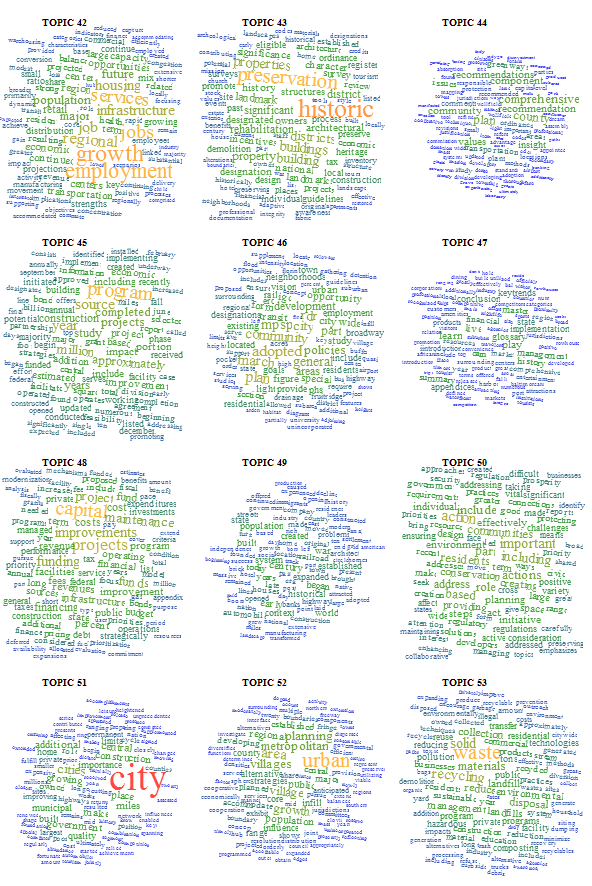
Topic Clouds made using D3.js with Jason Davies' cloud layout

The toughest part was getting the topics in order, since D3 calls the CSVs asynchronously and therefore needs to have the 100 SVG canvases put onto the page and identified before they’re populated. But I solved that by creating the 100 SVG canvases first, giving them unique IDs based on their order in the creation, and then calling the specific canvas during the word cloud creation. You can find the code on Github here.

Updated on 8/16

I showed this code to Ryan Heuser, who runs the Literary Lab here at Stanford, and he immediately improved it by suggesting that another dimension to be represented from topic model output is the percentage of a word represented in a topic out of the total number of that word represented in a corpus. For instance, if the word “housing” shows up 10000 times in a corpus and 9000 times in a topic, then it has a different character than a word that shows up 50000 times in a corpus and 9000 times in a topic. This percentage can be represented in a number of ways, but Ryan and I found that opacity was the best, causing words that were represented across topics to recede more than words that highly corresponded to a particular topic. Here’s an example:
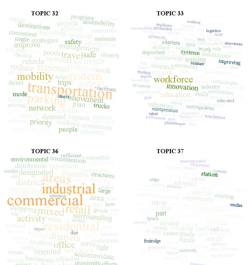
Topic clouds representing probability of a word appearing in a topic

* Using network visualization where topics, words, and documents are all represented with circles. I know, I should be ashamed of myself.

Posted in Algorithmic Literacy, D3, Text Analysis, Visualization | 6 Comments

Finish my PhD in 13 months?

The University of Nebraska at Lincoln, not content with stealing Matt Jockers from Stanford, is hiring more Digital Humanities faculty.

That’s pretty cool.

Posted in Natural Law | Comments Off

The Thermal Conductivity of Tungsten is an Argument

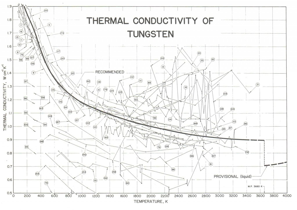
Thermal Conductivity of Tungsten from Tufte's The Visual Display of Quantitative Information

We all have our favorite pieces of information visualization, and many have been presented by Edward Tufte, but I prefer this more than any other, and more for the content than the representation. For those unfamiliar with Tufte’s The Visual Display of Quantitative Information, this particular figure displays the thermal conductivity of tungsten with the thick black line, surrounded by a variety of different proffered values of such thermal conductivity as presented in a series of historical journal articles. Tufte’s main point is that such a data visualization provides highly legible and dense information clearly, but what I continue to be attracted to is the highly visible discussion taking place about a subject that we would think, in the modern age, as inarguable. The strength of formal claims using agreed upon metrics is that they can be readily compared over time in a way that narrative claims do not admit to.

Mapping functions is much more interesting than mapping data.

Posted in Algorithmic Literacy, Amusing Historical Map Features, Visualization | Comments Off

My Information… Not Quite That Beautiful

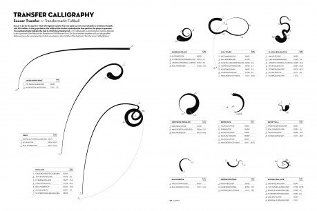
Transfer-Calligraphy-29-May-459x306

The Information is Beautiful Awards has released their shortlist. Though none of my own entries made it onto the short list, it is not surprising given the quality of work they were up against.

Posted in Visualization | Comments Off