Color and Precision

Color has been bothering me lately. To get to color, though, we have to take a short digression into space. You see, a lesson you learn early on in spatial analysis is that just because your GIS package gives you 12 points of decimal precision when you add a point, that doesn’t mean you should use it. False precision in the case of coordinates is well understood, but I wonder why there is no analog in color. As data visualization grows more prominent, color theory becomes a practical consideration of modern scholarship–just as geometry, ontology, formal logic, and countless other seemingly unrelated fields have begun to intrude upon literature and history. And while work has been done by folks like Cynthia Brewer and the team at Tableau to solve practical issues of palette and readability, I’m more interested in the issue of false precision in color representation and the use of functions to determine visual attributes rather than fixed values.

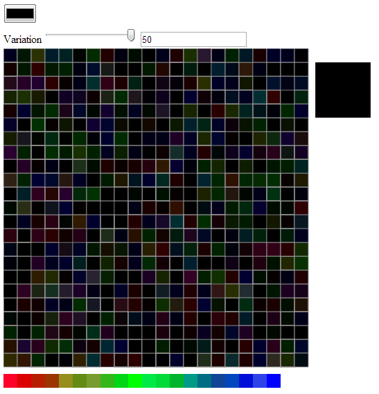
To better understand what random perturbation of color and visual elements would produce, I wrote a little color perturbation toy in D3 that takes advantage of the range slider and color picker HTML elements (these only work in Chrome) and wrote a quick function to randomize the color displayed in 506 squares, while displaying a single, large square with the original color selected.

Color Perturbation ToyThe original randomization function (still in the code as slightyRandomColor) just adjusted the individual Red, Green, and Blue (RGB) elements of the selected color in a completely random fashion:

    function slightlyRandomColor(r,g,b,range) {
      r = r + (Math.floor(Math.random() * range) - Math.floor(range / 2));
      g = g + (Math.floor(Math.random() * range) - Math.floor(range / 2));
      b = b + (Math.floor(Math.random() * range) - Math.floor(range / 2));
      return "rgb("+r+","+g+","+b+")"
    }

I updated this in the slightlyLessRandomColor function to take into account the “distance” from maximum value of that primary color. Naturally, there’s some disagreement as to what a primary color is, and a CMYK scale would treat this differently, but this is just an initial foray. In a finished version, I’d prefer this to be based on pure hues, so that variation increases in the muddy regions. The code is pretty simple:

    function lessSlightlyRandomColor(r,g,b,range) {
    var scaleRamp = d3.scale.linear().domain([256,0]).range([.5,2]).clamp(true);
    var rRange = (range * scaleRamp(r));
    var gRange = (range * scaleRamp(g));
    var bRange = (range * scaleRamp(b));

      r = r + (Math.floor(Math.random() * rRange) - Math.floor(rRange / 2));
      g = g + (Math.floor(Math.random() * gRange) - Math.floor(gRange / 2));
      b = b + (Math.floor(Math.random() * bRange) - Math.floor(bRange / 2));
      return "rgb("+r+","+g+","+b+")"
    }

The effects are rather striking. The idea is that rather than picking a single color out of the 256x256x256 (or 16.78 million) available colors, you designate a small or large color region. In a sense, this is an imprecise color suitable for less precise data. Now, perhaps you’re working with data where you can claim 1 in 16.78 million precision. I don’t typically have that at my disposal, and that’s one of the reasons I wanted to explore this. The primary motivation is still aesthetic, of course, and I think that this minor perturbation will be more appealing and attractive to readers.

This can be taken beyond color elements and applied to line thickness (as I’ve done in the demo) and curving on paths, opacity, et cetera. These channels, in the parlance of information visualization, are all amenable to functional values that can be jostled based on known inaccuracies in individual data points or generally understood issues of uncertainty, precision, and accuracy of the project as a whole. Again, the curves end up looking like they’ve been drawn (though with only minor perturbation, by someone with a steady hand) and so the aesthetic motivation is there, but the aesthetic enshrines a fact of data visualization used in representing the kinds of phenomena I’m called on the represent.

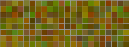
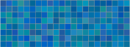
The results give a different understanding of what it means to have the “same level of variation” when that variation is not just a simple value but a function based on the value of the color being affected. Turning the variation up to a maximum of 50 (which means +-25 from the R,G, and B positions on the color) already implies less variation for values at the top or bottom of the scale (near 0 or 255, in other words) and since the function further scales this variation so that it is more at 0 and less at 255, the result is that “high variation” has quite different visual results:

High Variation RedHigh Variation BrownHigh Variation CyanHigh Variation Blue

There are, at least, three issues at play here. One is the capacity to optically distinguish between different parts of visual light spectrum, which could itself be accounted for in the development of functional colors. The second is the use of functions to perturb visual elements for aesthetic purposes as well as to address issues of visual representation of complexity and uncertainty. The final is the idea of regions, be they color regions or angle regions or line thickness regions, to fight against false precision. Naturally, with high enough variation, you can end up damaging the ability for a reader to distinguish between categories of elements, as seen in the changing color ramp on the bottom of the demo:

Effect of high variation in color attributes on color rampsThe variability in the blue (in this particular case, and each time it will be different) makes it impossible to distinguish between category 20 and category 18 and just as difficult to distinguish between category 17 and category 19, or if this is a continuous ramp, to distinguish that entire region. But it may be that this is imprecision is a more accurate representation of some very imprecise dataset. You may therefore be able to use functional colors and imprecise colors to provide higher accuracy with lower precision. Obviously, this begs for a robust implementation, which I hope to provide some time down the road.

The gist of the code can be found here.

Posted in Algorithmic Literacy, D3, Spatial Humanities, Visualization | Comments Off

The Digital Humanities as a Donkey

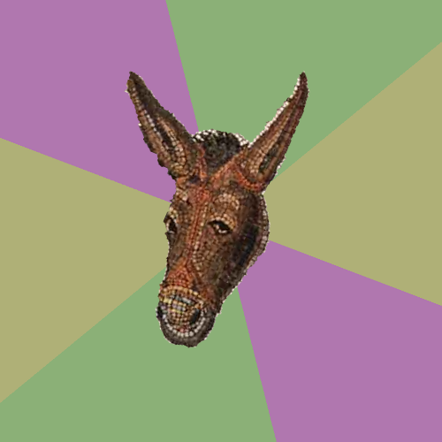
Advice animals are a long-established method of passing along knowledge and learning about subject matter, especially academic. But I have found no Digital Humanities advice animal, and so I offer up the only slightly used ORBIS donkey. I think we need a stalwart, mosaic Digital Humanities Donkey to explain the subtle truths of this field to prospective undergraduates on Reddit. Helpfully, I’ve also provided a superhip version:

Digital Humanities Donkey

Digital Humanities Donkey Hip

Now, maybe there’s some kind of digital humanities emu or marmoset out there, in which case I’m not trying to muscle in on their territory. But, if not, here’s an example or three to get the ball rolling.

Digital Humanities Advice - CV

Digital Humanities Advice - IT

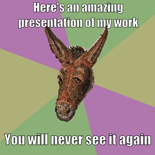
Digital Humanities Advice - Presentations

Posted in Natural Law, The Digital Humanities as... | Comments Off

Martin Evans

When I first came to Stanford University and I was expected to “do digital humanities” without quite knowing what that meant, I had the very good fortune to work with Martin Evans, a professor in the English Department and a Miltonist. While we never got around to representing the pan-chronology of Paradise Lost, we did manage to cobble together a small site, in Flash (remember, this was 2010, before Flash was evil) that presented people and places and texts linked together in a dynamic manner. If you’ve still got Flash installed, you can see Authorial London here.

Martin Evans died on Monday, February 11th, 2013. In my time working with him and since, he was always dynamic and incisive and ambitious. When I first started doing digital humanities professionally (I am a specialist, after all) I thought myself to be very much smarter than the folks who had neglected to learn how to code. Dr. Evans disabused me of this notion early on, and not through any kind of browbeating, but instead by simply demonstrating the kind of intellectual rigor and attention to detail it took to really understand the complexities of literature such as Lycidas.

In reading Martin’s obituaries, I’ve found him quoted as a staunch defender of the humanities. You would have to be as green as I was three years ago to think that such a defense would necessitate being an opponent of digital humanities.

Bitter constraint, and sad occasion dear,
Compels me to disturb your season due:


Posted in Digital Humanities at Stanford | Comments Off

Digital Literacy and Digital Citizenship

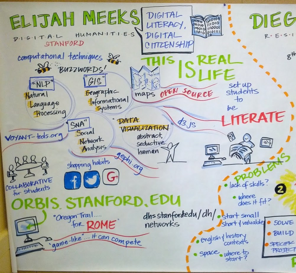
Visual Notes of my talk about digital humanities in high school education

Visual notes of my talk about digital humanities in high school education

On Friday, I gave a talk for a Bay Area Teacher Development Collaborative workshop entitled “Technology for Teaching and Learning:What’s Worthwhile? What’s the Next Chapter?” I was asked to speak, broadly, on the role of digital humanities in middle school and high school education, and put together this slide deck, which I thought I’d explain a little more fully here.

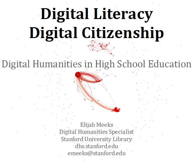
Digital Literacy, Digital Citizenship: Digital Humanities in High School Education, by Elijah Meeks

Usually, I don’t explain the title page. You already know the website address, and likely my email address, and probably my job title, but there’s a little piece of information that I’ve felt the need to emphasize more and more as I go out into the world for conferences and talks: I work for the library. I never imagined how much of a difference this would make in different venues. It’s an #alt-ac position, and so you receive the usual discourtesies if someone thinks that you’re pretending to be Stanford faculty. I’ve found it best to clearly mark and emphasize that. This wasn’t the case for the BATDC conference, and maybe that’s why I’m comfortable making this digression. The abstract network in the background is TVTropes, of course.

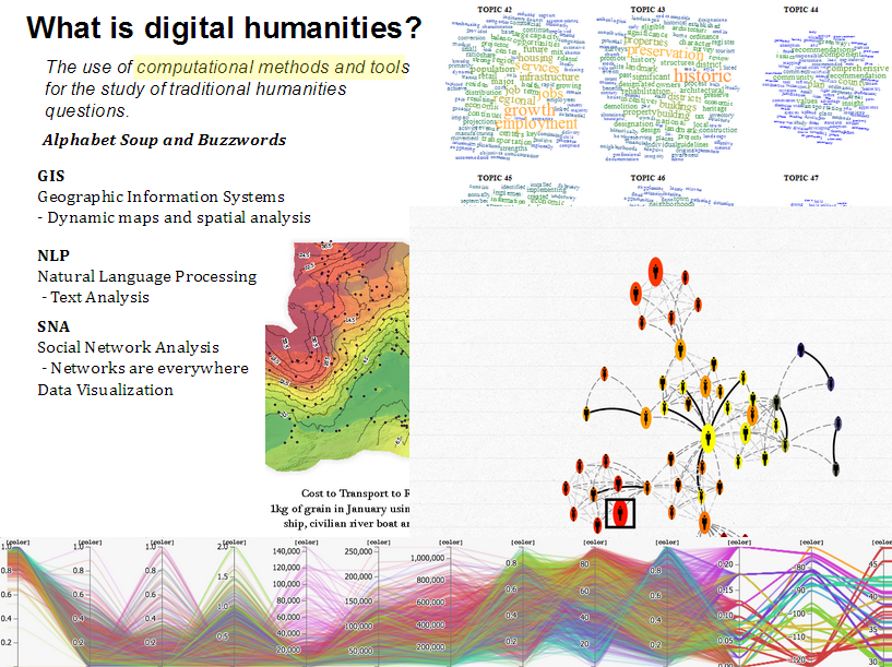
What is digital humanities?

In any talk about digital humanities, even those held at conferences that have “digital” and/or “humanities” in the name, it helps to suggest another definition of “digital humanities”. Here’s a rather practical one: It’s the application and integration of buzzwords and acronyms into humanistic inquiry. I’ve thought of GIS/NLP/SNA/DataViz as the 3+1 pillars of digital humanities for a while, but I think more than those particular methods, digital humanities is the demystification of computational methods and their application in new and untraditional ways. So, it helps to mock them. It may be that a better definition of digital humanities: Careful application of computational methods to humanistic inquiry paired with careful application of skepticism toward computational methods for humanistic inquiry.

The examples for each are an isophoretric map of the Roman World, topic clouds, a network visualization of several generations of Darwins, and a parallel coordinates visualization of neighborhoods. These latter two examples are from projects which we hope to release in the coming weeks.

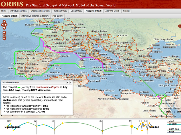
ORBIS, an example of GIS in digital humanities researchGIS

There are so many good examples of GIS used for digital humanities research. This might be bias on my part, since spatial analysis was my first experience with this kind of work, and so I’m more aware of projects like ORBIS, Vision of Britain, and Civil War Washington, all of which provide ready-made resources for middle-school and high school teachers that want to bring geospatial information visualization into their classes. Because we have such a long and rich history of representing abstract concepts and data on maps, it makes a good gateway into more exotic data analysis and visualization methods. So, while these sites teach us about space and history, they also provide object examples of data visualization that, because of our familiarity and literacy with maps, doesn’t seem so arcane as network and text and other information visualization.

Each of the slides for GIS, NLP, SNA, and DataViz is meant to not only give resources for course material, but also provide avenues for teachers that want to get started with creating and developing more material using these methods. To that end, Neatline, Google Fusion Tables, and Quantum GIS are all freely available and provide the capacity for teachers to build their own dynamic and interactive geospatial projects.

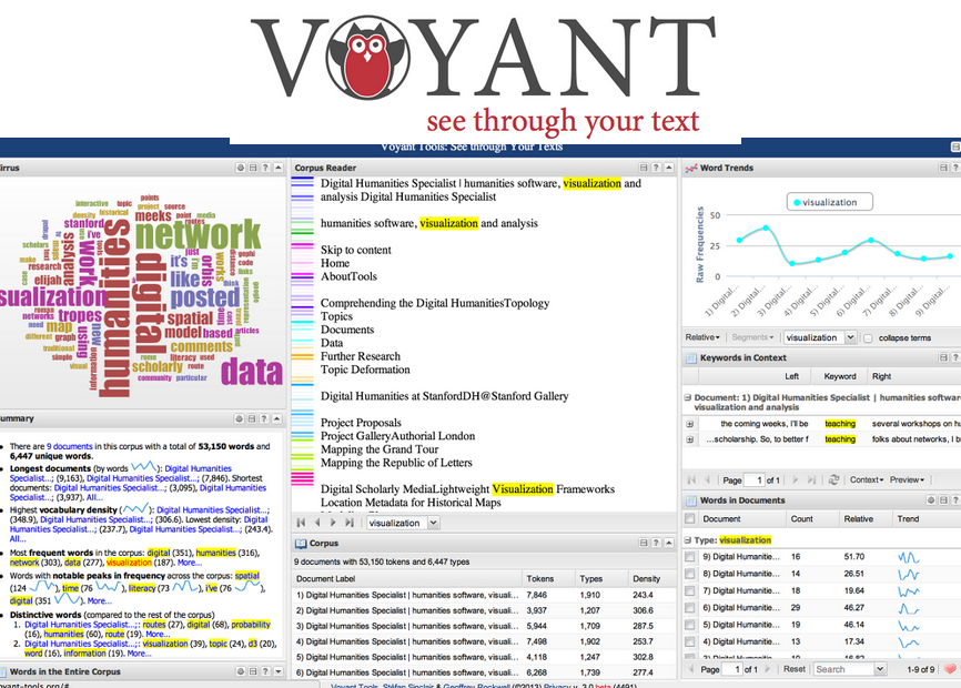
Voyant, an NLP tool for digital humanities researchNLP

Natural Language Processing is a harder thing to demystify than GIS. Maps and directions are a large and highly visible part of our life, but text analysis tends to be hidden away. But tools like Voyant provide teachers with the capacity to apply a wide variety of NLP processes to whatever text they would like to examine, whether it’s assigned reading or student essays. Importantly, the accessibility and user-friendliness of Voyant means that teachers (and students) can playfully engage with NLP and learn the methods through using the tools. Somehow I forgot to mention Wordle during the talk, but one of the teachers pointed it out during Q&A.

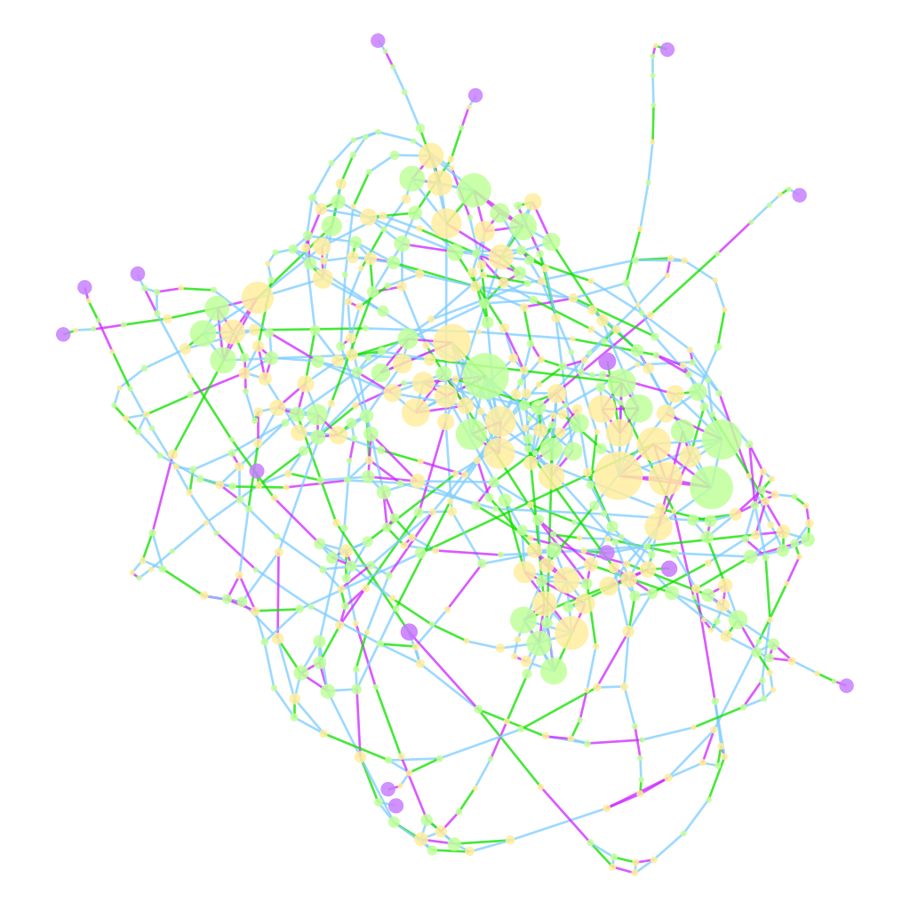
A network of genealogical connections between Nelson's Battle of the Nile admirals SNA

While network analysis is not only social network analysis, it’s what people know, and so part of explaining networks is starting with social networks and then introducing transportation networks, genealogies, administrative networks, and so on. Like NLP, it is difficult to point to straightforward examples that are easy to integrate into courses, but for those that want to get started, I pointed them to my Interactive Introduction to Network Analysis, as well as my Network Analysis toolkit of choice, Gephi.

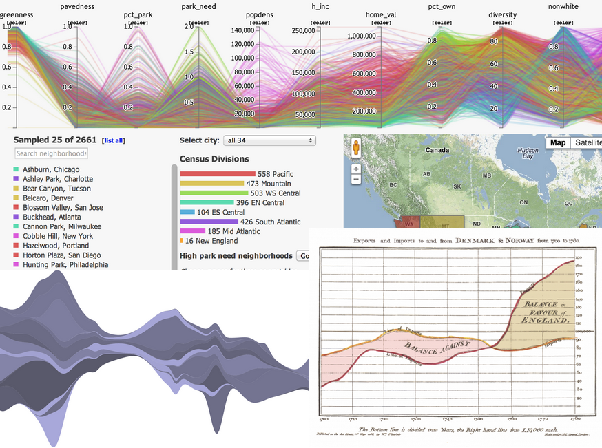
Data Visualization in Digital Humanities

Data / Information Visualization

Data visualization as a fourth category is interesting from an ontological perspective, since it overlaps and conflicts in scope with the previous three. But I’ve noticed that it occupies a distinct space in the mental map of the digital humanities among practitioners, and provides a very accessible entry into the various, more intimidating methods above. My only link is to D3.js, because it provides not only a great library with which to build data viz but an excellent gallery of examples of data visualization. There’s so much dataviz on the Internet, that providing examples seems pointless.

So, that’s what and how, but why?

The remaining slides in the deck deal not with what digital humanities is/are/was, nor how to do it, or find it, but why it’s important. The broad definition of digital humanities makes it more difficult to make this case, and so that’s why I settled on the constrained, practical definition I started with. Practically speaking, integration of these methods and techniques makes sense for the following reasons:

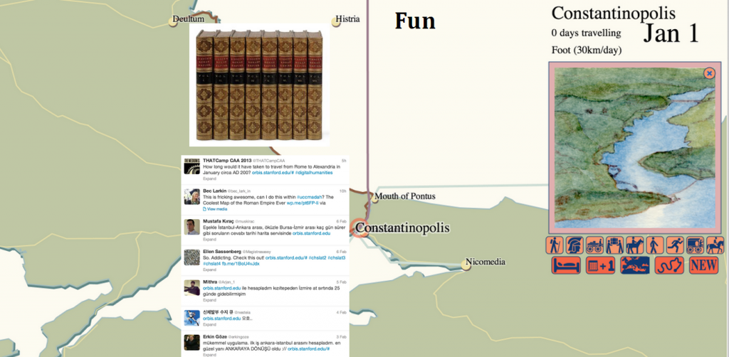
Reason #1: Digital humanities is fun.

digital humanities is fun, really

I touched on this a while back in regard to the popular appeal of ORBIS. By bringing innovative, interactive, and highly visual methods into the exploration of humanities subjects, you engage students in a way that just text does not. This is the basic principle behind gamification, except that the digital humanities isn’t trying to dress up an experience with the appearance of interactivity, but rather is predicated by it. Using Voyant is “fun”. You “play” with Gephi. People have tweeted that ORBIS is “awesome”.

Reason #2: Digital humanities is inherently collaborative.

I won’t repost the slide for this one, which is simply three lists of contributors to various DH projects. Collaboration is important from both a professional perspective and a social perspective. The world that your students are going to go out into is not one where they will work alone at one station, and punch a time clock and go home, but one where they are constantly in touch with everyone they are working with. More importantly, their world outside their work is the product of such collaboration. As I said in my talk, Steve Jobs didn’t go into his workshop and carve out an iPhone by himself, and so if we want young people to better understand and appreciate the way their world actually operates, we need to teach them about collaboration and to collaborate in their schoolwork. And because digital humanities is more self-conscious than the more established disciplines where this kind of collaboration is commonplace, it leads to more purposeful engagement with the subject.

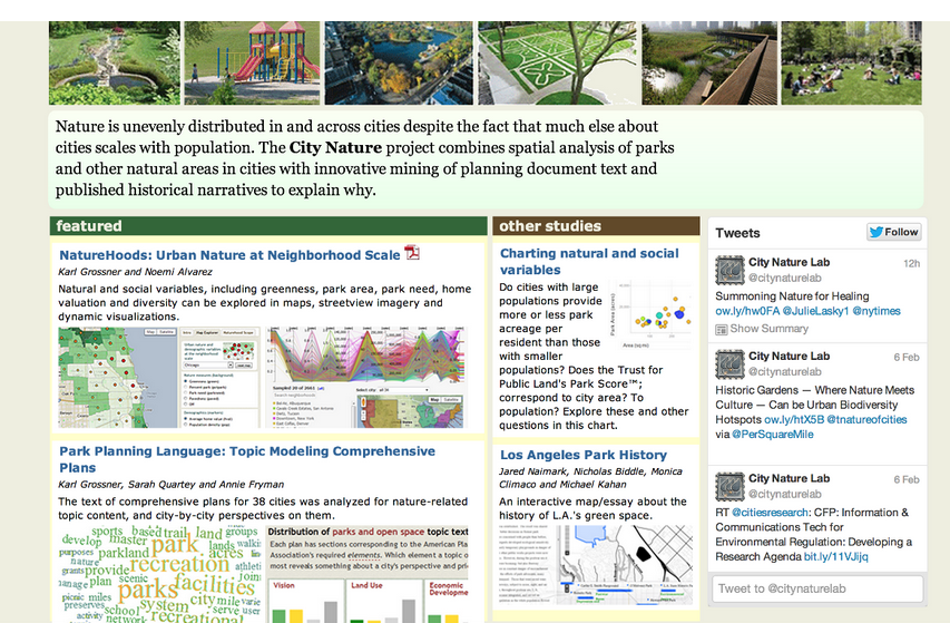
Reason #3: Digital humanities overlaps with STEM

digital humanities integration with STEMIn trying to understand the role of natural spaces in urban environments, we’ve had to integrate remote sensing, topic modeling, and demography. The above screenshot comes from a project to be released soon, which demonstrates how these disparate factors contribute to our understanding of “city nature”. As digital humanities grows more expansive in its use of computational methods, the research and products that result share more and more in common with science, technology, engineering, and math.

This is probably the most controversial point to make since, as I’ve said elsewhere, the overlap with STEM can mean that digital humanities research stops being humanities scholarship and becomes wholly information science or social science or computer science. But to understand the methods outlined above you need an understanding of projections, probability, statistical aggregation, and other computational and quantitative skills typically not associated with understanding Hamlet or Imperial Rome. I think the important thing to emphasize here is literacy versus fluency versus mastery. Digital humanities requires information literacy in a variety of now commonplace representations of data. Like everything else, it requires more as you do more, but it is, at least in my mind, still distinct from these other disciplines in that it seeks not to drive the development of those methods but rather to apply developed methods in those fields in novel and unexpected ways.

Reason #4: Digital humanities takes advantage of the growing accessibility of computational methods

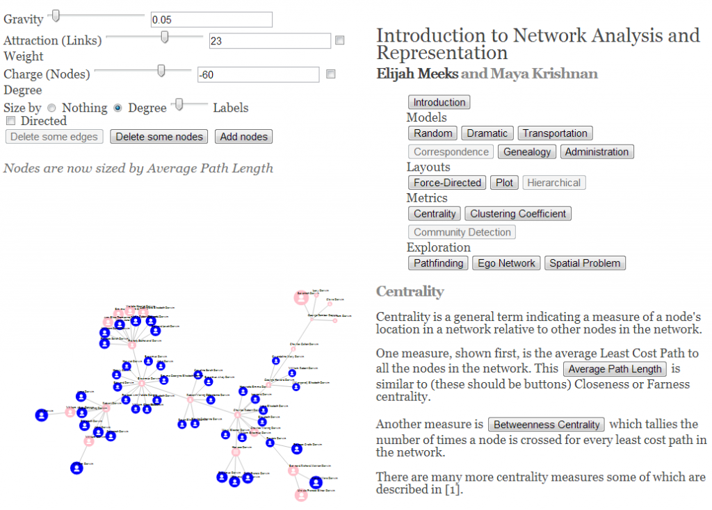
Network Analysis and Representation Tool/Toy Built with D3.js

Please run this in Chrome or Safari

Paired with the last point is that it takes much less to perform spatial analysis, text analysis, network analysis, or data visualization than it did ten or twenty years ago. Much less money, since there are often open source or otherwise freely available tools that perform all of these; much less infrastructure, because these tools run on the web or on your laptop and do not require servers; much less training, because methods and techniques have matured and UI/UX principles are increasingly better integrated into the software tools; and much less struggle in general, especially struggle to get data, since we’re so awash in data. You do not need to be a network scientist to understand network analysis, nor a geographer to understand GIS.

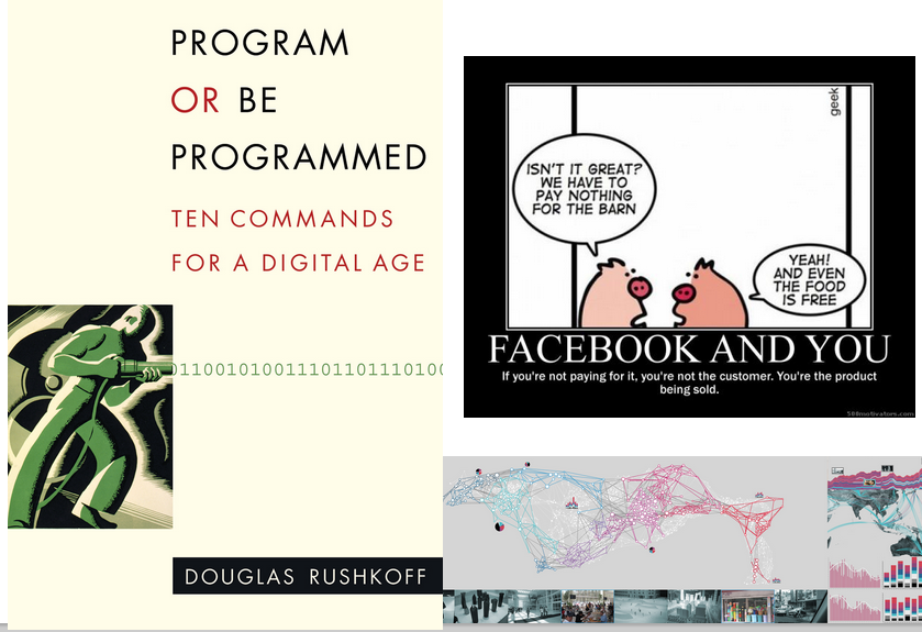
Reason #5: Information Literacy is Powerful

digital humanities - information literacy is powerfulUnderstanding and succeeding in a world mediated by the methods outlined here can only happen when you are aware of what those methods are. With specialization, we assume it’s okay that only students who focus on learning about networks know how networks operate, even though everyone in a modern society participates within explicit network structures. Digital humanities exposes these structures more democratically, and explicitly provides non-experts in the specific domains with the literacy necessary to successfully interact with a world where those domains affect their everyday life. Digital humanities, along with providing a more sophisticated understanding of humanities phenomena, provides a more sophisticated understanding of a modern world that runs on the very same tools and techniques outlined above.

Reason #6: Information Literacy is Meaningful

digital humanities -- information literacy is meaningfulI have a basic bias toward digital humanities for high school students, and it’s because I’m convinced that the humanistic aspect of computational methods is not explored in goal-oriented, practical courses on using these tools in the sciences. When a student learns how to use a spatial or text or network analysis technique in a computer science course, they don’t dwell upon the ethical and social ramifications of its use. By bringing the digital into the humanities, we provide a space to question the effect of these pervasive techniques and tools on culture and society. Digital humanities, as those of us who have taken part in it are aware, is extremely self-conscious and self-critical, it lingers on definitions and problems of its scope and place, and it especially turns a jaundiced eye to technological optimism of all sorts, even as it attempts to integrate new technologies into the asking of very old questions. At the high school level, it provides for a more literate, skeptical student, which would prove beneficial in every aspect of society.

And it would produce some really useful material for digital humanities undergraduate programs.


Posted in Algorithmic Literacy, Natural Law, Pedagogy, Tools | Comments Off

Learning Network Analysis and Representation with a Pedagogical Toy

Network Analysis and Representation Tool/Toy Built with D3.js
This tool runs best in Chrome and Safari

In the coming weeks, I’ll be teaching several workshops on humanities network analysis and representation using Gephi:

These are invariably billed as “Gephi Workshops” but really they’re an introduction to networks, network analysis, and network visualization (I prefer “representation”) for humanities scholarship.

So, to better facilitate teaching folks about networks, I built this network toy using D3.js for all the information visualization bits. If you’re going to play with it, you should probably do so in Safari or Chrome, since it uses range sliders and SVG, which does not run so well in Firefox or Internet Explorer. It’s very rough, but I hope to get some feedback on it before these workshops, as well as provide anyone who might be taking these workshops or otherwise interested in the subject matter a chance to play with it.

I built this for three audiences, really. The first is the growing body of humanities scholars who feel that networks have something to do with understanding the phenomena they research. The second is the general public, who I think is becoming more and more exposed to and familiar with network visualization. The third audience was me. By building something like this in JavaScript, it forced me to better understand the metrics and principles of networks than I did by using out-of-the-box algorithms.

I want to iterate that this is very rough, and there are not only many missing pieces, but also likely to be issues with the implementations. I’ve tried to note when that’s the case, but I hope to extend this tool/toy as I have time and as I receive feedback.

Posted in Algorithmic Literacy, D3, Digital Scholarly Work, Pedagogy, Tools, Visualization | 4 Comments

The Digital Humanities as Accidental Plagiarism

Karl Grossner, my colleague here at Stanford who I work with supporting digital humanities research, got a chance to read my previous post on geospatial information visualization. Karl’s got a PhD in geography and a bit of experience with geospatial information visualization as well as spatial thinking, so I was looking forward to his response to my essay. That is, until I heard his response.

“I liked it, but I was surprised by the fact that I wrote the first two paragraphs,” is not what one wants to hear about their writing. That initial piece of writing, I was reminded, was a draft abstract for a paper Karl and I had considered writing for DH13, but abandoned in favor of different proposals. The topic came from a presentation that I’d put together and presented at an earlier conference for which I had produced the maps and interactive application put forth in the post.

As anyone who found out on a chilly Monday morning that he was a plagiarist would do, I thought this would make an interesting topic to explore on the very same blog where I had done the deed.

While Karl laughed it off, I naturally found it very disconcerting. The chain of custody on the writing is, like many digital documents, quite messy: it went from a Word document to an OpenOffice document to a Google Drive document to a WordPress blog post, and in between transformed from an abstract for a paper that was abandoned into a more informal short essay about the same subject matter. By the time it was a months-old chunk of text on Google Drive, I’d forgotten that I hadn’t written it, and proceeded to explore the topic as if I had.

Probably more strange to an academic audience is that while I find it disconcerting, I’m not very surprised by it. That sounds more flippant than it really is, but I just cannot imagine how the constant collaboration and repurposing of code, text, designs, and data won’t create more situations like this. But there’s something about text, and not just in humanities scholarship, where reuse and mashing up does not occur quite so easily as with the rest. Plagiarism comes from the Latin plagiarius–literally a kidnapper–and carries with it a heavier condemnation than the use of some technique to represent data that was pioneered by one researcher without reference to that researcher, or the use of some small function in a larger piece of code, or the use of data without citing the provider of the data.

It’s my feeling that as we struggle with properly assigning credit for work done on large, collaborative projects, that the overwhelming ease and amount of collaboration will make it harder and harder to parse just where and how an idea came into existence and who and what described it. The only thing I feel I can do is that in those situations where I forget to do so is to immediately point it out when it’s happened, no matter how embarrassing it may be.


Posted in Natural Law, Peer Review, The Digital Humanities as... | Comments Off

Possibility and Probability in Geospatial Information Visualization

Update: This piece incorporates writing by Karl Grossner, without properly crediting him, a mistake in which I get into in more detail here.

Doing digital humanities often means producing digital geographic maps*. These maps increasingly provide a wide range of spatial objects to represent and as a result tend to present a mix of traditional cartographic principles: Simple pushpins or polygons indicating locations relevant to objects in a collection; chloropleth maps symbolizing geographic variation in a social or environmental variable; constructed raster surfaces depicting spatial analytic results or conceptual regions; lines and shapes indicating the magnitude, direction and duration of flows of social interaction; and network maps presenting plausible models of ancient transport.

While digital humanities research engages with (and thus adopts methods from) established technical professions, we cannot simply adopt their methods whole cloth, but instead normally adapt them to unintended purposes. Among the areas we draw from are computer science (topic modeling, text mining, natural language processing and data modeling), library and information science (collection annotation and metadata, information visualization), and geographic fields including cartography and geographic information science (mapping and spatial analysis). Obviously we should be respectful of and receptive to established practices—they are established for good cause—but we also bring particular requirements to the table and require cooperative engagement to extend digital tools to better suit humanities scholarship. More than that, though, the digital humanities has matured at a point when digital mapping techniques have multiplied in both power and application such that new techniques for representing geospatial data need to be developed.

There is conceptual and practical overlap with the other domains mentioned above besides cartography. It is precisely this overlap, and the growing trend in data visualization to see geospatial data as simply one more flavor of data to be displayed, rather than a distinct class, that provides the basis for understanding how digital humanities formalizes what has been referred to as “Spatial Humanities” or “the spatial turn” and what that might mean for data visualization more generically.

In contrast with data visualization of text analysis or network analysis, the modern representation of geographic information has centuries of practice to draw from, and even the most novel techniques for the representation of abstract geographic knowledge, such as cartograms, can often lay claim to being developed many decades ago. This deep store of aesthetic techniques and information principles, as well as practical requirements for the presentation of complex analysis growing out of the proliferation of GIS, is in sharp contrast with modern tools and techniques that utilize the map not as a fashioned piece of cartographic knowledge but one of many windows into a digital object such as a computational model or archive. The traditional map, whether individually or in an atlas, is a hand-crafted, long-belabored object, quite unlike the suddenly created and suddenly discarded geospatial visualization.

But it is just this move away from the map and toward the geospatial visualization that I think needs to be embraced. As digital research of historical systems becomes more commonplace, the ability to visually represent those systems becomes more critical. ORBIS provides a useful example of a computational model being used to express historical conditions due not only to its relative simplicity and scope but also because of its broad popularity, which has resulted in significant feedback in regard to the visual display of information. While the ORBIS site provides a detailed explanation of the scope and capabilities of the model, analytics and feedback have shown that key facets of the model need to move out of the text accompanying the data visualizations and into the dynamic representations themselves. This is a problem that can derive benefit from traditional cartographic techniques, but is fundamentally focused not on the crafting of one map, but rather creating an interface into a system that at its core has a strong geospatial character.

There are two categories of information that particularly need to be foregrounded, and which I will focus on here. Both of these have to do with a more general issue of modeling probability space in geographic space. First, the user needs to know that the route they selected is one within a multitude that exists between sites that vary based on time of year, priority, direction, and mode of travel. Such a route, distinct from the single best route discovered on our phone using Google Maps (the method which has done so much to improve transportation network literacy), provides a complexification of our understanding of travel, but at the cost of requiring careful language and cartography to represent.

The second is that there is no embedded understanding of how certain or likely travel along a particular route really was. While a pointed reminder that a transportation network model is a simulation suffices at a preliminary level, there needs to be some development of a visual rhetoric of probability in systems such as these where engagement with probability and possibility is most readily available. A computational network model is particularly well-suited to present not the annotated probability or historicity of a result (which can be presented anywhere) but a calculated probability within the logic of the system, which if the model is worthwhile should correlate with historic patterns.

Evidence for the misunderstanding of the multitude of paths exists in great quantity, as routes (with their duration and cost) have been quoted on many blogs, forums, and in Twitter, among other communication mediums on the web. Very often, the description follows the pattern of “X to Y in Z days”. While this may sound like a sufficient explanation, it leaves out critical variables that significantly alter the value of Z. A fully described route in ORBIS would very much (by necessity) resemble the programming code used to run the query from which that route was created, and would sound something like:

X to Y in Z days, during A month, with B priority for the choice of route, using C speed variables (represented as the Sea Model, River transport, and vehicle choices) with C restrictions on mode of travel, costing A1 denarii to ship goods on this route when using a wagon along the land portions, A2 denarii to ship goods on this route when using a donkey along the land portions, A3 denarii to ship passengers on this route.

This may sound familiar, as it was used as the logic that returns the natural language result to the user along with the polyline representing the geometry of the route. But this small block of text, along with the variety of options presented on the right, which are all signals of the aforementioned complexity, do not do enough to highlight the contingent nature of travel, nor do they do a proper job of expressing the uncertainty of such results.

Uncertainty in ORBIS was set aside when it was developed because the focus was on historical probability of routes being taken, which is a pernicious issue. However, the development of likelihood of a route being taken can be achieved by using the ORBIS model itself. In this way, representing the probability space allows us to also inform the user how far outside the norm a trip was between two sites. It also affords us the opportunity to explore the idea of whether certain corridors were more or less stable or constrained.

There are two goals: First, to represent the probability space with limited variables provided, such as the routes between two points where priority, direction, and time of year are unknown. Second, provide some understanding of the modeled likelihood of a particular route, leaving historical likelihood aside for now, and noting how outside the norm a route is based on its statistical similarity to other routes between such points. Both of these are accomplished by generating set of routes between two points. I’ve focused on the routes between London and Rome, as well as the routes between Rome and Constantinople. These two pairs of source and target provide distinct spatial patterns in their probability that provide a good illustration as to why it is important to express probability and possibility visually.

For this example, a rather simplified set of 48 possible routes between pairs has been generated. These routes consist of the path in both directions (from Rome to Constantinople, from Constantinople to Rome, and the same for London) according to two priorities (Fastest by foot and Cheapest by wagon) during each of the 12 months. Aggregated, these routes can be displayed by simply showing the line density of the 48 routes:
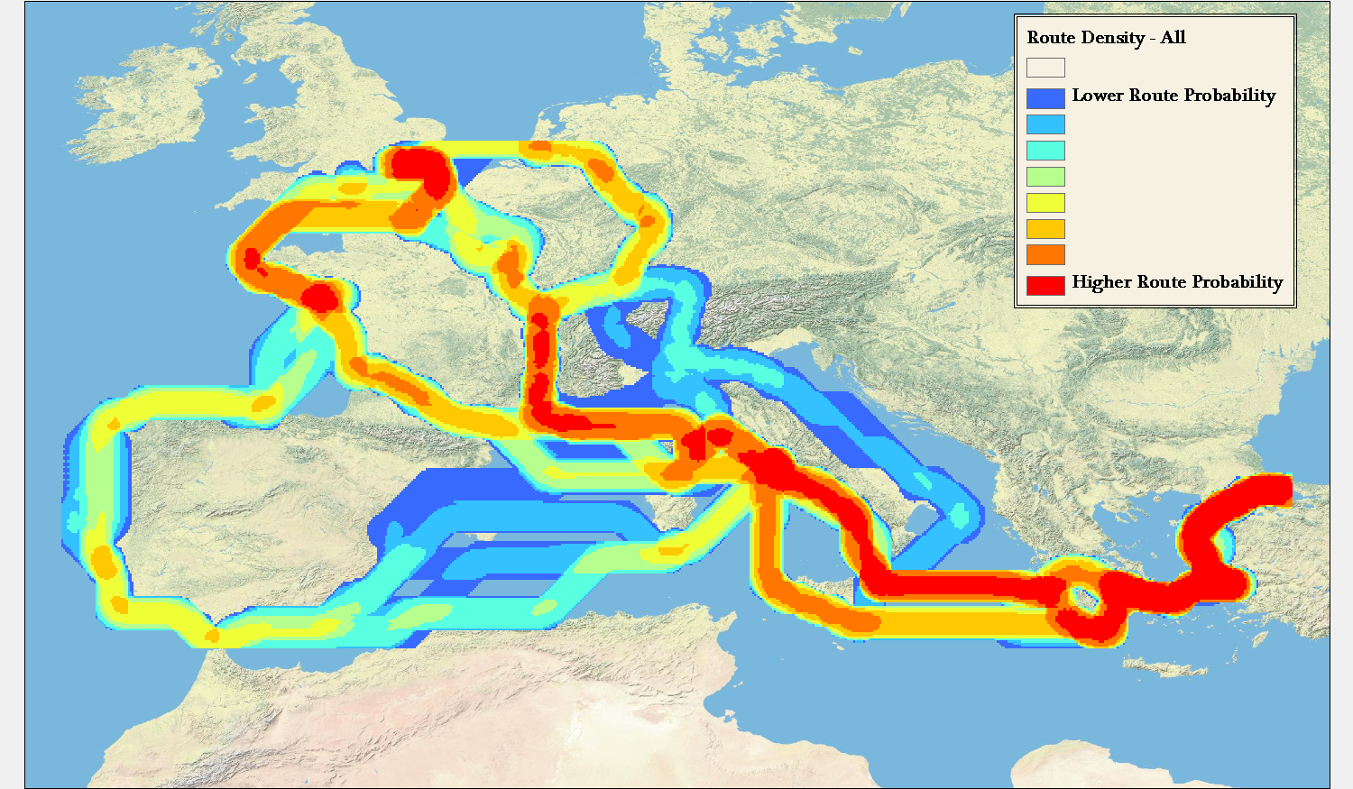
This simple aggregation of all paths shows the raw likelihood that the travel between these points would result in a traveler having been in a particular area. This reveals that the probability space between two points can vary widely. For instance, the aggregated route density between Rome and Constantinople, regardless of priority, direction, or time of year falls within a tightly constrained corridor. In comparison, travel between London and Rome is so affected by these variables that there are widely divergent paths.

Importantly, the above map and maps like this provide a fundamentally accurate answer (within the constraints of the ORBIS model) about travel between sites where we know no information except that the travel took place between such sites. To say that an individual traveled between Rome and London does not mean that they could have been anywhere in Europe, but rather that there is a recognizable region that they probably would have been.
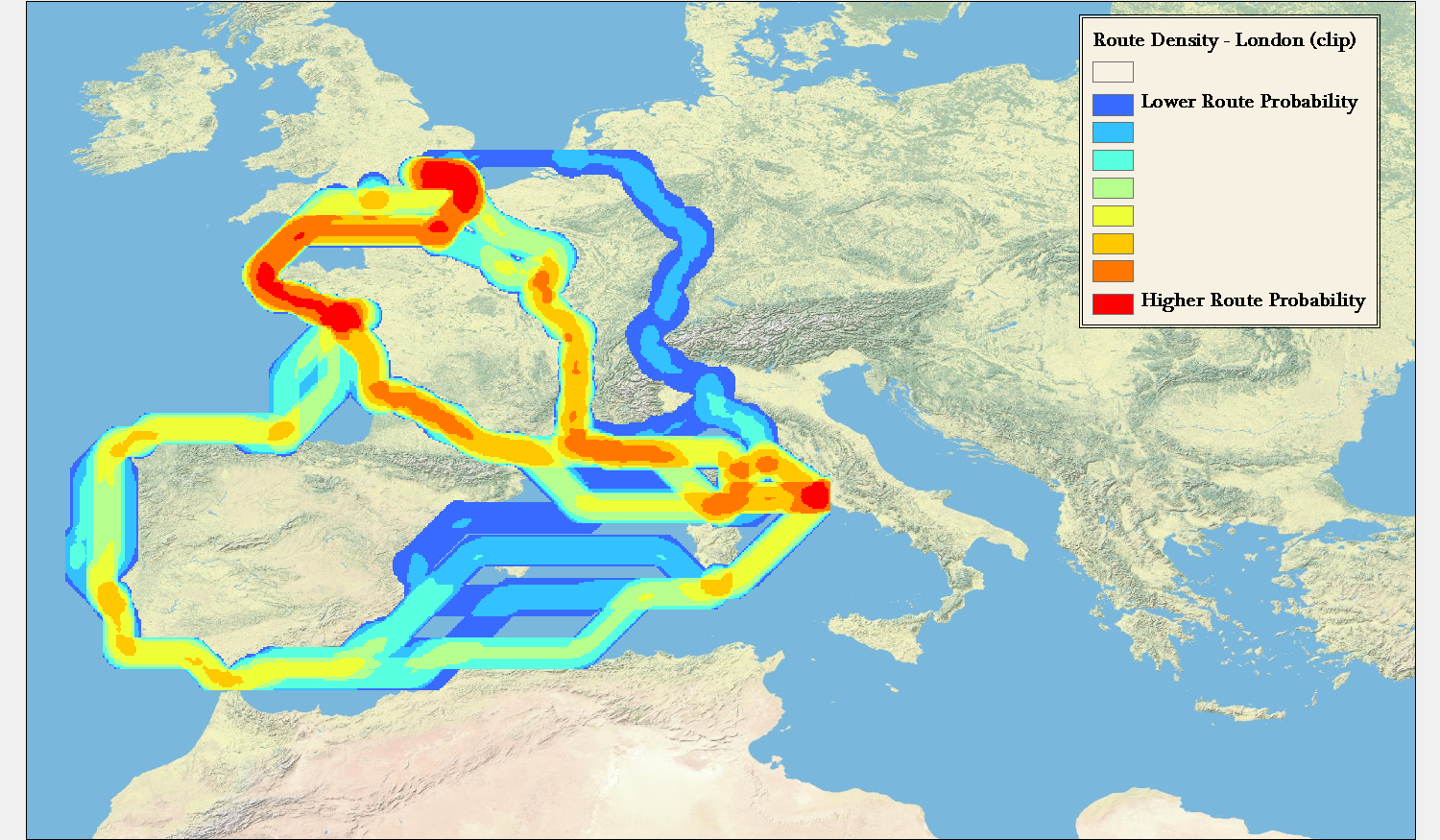
While some work has been done in trying to show geographic probability space in time geography, this tends to focus on the raw possibility of travel between two points separated by a given time, rather than the problem represented by routes in ORBIS, which is travel between two points constrained by the variability simulated in the model. Routes between Rome and London, especially, are prismatic in their nature, but do not consist of all “possible” routes between the two points, but rather all “probable” routes given the goals of the traveler. There is no chance, according to the model, that travel between Rome and London will involve spending any time in the central Iberian peninsula, or along the Levantine coast. This is not because it is constrained by time, but because these routes fall outside the least-efficient path algorithms that underpin ORBIS.

Contrast this with representations of spacetime prisms that utilize modern transportation networks and the difference is quite stark. While it’s possible, given a set amount of time, that a traveler could pass along any street in an urban area between two points, it is importantly more and less likely (approaching zero depending on the constraints) that they will pass along particular routes. This would seem more to reflect reality, given that even a traveler not focused on finding the shortest, fastest, or cheapest path between two points in a city will still have other goals (such as sightseeing) that would reduce or increase the probability that they would take particular routes. Fortunately, the ORBIS model’s simplicity allows this issue to be explored in a limited manner, but even in ORBIS the route matrix is constrained to not include variation in travel speed or surface. Each additional variable and expansion of possible variable values increases the number of routes signficantly.
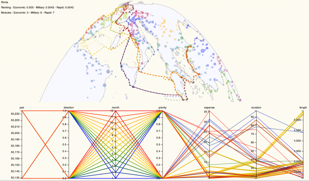
Route Probability Representation

Representing the data about these routes beyond simple line density led me to pair a parallel coordinates system with a map of the routes to produce the prototype above, which you can use here. Please keep in mind that it’s in rough shape and will likely change once I have time to work on it. For instance, my current implementation of parallel coordinates only recognizes numeric values, and so the clumsy way that I differentiate between the routes between Rome and London or Rome and Constantinople is to give the numeric identifier of the site paired with Rome (50235 for London and 50129 for Constantinople). Similarly, direction is represented by 1 for “To Rome” and 0 for “From Rome” while priority is represented with 1 for “Cheapest” and 0 for “Fastest”. Fortunately, we have a well-known numeric shorthand for months.

By providing parallel coordinates as a sort of dynamic legend (the titles of each filter can be clicked to color the routes accordingly) the complexity of representation of the possibilities of travel are foregrounded. One can visually write their “query” in such a way as to see the results of traveling only in one direction or during a few months or under a particular price. Such a system, much-improved visually and functionally, would make for an interesting alternative to the current method of querying ORBIS for possible routes.
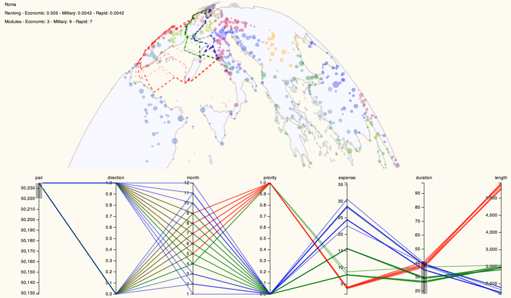
Parallel Coordinates Dynamic Coloring

While such an interface helps with the problem of revealing complexity and probability to users, this representation helps to solve the problem of likelihood and uncertainty, as well. Using parallel coordinates, we can manipulate and constrain the variables displayed on the map to isolate routes that are particularly outside the average in various categories. This method of representing probability space quickly demonstrates that the cheapest routes between Rome and London between October and April are so abnormally expensive and of such long duration that they could feasibly be dropped from an aggregation of possible routes, and these months during this priority can be treated as unlikely to the point of nonexistence, which should be noted when such a route is displayed to a user (in natural language, statistically, and visually).

Even a cursory exploration of this method for visualizing routes between just three sites reveals distinct patterns in route variability based on time and priority in the ORBIS model. Revealing that variability and factoring it into the results provided to a user, whether as a statistical measure or using techniques to represent the data, is necessary to foster meaningful interaction with the model. Concurrent with the explosion of data visualization libraries and tools is a growing fluency with the techniques they enshrine. As these tools make the creation of simple maps easy, they also more readily allow for the creation of complex and difficult geospatial information visualization. To produce the latter, we need to develop techniques that reveal the complexities of the systems we’re using.


* One could be excused for asking, incredulously, what other kinds of digital maps there could be, but “map”, like “graph” and “tree”, is a too-flexible word, such that the treemap of the graph of overlapping meanings those three words have would be very messy.

Posted in Algorithmic Literacy, Spatial Humanities, Visualization | 1 Comment

Good Data, Bad Data

One of the projects I’m supporting this year is an analysis of neighborhood similarity of cities in the United States. The similarity measure is based off a set of attributes and can be represented as a matrix, which can then be represented as a graph or network. Once in network form, it can easily be visualized and network community detection can take place, allowing for compression of a network into more a more manageable form if the community detection reveals a strong signal. Visually, that means a 3000×3000 matrix can be made to look like this:

Network of Neighborhoods Based Off SimilarityThe nodes are colored by module, which is to say that they indicate particular regions within the network where links within that region are more likely than links between that region and other regions. The modularity signal is a measure of that. In this case, we have a network with .785 modularity, meaning only 21.5% of links are between networks. But any such graph representation runs into the problem typical of graphs where the position of a node (or even of entire groups of nodes) can place it spatially close to nodes from which it is very distant on the network. This spatial illusion damages the credibility of network visualization because we presume that objects shown next to each other on a two-dimensional image are close to each other. In a network, though, objects that are close to each other may be close because they are being pulled toward connected nodes that are in vastly different parts of the graph.

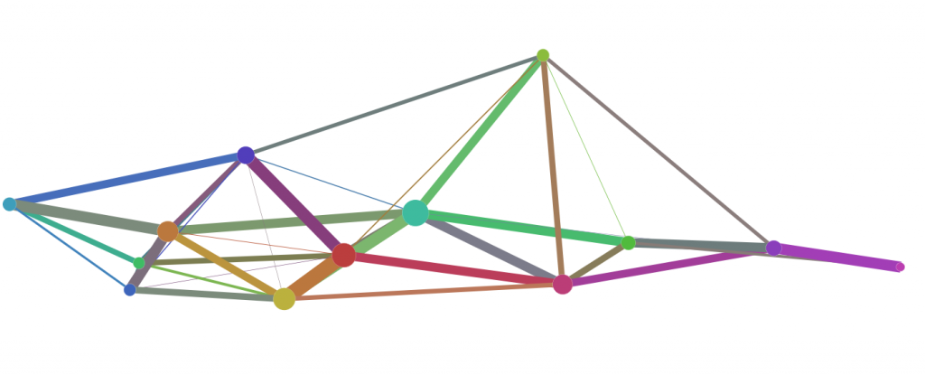
This creates an illusion of similarity that is difficult to adequately explain to an audience. Fortunately, when we have the chance to compress large quantities of data, we can provide some better explanation of the structures at work in the creation of a network visualization of this kind. In this case, our strong community signal allows us to compress ~3000 nodes into just 13. By providing the combined strength of connection between those nodes, which represents the connection across communities that makes up the above-referenced 21.5% of the connections in this network, and sizing the nodes based on their share of those connections, we get a better understanding of how much of the structure of the more complex network is illusory.

Community Meta-Nodes for a Network Based on Similarity Between US NeighborhoodsThe above image is the same network, though compressed into community meta-nodes. It can act as an inset map of sorts, providing the reader with the capacity to better understand the regionation of spatial inaccuracy of the network in a visual manner. I didn’t want to move the nodes, because I wanted to leave this process as straightforward as possible, but obviously there is some slight adjustment that should be made so that the connections between communities are not obscured. It is in these cases where curved edges, which bother many people, prove extremely useful.

Community Meta-Nodes From a Similarity Matrix Based on US NeighborhoodsThe resulting image, combined with the modularity score of the network, provides what I consider to be strong evidence for the validity of the network visualization. While in some cases communities are pulled near communities with which they hold little similarity, the overall structural patterns are distinct and the chains of similarity from community to community to community reinforce the apparent structure of the individual nodes in the more complex network visualization.

That structure would provide a researcher with a useful scholarly path to explore, if it weren’t for the fact that this network is invalid. It turns out the method for determining the similarity between the neighborhoods needs to be retooled. The final network may look just like this, or it may not look anything like this. With that in mind, I find it particularly interesting that it makes no difference in the usefulness of this network from a methodological perspective.

Exploratory analysis is typically construed to mean exploration of the material for its content as it applies to a research agenda, but much of what is done under the auspices of the digital humanities is exploration of the methods (either theoretically or enshrined in tools) for their suitability to a research area. It seems healthier to think one can sample and experiment with a variety of methods, and find methodological successes even when forced to retreat from claims that advance a particular research question. Or it could be that my position in supporting research allows me to value the methodological component higher than the traditional research agendas.

Either way, the use of inset maps that show a compressed version of a network, when there are valid methods available of compressing such networks, is a useful method in network cartography.

Posted in Graph Data Model, Spatial Humanities, Visualization | 3 Comments

Digital Humanities Specialist Call for Proposals 2013

Proposals are now being accepted for digital humanities support of research at Stanford University. This support will take place during the Spring and Summer Quarters of 2012-13 as well as the Autumn Quarter of AY2013-14.

In the past, this support has produced interactive scholarly works such as Authorial London and ORBIS, as well as supported more general research into the cultural aspects of species biodiversity databases, or the shape of the Grand Tour in the 18th century. With the increasing attention given to the publication of scholarly digital media, preference will be given to projects that aim to produce some kind of work for publication (whether static, dynamic, or interactive).

The full call for proposals and further details can be found here.

Posted in Digital Humanities at Stanford | Comments Off

The Sickness Unto Digital

Stanley Fish was here at Stanford recently, for a talk entitled “If You Count It, They Will Come” where he proceeded to count the dangers of the digital humanities–something familiar to those that have read his New York Times column. I’m sympathetic to his argument, since as it stands his version of a digital humanist should not be defended by anyone. When Ryan Heuser, of the Stanford Lit Lab, offered up the lab’s work as an empirical movement, complementary to traditional humanities scholarship, Fish made no complaint about a digital humanities that looked like that. The digital humanities that troubles Fish is the kind of manifestos and true belief, that presume the digital will change the very fundamentals of scholarship and hierarchy in academia. When I suggested to Fish that he and I were relics, and that a new breed of scholar who was savvy both in reading Milton and writing Python would obsolete us both, he rightly pointed out that such a scholar would also send the true believers to the dustbin of history. He followed this up with a claim that he was not so late in his career that he could not, if he wanted to, learn such things. The Programming Fish would be a thing to see. But I was struck by my own disclaiming of “manifesto digital humanities” and how that fit into Fish’s criticism of his vision of digital humanities. It seems, without too much twisting, that there exists the same tripartite despair outlined by Kierkegaard but for the role of the digital in the production of scholarship.

The Despair of the Unknown Digital

That first level, where one fears something because they simply do not know what it is, or even that it exists. For Fish, the digital humanities is Google Ngram Viewer and a few undergraduate NLP exercises coupled with some really great archives. He thinks it can just go away, as if it was a thing that admitted to leaving, when there is no reasonable conceptualization of humanities scholarship that does not involve digitally-enabled methods. This despair can be seen amongst digital humanists themselves, some of whom seem compulsed to point out at regular intervals that the word ‘digital’ has linguistic roots such that anything created with fingers could be considered digital, or that this kind of thing has been happening for seventy or seven hundred years, an argument that ignores the rule that as a thing grows in scale it changes in nature. When Busa created his concordance, as one man working with IBM, he followed one model of production in the digital humanities where the scholar teams with a technical expert to create something without reference to earlier dynamic or interactive work. That’s still going on today in the digital humanities, but it’s going on alongside production where the scholar is the technical expert and the work is tied (whether theoretically or, via API, directly) to existing projects and standards. And that’s simply one reformulation of what it means to do digital humanities. It is not that we have a thousand Busas today, and will have ten thousand tomorrow, each obeying strict division of labor, but rather along with those Busas has come a dozen new species that approach such research and theory from many different methodological and practical perspectives. I remain a firm believer in the big tent, but I think it is a very big tent.

The Despair of Humanities Accounting

Here lies an almost direct comparison between Kierkegaard’s despair and the despair of the digital humanist, for when one realizes that digital humanities actually exists, it seems best to use it to create digital objects in great abundance and variety. The creation and counting and correlation of so many objects–that empiricism to which Fish was so amenable (and what Miltonist does not love to count?)–would seem to finally provide answers where only gestures were possible before. Taken by the ability to fill one’s vision with production drives faculty at research universities to become archivists and librarians on one side of the factory and statisticians (or statistician groupies) on the other. Except this devolves into information production and not knowledge production, in an age where we already swim in information. As Baudrillard explains:

Information is thought to create communication, and even if the waste is enormous, a general consensus would have it that nevertheless, as a whole, there be an excess of meaning, which is redistributed in all the interstices of the social–just as consensus would have it that material production, despite its dysfunctions and irrationalities, opens onto an excess of wealth and social purpose. We are all complicitous in this myth. It is the alpha and omega of our modernity, without which the credibility of our social organization would collapse. Well, the fact is that it is collapsing, and for this very reason: because where we think that information produces meaning, the opposite occurs.
Information devours its own content. It devours communication and the social.

The Despair of Digital Uncertainty

Once the creation of digital goods exhausts or overwhelms the digital humanities scholar, they can sink into an authentic despair over the feasibility of digital methods, objects, and tools to provide meaningful communication of humanities knowledge. No database is complete, no information visualization technique perfect, no publication method all-encompassing, and so the digital humanities becomes a salon, where humanities scholars can interrogate and examine the components and ephemera of digital scholarship, and suggest and gesture toward a one day complete representation of the complexities and uncertainties of humanities knowledge using digital means. They eschew the counting of their younger days, and wonder even if there is a digital humanities to argue for the existence or non-existence thereof.

That Relationship Between the Finite and the Infinite

It has been too long since I read The Sickness Unto Death, and so I do not remember if the despairs are hierarchical in Kierkegaard’s version, but I know they are not in the digital humanities. I find myself swinging between all three, though more in the latter two than the first. I don’t know if the analogy carries through to a conclusion and doubt that there is some enlightened form of digital humanities to strive for, but I think these broad categories fit, and present dangers perhaps not in their expression but in their expression to the exclusion of each other.

Posted in Natural Law | Comments Off